How to Make a Box and Whisker Plot in Excel? Definition, Steps & Comments
A box and whisker plot, also referred to as a box plot or whisker plot, is an insightful and versatile visualization tool that effectively showcases the distribution and essential statistical measures of a dataset. In this comprehensive article, we will delve deeper into the details of box and whisker plots, guiding you through a step by step process on how to create one in Excel. Additionally, we will provide valuable insights and tips to enhance your understanding and interpretation of this visual representation. Therefore, this article outline includes basic box & whisker plot knowledge and building skills.
Table of Contents
1.What’s a Box and Whisker Chart?
2. How to Make a Box and Whisker Plot?
3. How to Read a Box and Whisker Plot?
4. Automatic Box and Whisker Plot Maker
5. Conclusion
6. FAQs
1. What’s a Box and Whisker Chart?
Before we delve into the process of creating a box and whisker plot in Excel, let’s first understand what it represents. A box and whisker chart provides a visual summary of a dataset’s distribution by dividing it into quartiles and showcasing key statistical measures such as the median, lower quartile (Q1), upper quartile (Q3), minimum, and maximum values.
What is the median? A data set’s median value is the point where 50% of the data points have values that are lower or equal to it and 50% of the data points have values that are higher or equal to it. Quartile two is often referred to as Q2.

When the data points are arranged in ascending order, 25% of them are found in the lower quartile, often known as the first quartile (Q1). When presented in increasing order, the value that 75% of data points fall within is known as the higher quartile, or third quartile (Q3).
These three values called quartiles divide sorted data into four equal portions with the same number of observations in each. One kind of quantile is a quantile. First quartile: also known as Q1, the lower quartile, or the median Third quartile: also known as Q3, or the upper quartile.
2. How to Make a Box and Whisker Plot?
In Excel, how can I create a box&whisker plot? We’ll go into great depth on how to use Microsoft Excel and its internal tools to solve the issue. If you are ready to discover to how to do, let’s begin.
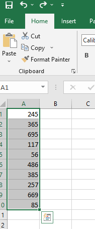
Step 1: Prepare and Select Data
To begin, ensure that your dataset is organized in a column or row format. Make sure it is sorted in ascending or descending order for accurate results. Select the range of data you want to include in your box and whisker plot.
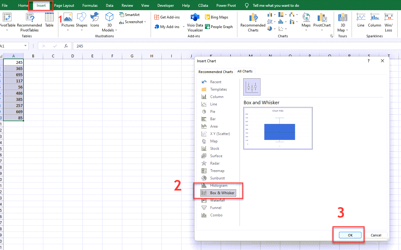
Step 2: Insert Chart
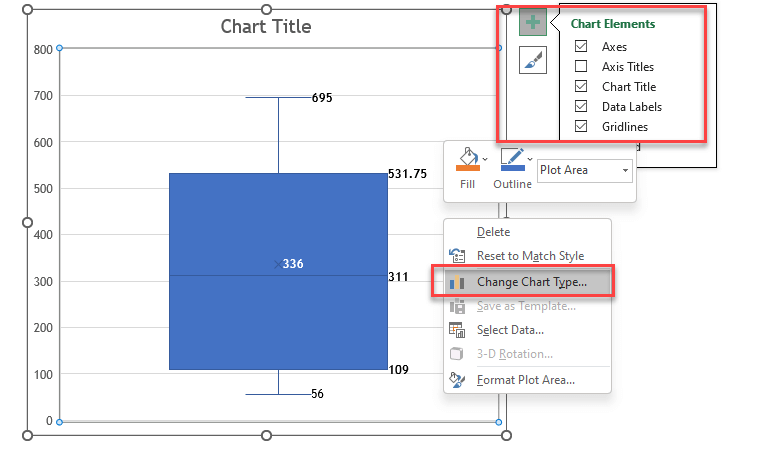
In Excel, creating a box and whisker plot is an easy process. Go to the “Insert” tab and choose the appropriate chart type, such as “Box and Whisker” or “Box Plot” Please note that if you are using Excel 2016 or earlier versions, the box and whisker plot feature might not be available. Manually calculate quartiles, create a chart, format as a box plot. Additionally, for those who are new to box plots, it would be helpful to mention about outliers. We will mention about them on the next step.
Step 3: Add Outliers
In other words, Outliers are data points that significantly deviate from the rest of the data, often due to factors like data entry errors, measurement inaccuracies, or inherent variability. Identifying outliers can be done through visual inspection of the data or statistical approaches, such as the interquartile range (IQR). Managing outliers involves considering specific circumstances and key tips include recognizing their value, avoiding automatic removal, and evaluating contextual relevance.
If your dataset contains any outliers, you can include them in the box and whisker plots. Outliers are data points that fall significantly outside the overall pattern of the dataset. Including them in the plot can provide additional insights. After adding and/or considering outliers, let’s check the calculation of the quartiles. You can check out the pro-tip below.
Step 4: Format Your Chart
When you get the results of the calculations using the formulas. Firstly, customize your box and whisker plots in Excel to create visual attraction. Modify colors, styles, labels, and more to personalize your plots. Secondly, take advantage of these actions in newer Excel versions for the flexibility to adjust colors to your liking. Explore different design choices and make your box and whisker plot unique.
3. How to Read a Box and Whisker Plot?
Reading charts is just as important as doing them. In this regard, reading a box and whisker plot involves understanding its key components and interpreting the information they convey. The box represents the interquartile range (IQR), which contains the middle 50% of the data. The line inside the box represents the median, the value that divides the dataset into two equal halves. The whiskers extend from the box and indicate the minimum and maximum values, excluding outliers.
Outliers, if present, as individual points outside the whiskers. By analyzing these elements, you can gain insights into the data’s distribution, variability, and skewness. Box and whisker plots provide a visual snapshot of a dataset, enabling you to identify trends, compare different groups, and detect potential outliers or unusual patterns.
Consequently, by understanding these concepts and methods, we can analyze box and whisker plots and gain results from the data they represent.
Interpretation of a Box and Whisker Plot
Understanding how to interpret a box and whisker plot is crucial for gaining meaningful insights. The plot’s elements, such as the box plot chart or any chart including the box (representing IQR and median) and whiskers (indicating data range without outliers), provide valuable insights into the data’s spread, central tendency, and potential anomalies. Let’s have a deep look at the concepts.
Q1 (First Quartile)
– Divides the data set into four equal parts.
– Approximately 25% of the data falls below Q1, while 75% falls above it.
– Represents the lower boundary of the upper half of the data.
– Can be calculated using the QUARTILE.EXC or QUARTILE.INC functions in Excel.
– In a box and whisker plot, Q1 is the lower edge of the box and indicates the range of data below it.
Q2 (Second Quartile or Median)
– Divides the data set into four equal parts.
– Approximately 50% of the data falls below Q2, and 50% falls above it.
– Represents the central value or measure of central tendency.
– In Excel, you can calculate it directly or find it as the middle value of the data set.
– In a box and whisker plot, Q2 is the line dividing the box into two halves.
Q3 (Third Quartile)
– Divides the data set into four equal parts.
– Approximately 75% of the data falls below Q3, and 25% falls above it.
– Represents the upper boundary of the lower half of the data.
– Can be calculated using the QUARTILE.EXC or QUARTILE.INC functions in Excel.
– In a box and whisker plot, Q3 is the upper edge of the box and indicates the range of data above it.
Understanding these quartiles is important for analyzing and interpreting data distributions, identifying central tendencies, and detecting outliers in different ranges of the data set.
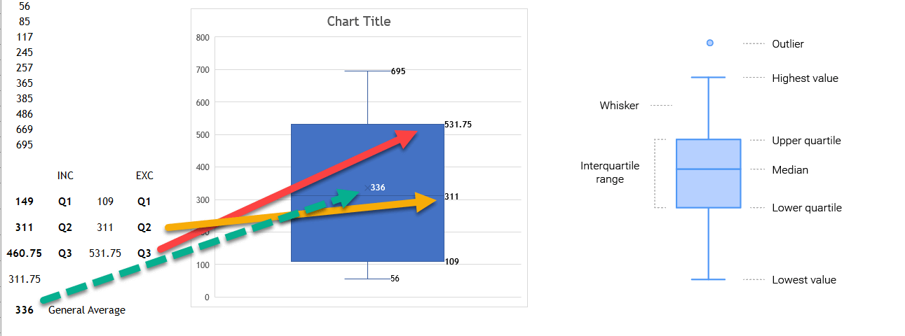
Therefore, you can check and understand the results for whiser and box plots. In this sample data, Both of the EXC functions identify a particular quartile in the given data collection. QUARTILE. INC based its calculation on a percentile range of 0 to 1, inclusive, whereas QUARTILE. EXC bases its calculation on a percentile range of 0 to 1, exclusive. This is the difference between these two functions. Thus, Quartile Exc Q3, 531.75, is calculated with =QUARTILE.EXC(A1:A10,3). The median as INC Q2 and EXC Q2 is 311, calculated by =QUARTILE.EXC(A1:A10,2) or =QUARTILE.INC(A1:A10,2).
Moreover, you can find and check the values, as shown above. These are, highest value, lowest value, upper quadrant, median, lower quadrant, and interquartile range.

4. Automatic Box and Whisker Plot Maker
First of all, having Excel’s automatic box and line chart features was useful but not the only option, especially in versions released after Excel 2016. Consequently, this maker tool by highlighting its benefits in terms of saving users from manual calculations with its efficiency. Sleek and creative design. Additionally, new innovative solutions are prepared to examine and tackle this incredible specific for the data analysis tools for different user kinds.
The Excel Box and Whisker Plot Maker is a magical tool for visualizing and analyzing data sets. Hence, it enables you to easily create box and whisker plots, providing insights into the median, 1st and 3rd quartiles, minimum, and maximum values within your data. This chart identifies illogical data or calculation errors in your inputs. Additionally, box and whisker plots are widely used in statistical research and experiments.
Data Entry of Box and Whisker Plot Maker
In this chart maker tool you can have simply two options which are Full Data Input
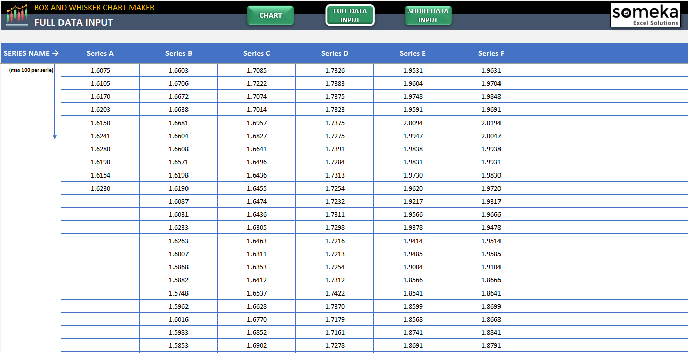
Full Data Input of Box and Whisker Chart Maker of Someka
or Short Data Input as shown below.
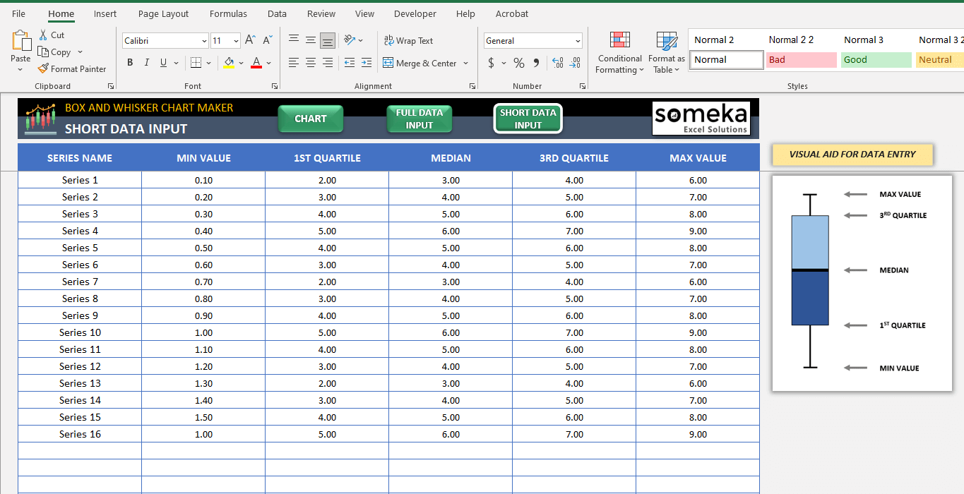
Short Data Input of Box and Whisker Chart Maker of Someka
Getting Chart of Box and Whisker Plot Maker
The Excel Box and Whiskers Plot Maker lets you have a great output chart with its different options. Thus, simply fill out the area for data input that corresponds to the size of your dataset, whether it be the Short Data Input portion for smaller datasets or the Full Data Entry section for larger ones. Furthermore, this user friendly way simplifies and expedites the process of gaining valuable insights from your data. Moreover, the output chart can be used after being changed as needed. Your actions will take less time with this time saver Excel solution.
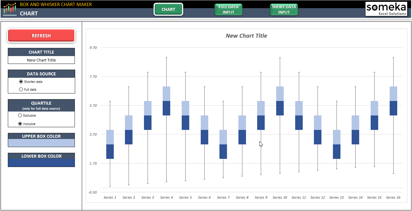
This chart easily and quickly created with the Excel Box and Whiskers Plot Maker template of Someka
The Box and Whisker Plot Maker simplifies creating box and whisker plots in Excel. Firstly, it has a user friendly interface, works on both Mac and Windows, and is compatible with Excel 2010 and newer versions. No installation is required, making it ready to use right away.
The chart maker is print-ready and includes informational notes, enhancing your data visualization process. Lastly, it offers a convenient solution for creating professional box and whisker plots in Excel. There is also another solution such as the Excel template that you can download if you want to store, review, or share your work for the Box and Whisker Plot Google Sheet Template as online.
Nevertheless, if you want to discover more about box & whisker plot maker, you should watch the video below:
5. Conclusion
In conclusion, a box and whisker plot is a powerful showing tool that offers a general summary of a dataset’s distribution and statistical measures. It divides the data into quartiles and displays necessary values like the median, lower quartile (Q1), upper quartile (Q3), minimum, and maximum, providing deeper insights into the data. Besides, Excel provides ready to use templates specifically designed for creating box and whisker plots, automating the process and ensuring accuracy in data analysis. So, when interpreting a box and whisker plot, understanding elements like the box, whiskers, and outliers is crucial for gaining valuable insights.
In addition, newer Excel versions offer the creation of visual attractive box and whisker plots. By using Excel’s templates, users can create interactive and customizable plots, enhancing data analysis and decision making. In summary, ready to use Excel templates offer a dynamic solutions for creating box and whisker plots, improving data visualization and helping in data interpretation.
6. FAQs
1.How do you find Q1 and Q3 in Excel?
Firstly, to find the first quartile (Q1) and third quartile (Q3) in Excel using the QUARTILE() function, you can follow these steps. Secondly, the syntax for the QUARTILE() function is as follows: =QUARTILE(array, [quartile]).
After that, “array” represents the range of cells that contains the data, and “quartile” indicates the number of the quartile you want to find, where Q1 is the first quartile, Q2 is the second quartile (also known as the median), and Q3 is the third quartile. For instance, to find Q1 in a range of cells called A1:A10, you would use the formula =QUARTILE(A1:A10,1). Similarly, to find Q3, you would use the formula =QUARTILE(A1:A10,3).
2.Why is there no Whisker on Boxplot?
Evidently, a boxplot is a graphical representation of the distribution of data. It consists of a box, whiskers, and a median. The box represents the middle 50% of the data, the whiskers extend to the farthest data points, and the median is the middle value of the data.
There is no whisker on a boxplot if there are no data points outside the interquartile range (IQR). The IQR is the difference between the third quartile (Q3) and the first quartile (Q1). If all of the data points fall within the IQR, then there are no outliers, and there is no need to show.
3. Can you make a Horizontal Box and Whisker Plot in Excel?
Creating a horizontal box and whisker plot in Excel is an easy process. To begin, select the data that you want to plot. Then, select to the “Insert” tab and locate the “Box and Whisker” icon within the “Charts” group. Click on the icon and choose the “Horizontal” option. Finally, click on the “OK” button to create the horizontal box and whisker plot in Excel. The plot will consist of a box that represents the middle 50% of the data, whiskers that extend to the farthest data points, and a median line indicating the middle value of the data.
Lastly, MicrosoftExcel enables editing of box and whisker plots, giving you control over colors, fonts, and other visuals’. For more info, you can visit to Microsoft Support about Create a box plot.
Recommended Readings:
Related Posts