What is a choropleth map? Definition, Examples & Tools
Firstly, choropleth maps are one of the most common methods when it comes to geographical data visualization. Secondly, it is a way of classification for geographical areas.
Table of Content
1. What is a Geographical Choropleth Map?
2. What are Choropleth Maps used for?
3. What is the difference between Choropleth Map and Heat Map?
4. Data Classification Methods
5. How do you read a color-coded map?
6. Choropleth Map Generators
7. Someka Map Collection
1. What is a Geographical Choropleth Map?
Certainly, a color-coded map is one of the most common data visualization tools. So forth, Professionals mostly use it to show the distribution of certain data in a specific geographical area.
Moreover, color-coded maps are the tool to make comparisons between different regions and results.
Therefore, the aim of the choropleth map is to show the distribution and the difference between data results based on geographical areas.
Lastly, it is created with discrete data and strictly connected to regional boundaries.

2. What are Choropleth Maps Used for?
Undeniably, the colors of color-coded maps can vary so each color has its own code and meaning. Following this, color-coded maps are often used to show, political or socio-economic data.
Therefore, when there is an election, most news channels are using color-coded maps to make their data basic.
For instance, if you have discrete data about traffic, it is the tool you should use.
In another case, you can use color mapping and data classification for the socio-economic data such as the unemployment rate.
Lastly, you can use color-coded maps for literacy rate data.
3. What is the difference between Choropleth Map and Heat Map?
Obviously, there are several differences between a choropleth map and a geographic heat map.

Firstly, the data type is different as geographic heat maps are using continuous data but color-coded maps are using discrete data. For instance, heat maps are using income rate differences and choropleth maps are using election polls.
Secondly, the purpose of the geographic heat map and color-coded map is different. Following this, geographic heat maps are showing the density of data throughout the geographical areas but color-coded maps are showing the distribution of data. For example, a geographic heat map shows the density of traffic and a color-coded map shows the distribution of income levels.
Thirdly, the geographic heat map does not have strict geographic boundaries but the color-coded map has strict geographic boundaries. For instance, you can use geographic heat maps without geographic boundaries such as state borders but you should rely on geographic borders on color-coded mapping.
So forth, geographic heat maps are using a single color with its shades but color-coded maps are using several colors. At this time, we can say both map styles are using color-coded maps but one of them using only one color, and the other uses color mapping with several colors.

4. Data Classification Methods
Definitely, data classification is a must before creating a geographical map. Afterward, you can design your own choropleth map. Following this, let’s take a closer look at data classification methods while creating a heatmap.
Therefore, you have a couple of options while making your data ready for work. Also, the most used data classification methods are:
- Simple breaks
Firstly, let’s say you have a huge dataset and you don’t know what to do with it. At this point, you can start with simple breaks in data classification. So forth, you should define a number range for the data and normalize the data within those numbers. As a result of the simple breaks, you will have simpler data and you can visualize the data in a better manner.
- Equal intervals
Secondly, equal intervals, divide the data into equal-sized intervals. For example, you have a dataset that is pretty complicated to analyze. As I have said, you can divide the data into equal-sized intervals so it will become simpler.
- Multiscale equal intervals
Furthermore, multiscale equal intervals, divide the data into equal-sized intervals with multi-scaling. Summing up, this process will make your data simpler.
5. How do you read a Choropleth Map?
In this case, better to read a map together to explain what you should see on a color mapping.
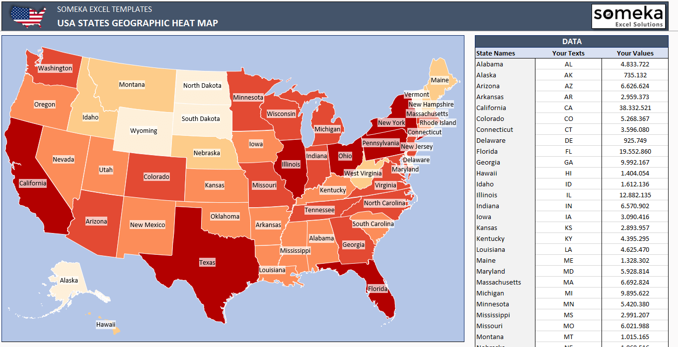
– This diagram is created on USA Choropleth Map Generator Excel Template by Someka –
On this occasion, we are showing income range, after you check the map, you can say darker color states such as California, New York, and Texas have higher income than any other states.
6. Choropleth Map Generators
On the whole, creating color-coded maps is hard so Someka offers a wide range of color-coded maps. For instance, you can just download one of the color-coded maps that Someka designed for you and use it with any kind of data.
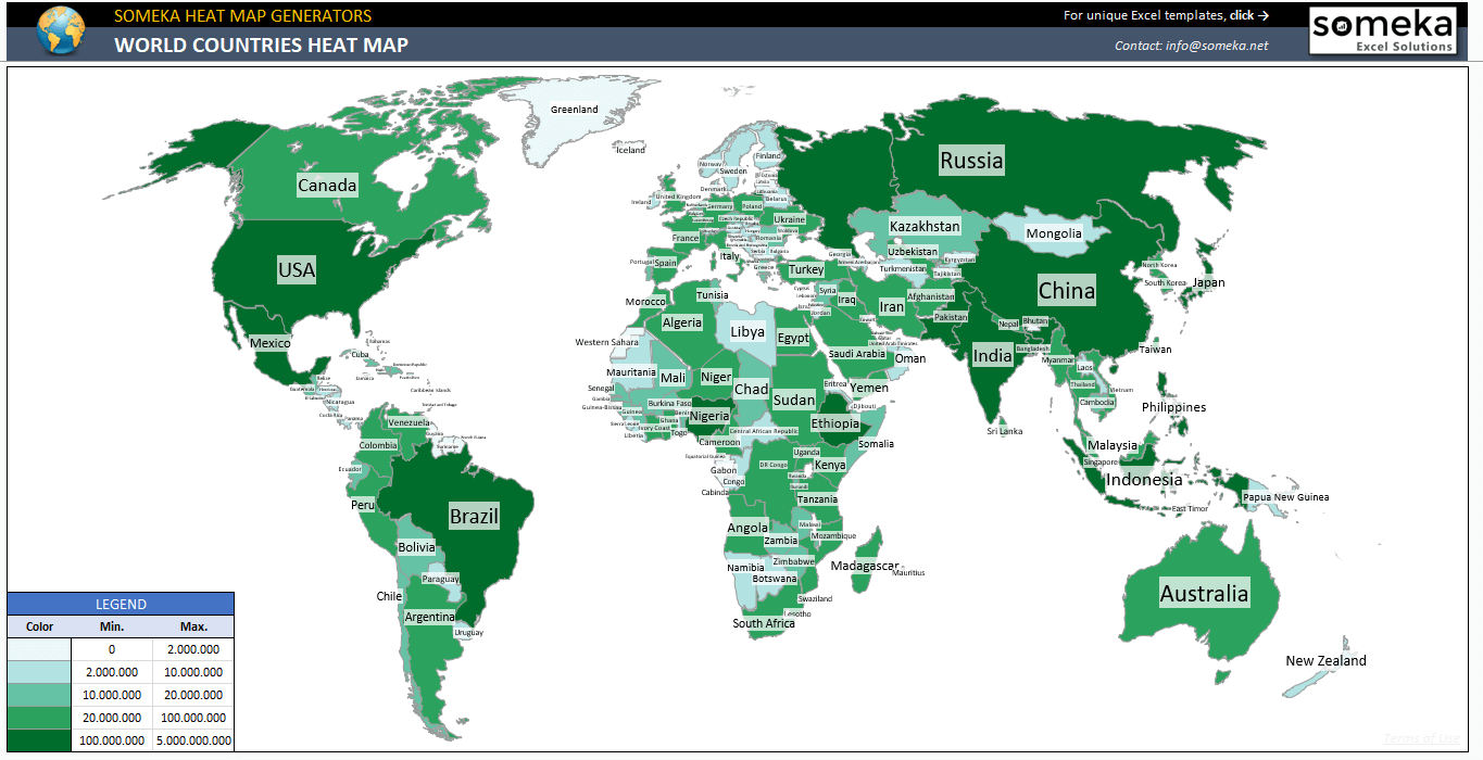
– This diagram is created on World Countries Choropleth Map Excel Template by Someka –
There are many different color-coded map generators that you can choose either the whole World or a specific country.
To summarize, ready-to use map generators have many benefits:
- Easy-to-use
- Editable
- Customizable
- Professional looking
- Printable
- Efficient data visualization
7. Someka Choropleth Map Collection
Recommended Readings:
Related Posts