Excel Dashboard Design: How to make impressive Excel dashboards like Someka does?
This is the very common question we got from our users: How do you create so much impressive Dashboards? Yes, Someka dashboards look really impressive, but why? Today we’ll try to explain our Excel Dashboard Design methods and standards.
Let’s start.
Table Of Content
1. ARCHITECTURE
1.1. Designing the Excel File Workflow
1.2. Dashboard Elements
2. DATA INPUT
2.1. Quick Warnings
2.2. Quick Tips in Data Input
3. CHARTS
3.1. How to Make Impressive Charts?
3.2. Keyword Cheat Sheet to choose best chart type
3.3. Real Life Examples
3.4. Chart Formatting Quick Tips
4. DASHBOARD TIPS
4.1. Mockups
4.2. Interactive Elements
4.3 Color Schemes
4.4. Magic of Pivots
In this article, we’ll comprehensively explain how to make impressive dashboards in Excel, similar to the ones created by Someka. We’ll detail how these dashboards are designed and the key considerations we keep in mind during the design process.
As we proceed, you’ll essentially get a summary of this: Yes, the dashboards we’ve created look very attractive and indeed appealing. However, there’s a reason for that. They look good because of the numerous factors we pay attention to. Otherwise, creating visually appealing and well-functioning dashboards is genuinely not easy.
1. Excel Dashboard Design Architecture
Architecture is the most important section in our opinion. Under the umbrella of Architecture, we will explore two major sections:
- File workflow
- Dashboard structure
Prior to anything else, we must comprehend the file’s actual structure, including how it ought to be organized, what data input and output are, and the important questions we must ask of ourselves. We will go into great detail about Elements in the second main section because it is very important. 
Shapes, typefaces, texts, and other things can all be considered elements. We’ll assess their significance and the narrative they present. Each component used to create a dashboard has a purpose.
1.1. Designing the Excel File Workflow
When creating a file, workflow, or design a Excel dashboard, let’s take the following into account:
- How many data tables will I need?
- So how many data tables will there be?
- How many different data types do I need to show in this dashboard?
- Is there a specific order between different sections?
- Will there be a settings section?
- How many output and input sections and how many reports will I need
- Is the number of sheets dynamic?
We consider the complete file when posing these queries—not just the dashboard portion.
 We take into account all of these together, even if there are separate sheets for settings and data input. Don’t limit our discussion of a dashboard to one page with some charts; instead, consider the entire file system. For example, will we be able to navigate by clicking between sheets or will there be a separate navigation menu?
Sometimes a separate navigation menu helps with complex files. However, sometimes all we need to do is add a few buttons next to a few charts on a page. The complexity of the file will determine this choice. For instance, our Trading Journal product consists solely of a navigation menu with descriptions that outline each section’s purpose. That is the operation of the navigation menu.
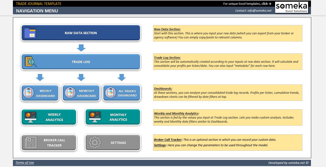
– Navigation Menu of Someka Trading Journal Excel Template –
However, we occasionally use a combination of settings and navigation in other products. Allow me to provide an additional example.
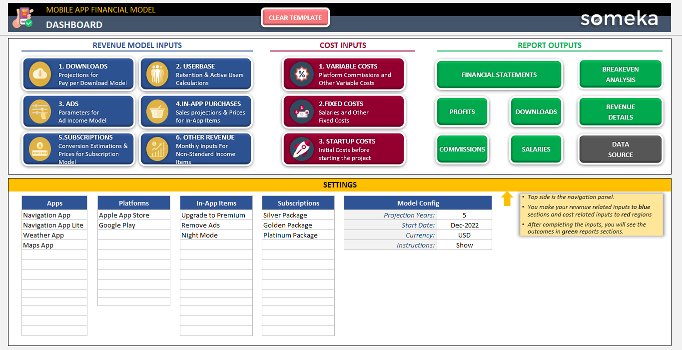
– Navigation Menu with Settings Example from Mobile App Financial Model Template in Someka collection –
We will now move on to the architecture section’s second point, which is about elements.
1.2. Dashboard Elements in Excel Design
In this second section of Architecture, we discuss something that might be one of the most crucial parts of this presentation, article, or post: the elements we use and their meanings. When we talk about elements in a dashboard, we are essentially discussing UI and UX design, though here we’ll specifically focus on Excel.
Here are the main elements in an Excel Dashboard design:
- Size
- Color and Color Effects
- Order of the Buttons
- Icons
- Fonts
- Shape Effects
- Background
- Additional Elements.
- Using an Infographic Chart and Image
Now let’s go through the meanings of all of these one by one.
Size:
The size of something can indicate its importance or the extent of content it covers. For instance, in a navigation menu, you might make the size of a button bigger if it’s deemed more important or covers a broader scope. Thus, size is significant in this context.
However, be cautious not to use vastly different sizes. As we’ve mentioned in another article, just like using bold or too many colors can be overwhelming, the same principle applies here on Excel Dashboard Design. We should design in a more refined manner so that our message is clearer.
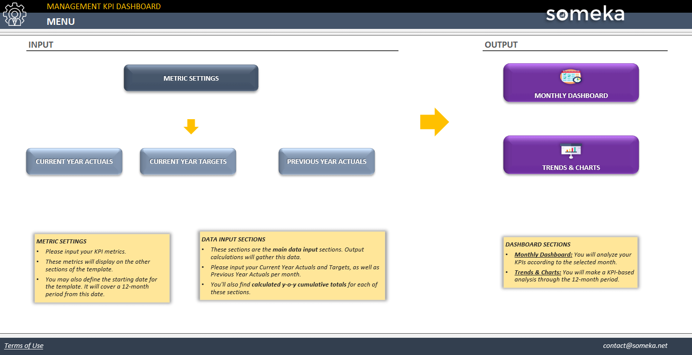
– This is the Navigation Menu of Management KPI Dashboard showing the buttons with different sizes –
Colors and the meanings of colors:
We will delve deeper into color palettes in the fourth section, but even here, the color of a button you use has a meaning.
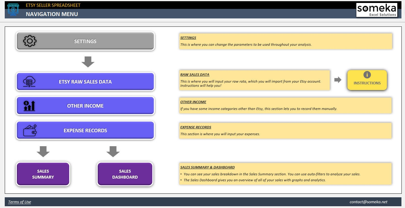
– The navigation menu of Etsy Seller Spreadsheet Template with different color of buttons –
For example, if all colors are blue, a red button indicates something different – perhaps danger, a need for update, or a warning. Grey, for instance, is often used for navigation buttons that lead to settings sections. They are not too attention-grabbing but are essential for initial setup.
Order and Placement of the Buttons:
The placement of buttons or assets is important.
This flow of buttons is significant. If not placed correctly, users won’t understand the intended workflow, especially what to do first or where to input data. This is particularly crucial in complex files. For example, if there’s a sequence like first going to settings, then entering data in the data input section, and finally analyzing some aspects in charts as output, your navigation menu should reflect this order. However, this isn’t always so linear.
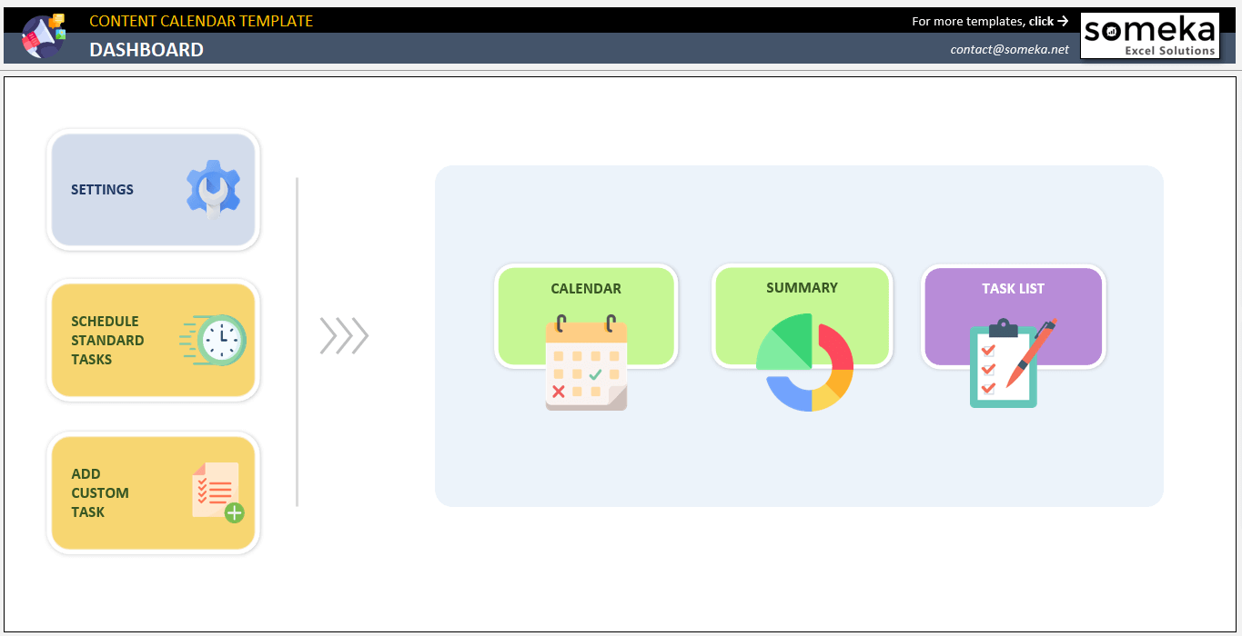
– A unique navigation menu from Content Calendar Excel Template –
For instance, in some cases, there’s a large central section, and after completing tasks in smaller sections, we need to return to the main section to process changes. In such cases, we can’t place these in a linear, sequential layout. Instead, we might place the main menu in the center with a larger size and arrange the supporting sections around it. Techniques like these help us better convey the flow, or the sequence within the file.
Icons:
The use of icons is significant in Excel Dashboard design. Especially when there are many menu buttons or clickable items, small icons can be added next to the buttons for easy visual recognition. This helps users associate visually and understand where they need to go more easily. You can use a data icon to add more visuals to your dashboards.
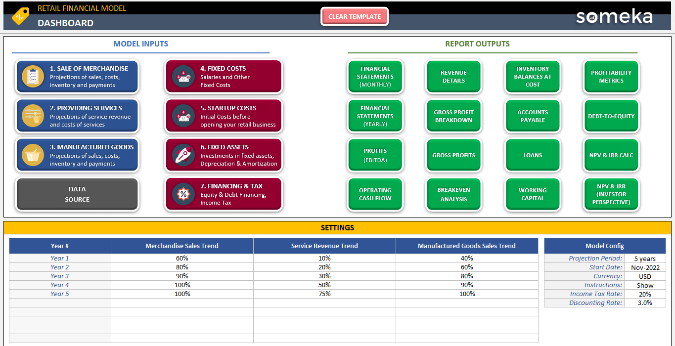
– Check the icons on the buttons in this image from Retail Business Financial Model by Someka –
For example, in our financial models, there are many sections, so just using text for each section isn’t sufficient. We also need to add small icons.
Fonts:
The use of fonts is important. You might have heard that Steve Jobs was very particular about fonts when founding Apple. He realized that when fonts are beautiful, they greatly enhance the overall appearance. Hence, Apple started using more aesthetically pleasing fonts in their computers.
Honestly, if you can’t immediately understand why one dashboard or UI looks better than another, but one just seems more appealing, it’s likely due to the fonts.
If you can’t understand why one of the two images is more beautiful than the other, the reason is probably having a better font.
Shape Effects:
Here, we are talking about the visual effects of an asset or shape in Excel. For instance, what do we mean by visual effects? Like Shadow. In Excel, this gives your buttons a sense of depth. Different effects used for shapes can be found under their menu.
> Go to Shape Format > Shape Effects and play with Preset, Shadow, Reflection ant other setting to create beautiful shapes:
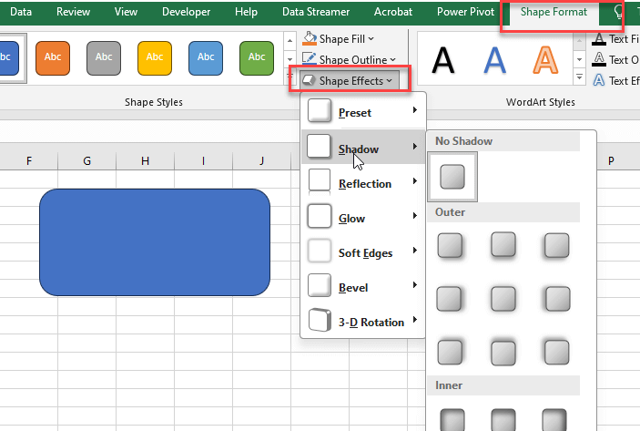
Here’s how you can change a shape:
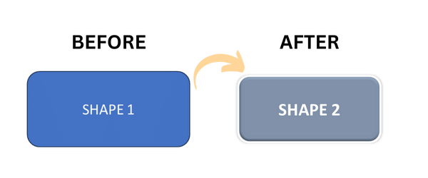
However, remember that the current global trend is more towards flat design. Images that are too puffed up, with heavy shadows or a 3D look, are no longer considered appealing and can even seem old-fashioned. Also, you can resize your images with an image size changer to protect the aspect ratio.

So, be cautious with the use of shadow or dimensions. Stick to flat design unless you specifically need to highlight something, in which case you can use different preset features. But if you use it for many menu items or assets, it can result in an unattractive appearance.
Background:
The background is essentially about colors in terms of Excel Dashboard design. A solid background color is soothing to the eye. Therefore, we generally make the areas for input a different color, like white, and use a light grey for the rest to avoid drawing attention and straining the eyes. This way, the input areas are more visibly distinct, allowing the user to focus.
When we talk about Additional Elements, think about what extra things you can add to your dashboard. This can intertwine with the sub-item of using infographics, charts, and images. Sometimes, a dashboard or navigation menu might seem empty, but adding a particular visual can beautifully convey the flow or the overall structure of the file. Such elements can be used in these cases.
Thus, we have completed the Architecture section in general. Now we will continue with data input.
2. Data Input in Excel Dashboard Design
We can divide this Data Input section into two subsections:
- Quick Warnings
- Quick Tips
Let’s start.
2.1. Quick Warnings
Data input is already a very boring process, and it is also very vulnerable to errors in creating Excel workbooks. So we should prevent Data Discrepancy here.
Here we will give you 5 quick warnings on data input in Excel files:
-
Do Not Demand More Than Needed
Avoid burdening yourself with needless data entry requirements. It’s better to have less. Avoid making the mistake of assuming that more data entry equals better results. In fact, it may make the data entered of lower quality.
-
Pursue Habits
Continue entering data into the file using the same procedure every time. Anticipate and permit the same method in other sections if data is entered in a particular way in one section. Consistency in the visual interface is also important. Users won’t have to repeat the procedure every time in this way.
-
Date Formats Are Always A Nightmare In Excel
In Excel, date formats are always a nightmare. You may have noticed the plethora of memes regarding this on the internet. Excel date formatting calls for close attention. While date pickers are used by some, maintaining uniformity can help prevent misunderstandings.

For prevention of incorrect formatting, you can also employ methods found in the Data Validation menu.
-
-
Decimals Are Mostly Useless
-
Yes, guys, decimals are mostly useless.
In summary, don’t go overboard when using decimals in table formatting unless absolutely necessary. Decimals are frequently unimportant for big numbers, particularly those pertaining to revenue or turnover.
So, decimals can be ignored because there is no real-world difference between $100 million and $100 million plus 50 cents. As a matter of fact, decimals should be used primarily for small numbers where they are crucial, such as exchange rates.

-
Shrink to fit is a lifesaver
There are situations when you can’t tell how long a user will type. ‘Shrink to fit’ formatting for your cells will prevent you from creating columns that are too wide. In this manner, when a user enters a long text message, the font will automatically resize to fit inside the cell and stay visible.
2.2. Quick Tips in Data Input
Now let us share some quick tips to do in data input sections:
-
Dropdowns
In Data Input sections, encouraging the user to use Dropdowns as much as possible is greatly advantageous for data cleanliness. This is especially true if the data being entered is predetermined in a common area, like a Settings section. You can see this in many of our templates. Otherwise, consider, for instance, a table where user names are entered.
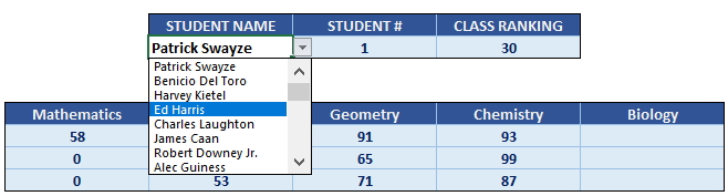
If each user has to manually enter their name every time, there might be variations like extra spaces, typos, or inconsistent use of surnames or initials. Eventually, when you try to consolidate this data, these variations are perceived as different data entries, causing major issues in analyses like pivot tables.
-
Cell Formatting
By pressing Ctrl+1 simultaneously, you can access the cell formatting options. You can also right-click to enter cell formatting. For instance, the ‘shrink to fit’ feature I mentioned earlier can be found there. By applying different formatting to your cells, you can make data input cleaner and more visually appealing

-
IFERROR Function
To avoid errors like #DIV, #N/A, #NUM, or #REF from showing up in your file when entries are incorrect or missing, you can use the If Error Function. This allows you to control what is displayed in such cases.
For example, if a formula involves division and the divisor hasn’t been entered by the user yet, it will result in an error. Leaving the formula as is will make all unfilled rows in your table display an error, which looks untidy. Instead, using if error to show a dash or similar when there’s an error helps you understand it’s an expected issue.
Additionally, there’s another important aspect. When preparing your file, you anticipate where errors might occur and handle these with if error. However, if you still see errors like #DIV, #N/A, #NUM, or #REF, it alerts you as the developer. This might indicate overlooked or unforeseen issues, making the use of if error function significant for error detection.
-
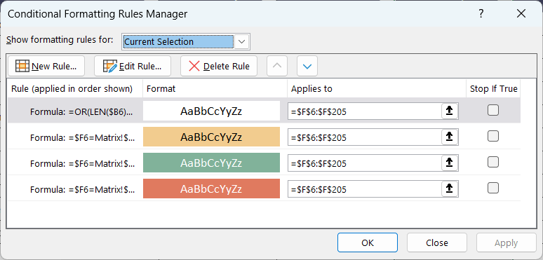
Conditional Formatting
This is a complex topic on its own and will be discussed separately. As a quick note, you can use conditional formatting to alert the user about duplicate data, incorrect data formats, or empty cells. This helps maintain clean data input and ensures error-free data entry by the user.
3. CHARTS
The charts are perhaps the most visually appealing and attention-grabbing part of a dashboard design in Excel.
In this section we’ll try to explain:
1. How do you make better looking charts? – A general guidance
2. Keywords to decide in what situation and which chart type you should use
3. Real-life examples – Which chart we would use here or how we would do data visualization
4. Quick Tips on chart formatting
3.1. How to Make Impressive Charts?
We’ll make list on Should Dos and Should Avoids in charts:
1. First of all, do not use these three-dimensional charts in your Excel files anymore! Do not use three-dimensional graphics.
2. Also, do not use borders unless necessary. Never use anything three-dimensional unless necessary.
3. Stay in flat colors and flat design as much as possible.
4. Don’t use shadows, don’t use embossing.
5. Choose the appropriate chart type for your data type. For example, if you are talking about a trend, you cannot use a pie chart for it. We will talk about this in detail a little later.
6. Don’t put too much data. The human eye can examine a certain number of elements.
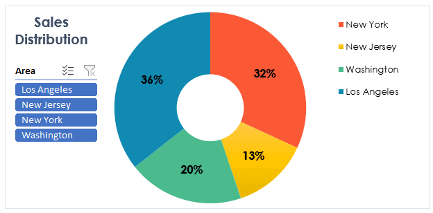
Below, we show you some appealing chart types, so you can take inspiration from them or from UI and dashboard examples on the internet.

– This is the Dashboard of Product Pricing Calculator with Sleek-Design Charts –
Another good example:
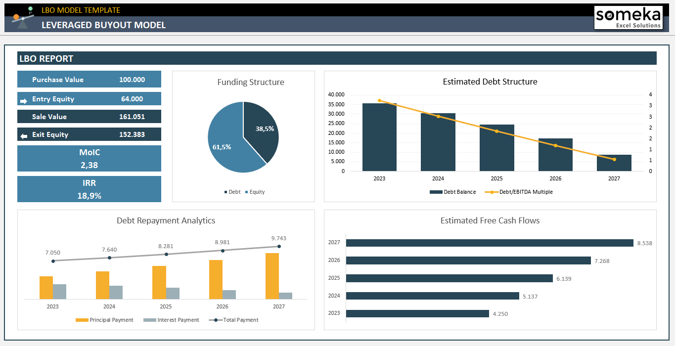
– These are the analysis charts from LBO Model Excel Template –
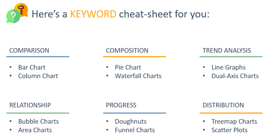
3.2. Keyword Cheat Sheet to choose best chart type
Below, we’ve listed what types of charts can be used for different data types. For example, if you’re doing a Comparison, you can use a Bar Chart or Column Chart. For Trend analysis, which might involve months on the X-axis, Line Graphs are suitable. If discussing a Mix or market share, Bar Charts are applicable. For Distribution, consider using Tree Maps or Scatter Plots. The right choice of chart according to your topic is essential to avoid confusing the viewer.
3.3. Real Life Examples
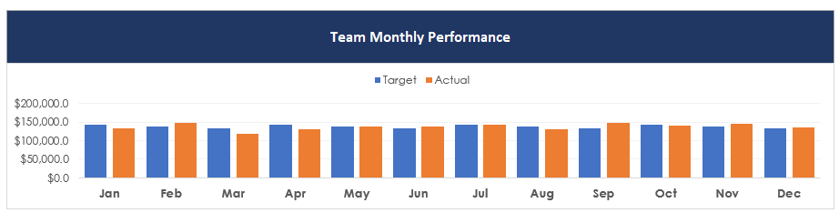
- Estimated monthly sales volume and actual monthly sales volume
- Revenue from four different branches of a pizza store
- Personal expense details
- Course completion percentage
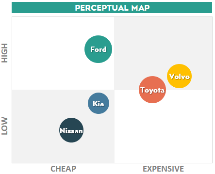
- Quality vs Price comparison of five car models with market shares
- Number of candidates in each recruitment stage

3.4. Chart Formatting Quick Tips
-
Remove the Gridlines while doing Chart Formatting
Gridlines are unnecessary in dashboards as they are not being used for Data Input or table-like structures. Instead, we display our summary tables by playing with filters. So, it’s advisable to remove the gridlines to clean up the visual space.
-
Remove the Chart Border
As mentioned earlier, avoid using borders. Borders can unnecessarily crowd your charts. Even simply removing existing borders from your charts can instantly make them look better. This is a simple yet effective trick to enhance the visual appeal of your charts.
-
Format Axis Labels Clearly
Clear labeling of your X and Y axes is crucial for understandable Data Visualizations. Often, it’s not clearly indicated what each axis represents, leading to confusion. Ensure that the axes clearly display what they are representing to make the data easily understandable.
-
Be Cautious with Using 3 Axes
In rare cases, you might think you need to use 3 axes to represent data across three different parameters. Historically, 3D charts were used for this purpose, but they are notoriously difficult to interpret. Analyzing and drawing conclusions from 3D, triple-axis charts can be challenging. So, try to avoid this and aim to represent your data effectively within two axes.
- Use Colors and Labels Strategically
It might be tempting to use a variety of colors for each bar in a bar chart, but this can be visually overwhelming and unattractive. As discussed in the Color Palette section, you can create attractive charts using colors thoughtfully. Avoid randomly choosing colors; try to use different shades of the same color if variety is needed.
- Top 5 Style Usually Works
There’s no need to reinvent the wheel. Certain methods and styles are already well-established and commonly used in the best dashboard designs. You can take inspiration from these.
Searching for the type of dashboard or chart you want to create on Google Images can yield many excellent Dashboard Excel examples. Remember, many designers around the world have already thought through and created these designs. Also, don’t underestimate the capability of Excel in creating beautiful charts.
Often, people think that Excel is incapable of producing visually appealing charts, but with some effort and a careful eye, you can replicate many great designs in Excel. Our dashboards are a testament to the modern and visually appealing charts and graphics that can be achieved in Excel.
4. DASHBOARD TIPS
Now we will focus on various important aspects of dashboards. Here we will again explain its four sub-breakdowns:
- Mockups
- Interactive Elements
- Color Schemas and Color Palettes
- Magic of Pivots
4.1. Mockups
Firstly, let’s discuss Mockups. Before designing a page or delving into a complex file, create a rough mockup of your dashboard or file using shapes and buttons, no matter how rudimentary it may look. This is also known as a Wireframe
While there are specialized tools for this, you can even use PowerPoint or simply Excel with non-functional shapes. These mockups, which are initially devoid of any calculations, provide a basic visual structure that will greatly simplify your work later.
4.2. Interactive Elements
Consider what elements can be interactive in your dashboard or in the data input or settings sections. We have provided some information below for your reference.
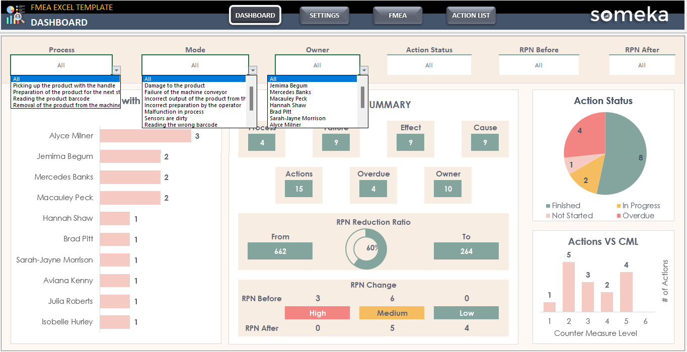
– This is the Dashboard of FMEA Excel Template with analysis filters above –
For instance, filters, slicers, and drop-down menus can make your dashboard more interactive, allowing users to not just view data but also manipulate it. A small tip here: always include an ‘all’ option in your drop-downs to allow for a comprehensive view.
4.3 Color Schemes
Colors play a crucial role. The most important advice here is not to select colors randomly.
Do not try to choose colors according to your wishes.
If you try to pick colors on your own, you might end up with an unattractive and jarring combination. Instead, use pre-selected color palettes. There are many websites that offer such palettes, and links to some are provided below:
Remember, color theory involves complementary and contrasting colors, and it’s detailed work. You don’t need to be an expert; just choose a nice palette from these sites and apply it consistently throughout your file for coherence and visual appeal.
4.4. Magic of Pivots
Pivots are incredibly useful. With static charts, any change requires substantial modification to the chart’s structure. Pivots, however, are more dynamic. You can easily change their structure, rows, columns, and values.
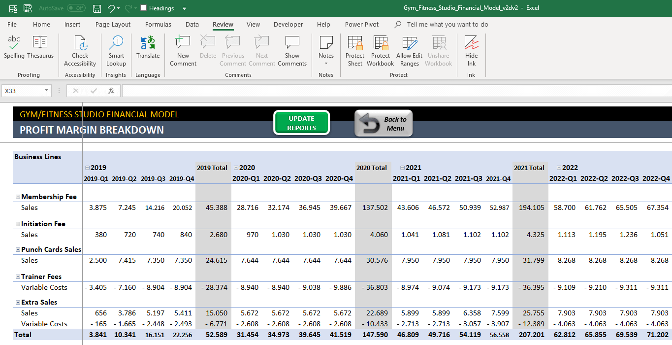
– A complex profit margin breakdown pivot table from Gym Business Financial Model by Someka –
They also allow for complex calculations using Calculated Fields. By refreshing pivots, you can keep your data up-to-date.
5. KEY TAKEAWAYS
Do you see how to design impressive Excel Dashboards like Someka? Here we have explained most of our secrets. Key points are:
- Make a mockup
- Plan the workflow
- Be careful about data formats
- Ease the data input process
- Get inspired from the best design standards
If you have any comments about this or anything you would like to add, we would be pleased if you contact us at any time. I hope it was useful.
Recommended Readings:
Complete List of Things You Can Do With Excel
How to use Google Sheets as a Database? Guidance, Examples, and FAQs
How to Calculate Break-Even Analysis in Excel? Formulas & Charts in Excel!
Related Posts