Google Sheets Dashboards: With Expert Pro-Tips
Google Sheets Dashboards are vital tools for data analysis and visualization. In this blog post, we will explore the concept of a Google Sheets Dashboard, offering step by step instructions for creating one. Share best practices and dynamic Google Sheets files for various needs.
Thus, this blog will help business professionals, project managers, and data experts to create sleek Google Sheets dashboards. Additionally, we will cover related topics such as control panels, indicator panels,, Google Sheets trackers, analytics, reporting in Google Sheets, Google Docs, and Google Visualization. You can find expert tipsto understand how to create Google Sheets dashboard and their actions.
Table of Contents
1. What is a Google Sheets Dashboard?
2. How to Create a Dashboard in Google Sheets?
3. Best Practices: How to Create a Quality Dashboard?
4. Examples: Google Sheets Dashboard Templates
5. Conclusion
6. FAQs
1. What is a Google Sheets Dashboard?
A Google Sheets Dashboard for business is a powerful tool that enables users to transform data stored in Google Sheets into visual attractive representations. Thus, by consolidating and analyzing data from various sources, these dashboards serve as hubs of information. They offer comprehensive and organized overviews of key metrics, empowering users to make well informed decisions and derive valuable insights. So, you can easily explore trends, patterns, and insights with these data panels.

2. How to Create a Dashboard in Google Sheets?
Creating a Google Sheets Dashboard is a systematic and straightforward process that touches several key steps:
Step 1: Import or Collect Data
Firstly, to begin your Google Sheets Dashboard, begin by importing or collecting the necessary data into your Google Sheets document. Secondly, this could involve sourcing data from spreadsheets, CSV files, or external sources, depending on your specific needs. Lastly, by collecting the data in one central location, you make the foundation for creating a general and insightful dashboard.
Step 2: Define Your Key Metrics
Next, it is crucial to identify the key metrics and data points that you want to track and display in your dashboard. Thus, to take the time to carefully consider which metrics align with your specific goals. By focusing on these necessary indicators, you ensure that your dashboard provides meaningful insights and supports informed decision making. Lastly, choose metrics that drive success by being relevant, actionable, and tied to your goals, making your dashboard a powerful monitoring tool.
Step 3: Parse Your Data
To effective way of parse data in Google Sheets and enhance data analysis, follow these step by step instructions:
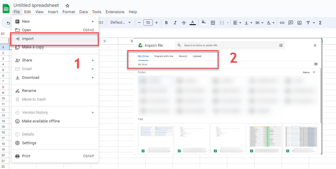
1. If the data is not already in your Google Sheets document, copy and paste it into a new or existing sheet.
2. Locate the top menu and click on “Data“.
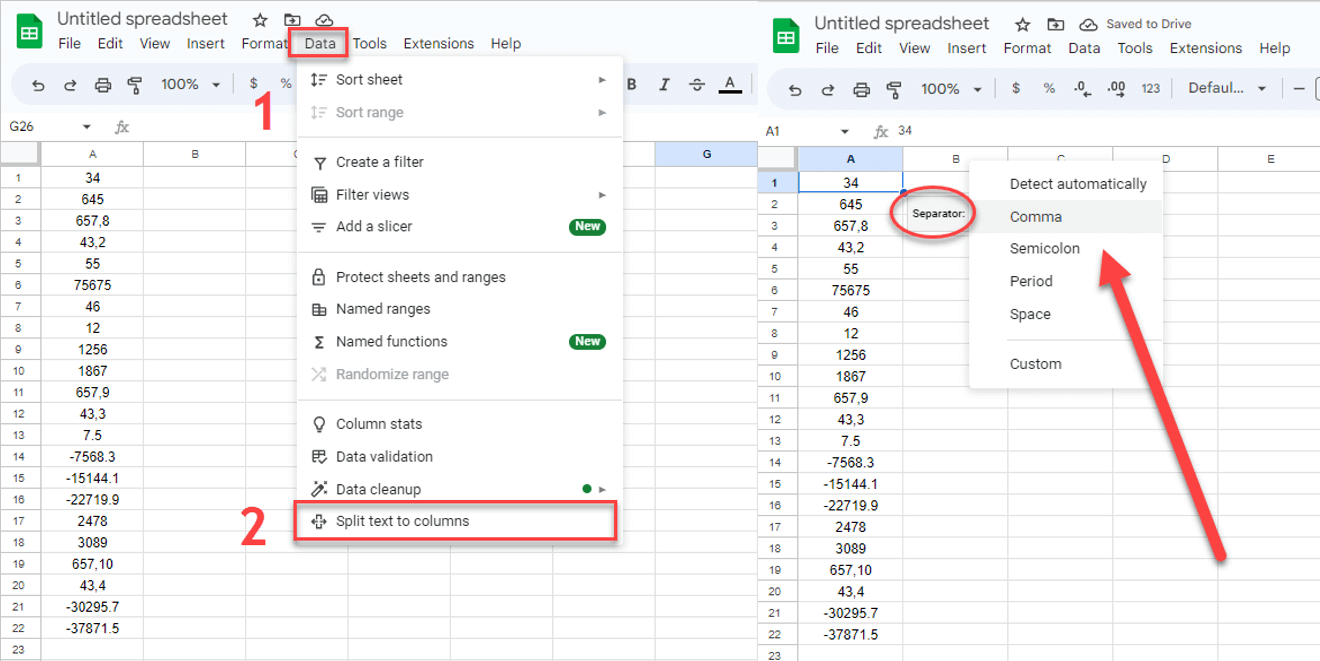
3. From the drop-down menu, select “Split text to columns“.
4. Next to the “Separator” option, click the dropdown menu to specify the character that Google Sheets should use to split the data.
5. If you want Google Sheets to automatically detect the appropriate column separation, choose “Detect automatically” from the menu next to “Separator“.
6. Review the results to ensure that the data has been parsed correct way into separate columns.
By using these steps, you can efficiently split and organize your data into separate columns for further analysis. Additionally, to further optimize data handling, leverage functions and formulas within Google Sheets. For more detailed instructions, guidance, and formulas about “How do I parse data in Google Sheets?” . You can visit resources such as the “Parse data in Google Sheets” guide available at Someka, which provides general insights and helpful instructions for working with data in Google Sheets.
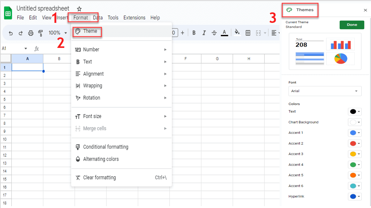
Step 4: Visualize Data
To present your data effectively in a Google Sheets Dashboard, it is important to utilize various chart types and visualization techniques. Different chart types, such as line graphs, bar charts, or pie charts, can convey data in a visual engaging manner, facilitating easy comprehension and comparison. Then, choose the chart types that best represent your data.
In addition to charts, consider incorporating informative info boxes within your dashboard. Info boxes can be used to highlight essential metrics, key performance indicators (KPIs), or important data points. By strategic way of placing info boxes throughout your dashboard, you can draw attention to critical information and provide concise summaries that complement the visual representation of your data.
By combining well chosen chart types and the strategic use of info boxes, you can create a Google Sheets Dashboard that presents your data in a compelling and informative way, enabling users to quickly grasp key insights and make informed decisions based on the information provided.
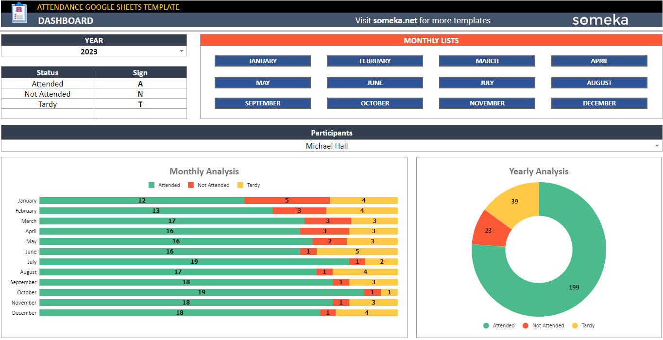
– This dashboard is from Attendance Google Sheets Template by Someka –
Step 5: Design Your Dashboard
Firstly, when creating a dashboard, keep the most critical information in mind and use consistent formatting, design components, and language. Also, to tell an interesting story with the data, select an attractive color palette. Lastly, examine its print readiness to ensure clarity and visual integrity when printed or shared.
Step 6: Present Your Dashboard
Google Sheets offers several flexible methods to effective way to distribute your dashboard. Besides, these options include publishing it to the web, downloading it as a PDF, and integrating it into presentations using tools like PowerPoint or Google Slides. These options provide flexibility, allowing you to choose the most suitable method for sharing and presenting your dashboard based on your specific needs and audience choices.
3. Best Practices: How to Create a Quality Dashboard?
To design a high quality dashboard, best practices such as simplicity, consistency, storytelling, interactive elements, data visualization, color palette, and print readiness must be followed. Let’s go over them one by one.
–Keep it Simple: Avoid clutter and complexity by focusing on the most important information. Present data in a clear and concise manner, ensuring that users can quickly grasp key insights without confusion.
-Be Consistent: Use nice formatting, design elements, and language throughout your file. This helps create a professional look, making it easier for users to navigate and understand the information presented.
-Try to Tell a Story: Arrange the data in a logical order that tells a narrative or conveys a specific message. Guide users through the data by organizing it in a meaningful way, allowing them to draw conclusions and make informed decisions.
-Keep it Dynamic: Make your dashboard interactive and dynamic by incorporating features such as filters, slicers, or dropdown menus. So, this enables users to explore the data from different angles, customize views, and interact based on their specific needs.
-Use a Color Palette: Utilize a deliberate color palette that enhances data visualization and supports the overall design. Thus, to choose colors that are visual attractive, convey meaning, and help highlight important data points or trends.
-Ensure Print-Readiness: Consider the possibility that your dashboard may need to be printed or shared in a physical format. Design the dashboard with print readiness in mind, ensuring that it fits well on standard paper sizes, maintains clarity when printed, and retains its visual integrity.
By following these best practices, you can create a quality dashboard that effective way communicates data, engages users, and provides valuable results in a visual attractive and user friendly manner.

4. Examples: Google Sheets Dashboard Templates
In the world of Google Sheets Dashboards, numerous third party creators offer a wide range of specialized templates tailored to diverse needs like Someka.net or Vertex42. Leveraging these tools brings several advantages, making them a choice. Google Sheets Dashboard templates empower users to create impactful dashboards that meet specific needs for data analysis and visualization.
Moreover, they save time by creating a ready to use framework that can be quickly customized to specific data and metrics, and feature professional way designed layouts, visuals, and formatting. Additionally, these templates embrace creative elements and advanced actions like dropdown menus, filters, and dynamic charts, enhancing user engagement. Hence, a dashboard presentation can be so essential.
Therefore, these tools and techniques equip professionals, project managers, and data experts to create effective dashboards using Google Sheets.
4.1. Google Sheets HR Dashboards
Google Sheets templates can be useful in the area of human resources. This action ensures that similar information can be used with the control panel and the indicator panel. Thus, Someka Employee Training Tracker Google Sheets Template shown below is an attractive example.
![]()
– Dashboard of Employee Training Tracker by Someka –
You can also create dashboards for your hiring efforts:
![]()
– This panel is from online Recruitment Tracker tool by Someka –
The PTO Tracker Google Sheets template simplifies tracking your paid time off (PTO) by effective managing your vacation and sick leave days. So, you will always be aware of your PTO and will never miss any key holidays if you use this useful tool.
![]()
– Employee Dashboard on the PTO Tracker Google Sheets Template by Someka –
4.2. Google Sheets Task Management Dashboards
Online spreadsheets are also quite useful for task management.
Hence, Kanban boards are a good example for project management. You can both create Kanban cards and dashboards on Google Sheets:

– Dashboard of Kanban Board Google Sheets Template by Someka –
A Gantt Chart is a project management tool used to plan and schedule projects of all sizes. Besides, it visually represents tasks, deadlines, and organizes them into a work structure. Evidently, you can create WBS Gantt charts in seconds with ready tools.
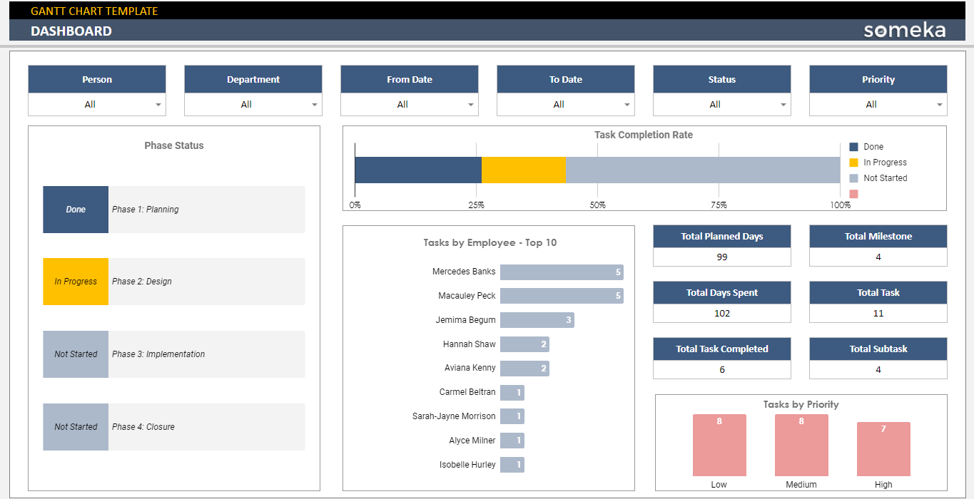
– Dashboard of Gantt Chart Google Sheets Template in Someka portfolio –
4.3. Google Sheets KPI Dashboards
Thirldy, we can declare that one of the active areas that Google Sheets files and their dashboards use is, of course, KPI metrics. As a matter of fact, impressive and effective ones can be created for all of them.
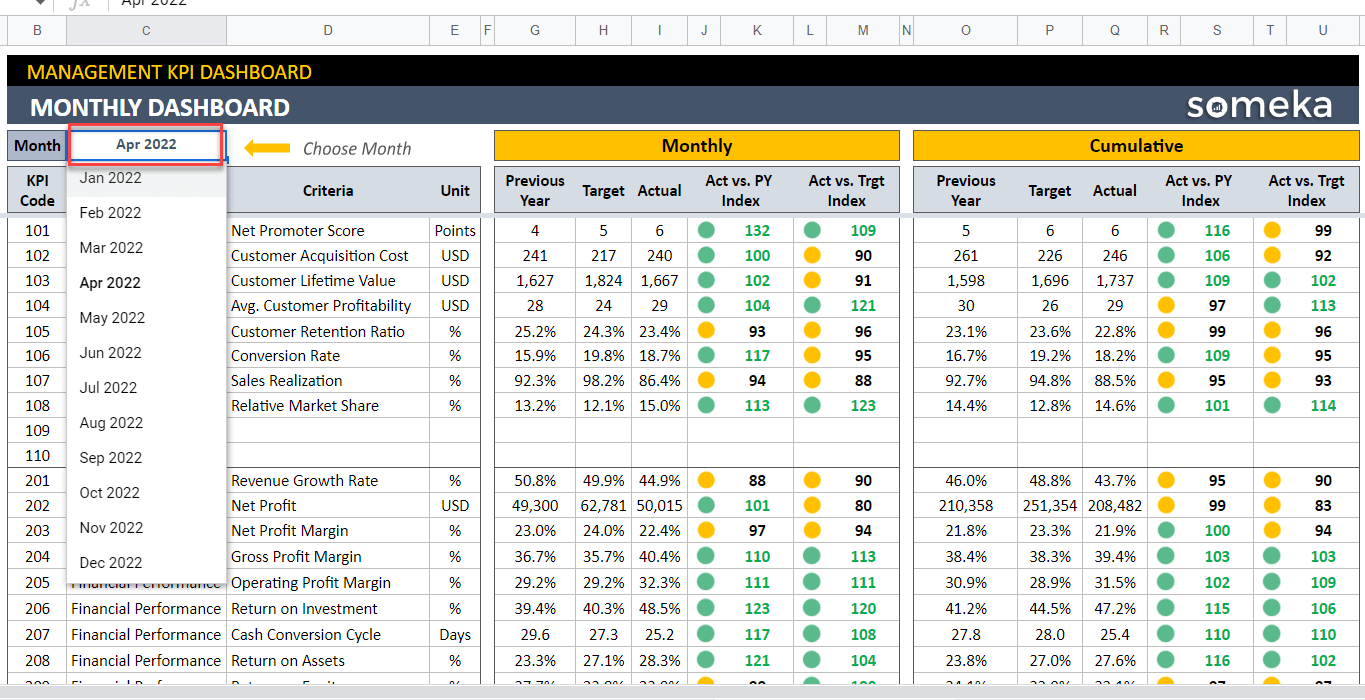
– Monthly Dashboard of Management KPI Dashboard Google Sheets Template by Someka –
5. Conclusion
Dynamic dashboards in Google Sheets are necessary tools. This article provides step by step instructions for creating one, discusses best practices for creating high quality dashboards, and showcases examples of dynamic templates. Consequently, it covers topics such as control panels, indicator panels, instrument boards, Google Sheets trackers, analytics, dashboard reports, reporting in Google Sheets, Google Docs, and Google Visualization. Therefore, to using third party Google Sheets Dashboards offers time saving benefits, professional design, sleek creation processes, dynamic position, and improved data visualization.
Furthermore, with the knowledge, techniques, and resources shared, create impactful Google Sheets dashboards, enhancing data analysis and informed decision making. Thus, Someka also creates free Google Sheets dashboards and free Google Sheets dashboards as a third party creator.
6. FAQs
1. Where can I download Google Sheets Dashboard Templates?
You can download Google Sheets dashboard templates from two main sources. Firstly, you can access them from Google’s template gallery, which offers a variety of options to choose from. Additionally, for a more professional solution, you can explore third party creators such as Someka.net, which provide a wide range of options.
2. Can I create a dashboard in Google Sheets?
Absolutely! Google Sheets provides some actions that allow you to create dynamic and active ways. Lastly, to switch your data into a general dashboard with built-in analysis, visualization, and charting tools, enabling valuable results and informed decision making.
Recommended Readings:
Related Posts