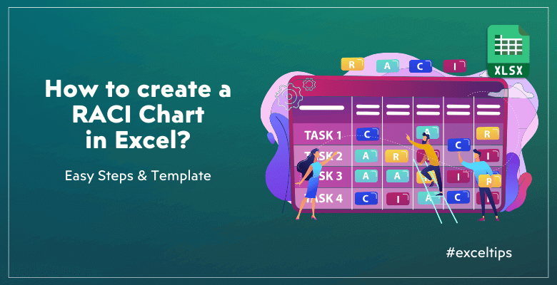
How to Create a RACI Chart in Excel? Steps, Examples & Templates
Do you want to build a responsibility matrix for your team in a project? In this article, we’ll explain how to create a RACI Chart in Excel with examples, templates and easy steps.
Table Of Content
1. What’s a RACI Chart?
2. Is there a RACI template in Excel?
3. How to create a RACI Chart in Excel?
4. What’s the best tool for creating a RACI?
5. Is RACI matrix outdated?
6. What are the downsides of RACI Charts?
7. What are the alternatives of RACI?
8. Conclusion
Effective and transparent project management makes use of a wide range of tools and methodologies. So, the RACI chart is one such tool.
1. What’s a RACI Chart?
A RACI chart is basically a matrix that specifies who is responsible for what in a project.
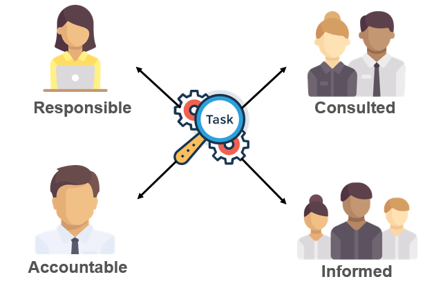
One easy way to make everyone’s duties and responsibilities clear in a project or process is with a RACI chart, which stands for Responsibility Assignment Matrix.
Also, what does the RACI stand for?
- Responsible: Who is doing the task
- Accountable: Who is making sure the task is done
- Consulted: Who provides input or expertise
- Informed: Who needs to be updated on progress and outcomes
In summary, a RACI chart lays out these responsibilities in a way that everyone can understand them, which helps avoid misunderstandings and unnecessary duplication of effort.
2. Is there a RACI template in Excel? How to create one?
Yes, sure!
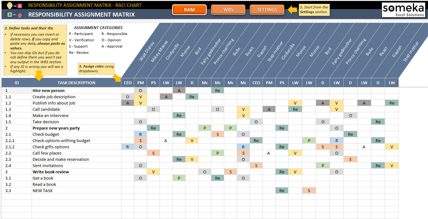
You can download Someka’s RACI Template in Excel and start building your RAM (Responsibility Assignment Matrix) immediately.
>> Download RACI Matrix Excel Template
So, you do not need to build your RACI format from scratch. You can download this file and start immediately to build your responsibility matrix:
- Instant download
- WBS (Work Breakdown Structure) Included
- Available in Excel and Google Sheets
- Editable and printable
3. How to create a RACI Chart in Excel?
But, if you’re still looking to build your own RACI chart, you ca follow the below steps.
So, here’s a step-by-step instruction list to create a RACI chart in Excel:
Step 1 – Define the roles in your project
Firstly, you’ll define the RACI roles on your project.
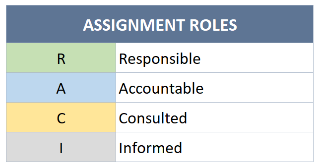
And if you also add abbreviations for each role, this will make your table easier to read.
Also, you can use this table to feed your dropdown menu.
Step 2 – List your tasks to create Excel RACI Chart
Next, you’ll list all the tasks or activities that need to be completed in your project.
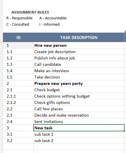
Please remember that these tasks should be comprehensive and cover all the work required to achieve the project’s objectives.
Step 3 – Add your employees
Then, you’ll make a list of everyone who will be doing what on your project.
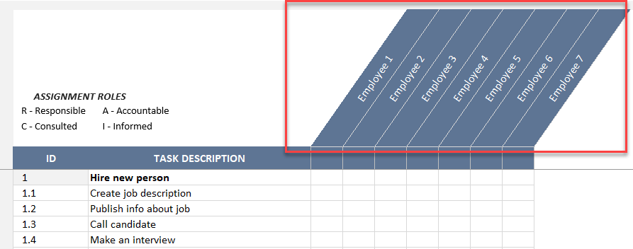
Also, people in these roles may include stakeholders, team members, team leaders, and project managers.
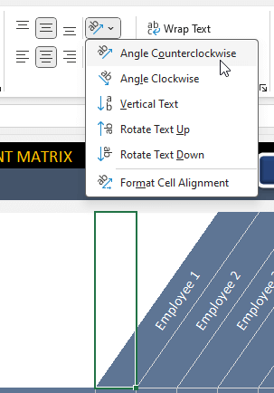
*PRO TIP: You can use a vertical or angle-wise vertical formatting for your employees to make your matrix cleaner.
To change the cell format as vertical text, you can use the text format as Angle Counterclockwise as shown below:
Now your basic format for the RACI matrix is ready.
Step 4 – Add dropdown menus to create a RACI chart in Excel
To make your RACI chart easy to use, you can add dropdown menus for each cell in the table.
We recommend using the abbreviations of the RACI options for Responsible, Accountable, Consulted, and Informed.
To add dropdown menu:
- First, select the cells in the matrix chart area
- Then, go to the Data tab and click on Data Validation
- In the Data Validation window, choose List from the Allow dropdown
- also, in the Source box select the list of abbreviations
- Lastly, click OK
In fact, this is an optional feature. But it will bring you data accuracy and visual clearity.

Step 5 – Add conditional formatting
Again optionally, you can add conditional formatting to visually differentiate between the RACI roles.
Here’s how to add it:
- Firstly, select the range of cells where you’ve added dropdown menus
- Go to the Home > Conditional Formatting > Use a formula to determine which cells to format
- Enter a formula based on the text in the cells such as A1=R
- Select a color or other formatting rule
- Duplicate this rule for all roles and change the formatting for each one

So, the above windows shows how to add conditional rule for your RACI Chart in Excel
Step 6 – Print and update
Finally, you can update your RACI chart throughout your project. Also, you can print your RACI matrix whenever you need.
Lastly, as tasks progress and roles potentially shift, regularly revisiting and updating your RACI chart ensures continued clarity and accountability.
4. What’s the best tool for creating a RACI?
Excel is one of the best tools to create RACI charts. First of all, the adaptability and popularity of Excel make it an ideal tool for any matrix formats.
Microsoft Project, Smartsheet, or another dedicated RACI software are a few alternatives that may also provide raci matrix formats or integrations for project management.
Also, you can improve your project management with built-in templates in Excel or Google Sheets:

>> Download RACI Matrix Excel Template
5. Is RACI matrix outdated?
No, not really.
Firstly, the project managers have relied on the RACI matrix for many years. Because, its simplicity and inflexibility in handling complicated projects have led some to claim that it is no longer relevant, even though it is still effective for many.
Although there are more interactive ways to delegate and monitor progress in modern project management tools and methodologies, the RACI chart is still useful due to its simplicity and clarity.

6. What are the downsides of RACI Charts?
However, there are still some drawbacks to using RACI charts, despite their usefulness:
- Over-simplification: The RACI charts might be insufficient for complicated projects.
- Ambiguity: Also, team members might assume different responsibilities in the absence of explicit instructions and explanations.
- Maintenance: Moreover, it takes effort to keep the RACI chart updated.
- Resistance: Lastly, the RACI chart may face pushback from teams that are used to different approaches.
So, these are the most common cons of RACI Charts.

7. What are the alternatives of RACI?
As RACI is a very common model to display responsibilities clearly, there are also some additional models to enhance RACI:
- RASCI: This is RACI + Support model, which adds a Support role for those who assist with tasks.
- DACI (Driver, Approver, Contributor, Informed): Another matrix format, which focuses more on decision-making roles.
- RAPID (Recommend, Agree, Perform, Input, Decide): Also, this matrix format emphasizes decision-making and execution.
- LRC (Linear Responsibility Chart): Also Similar to RACI, but includes more detailed roles and tasks.
8. Conclusion: How to create a RACI Chart in Excel?
In summary, RACI charts aims to display the breakdown of all responsibilities in a matrix format. And, this article summarizes how to create a RACI Chart in Excel with step-by-step guiding plus examples and templates.
Thus, the main idea is creating a grid with tasks in vertical axis, and the employees in the horizontal axis. Also, you can add the R-A-C-I abbreviations to select the role of each employee in the particular task. Lastly, you can enhance the readability of your chart with dropdown menus and conditional formatting.
Alternatively, you can download a ready-made RACI Chart Excel Template and start adding your tasks in a sleek design file.
Hope you enjoy our article!
Recommended Readings:
How to Make a Gantt Chart in Excel?
Best Monday Alternatives in 2024: Top Project Management and CRM Tools
Related Posts