How to Make A Histogram in Google Sheets? Step-by-Step Guide
Histograms are great tools to comment data. But, most people still do not know how to make a histogram in Google Sheets. Here is the complete guide to make a histogram charts in Google spreadsheets.
Table of Content
1. What’s a Google Sheets Histogram?
2. How does a histogram work in Google Sheets?
3. How to make a histogram in Google Sheets?
4. Ready-to-Use Templates
5. FAQs
1. What’s a Google Sheets Histogram?
Data analysis on histogram charts is widely popular amongst any business. Showing data such as sales volume in a specific time range using histogram charts is easily understandable even for untrained eyes. That is the reason why Histogram charts are a popular data visualization tool in business. But what is a histogram chart and what is it used for? Histogram charts are mostly used for statistical analyses and distribution analysis.
Histogram charts are created with multiple vertical bars that show volume and they are placed on a horizontal axis that represents a separate dataset, mostly divided into intervals. For instance, vertical bars or boxes represent the sales volume of a product or service and horizontal line represents a monthly, yearly timeline.

We will cover how to create professional-looking Histogram graphics in Google Sheets, how to add data, customize the chart to make it more standout, and generate a histogram chart using a Google Sheets template.
2. How does a histogram work in Google Sheets?
You can create a histogram in Google Sheets by using its own chart maker. Even though the options under the column category resemble the histogram chart, Google offers a specific Histogram Chart option under the “other” category. The histogram graph offered by Google is dynamic meaning it will continuously update the chart according to the data you input. So once you create the Histogram Chart, input your data, and customize it according to your needs you can use it to present only by changing the variable data. In other words, once you create the chart it is plug and play, but how do you actually create one in Google Sheets from scratch?
3. How to make a histogram in Google Sheets?
Here is how to make a histogram in Google Sheets guide;
Step 1 – Sign-in to Google Sheets
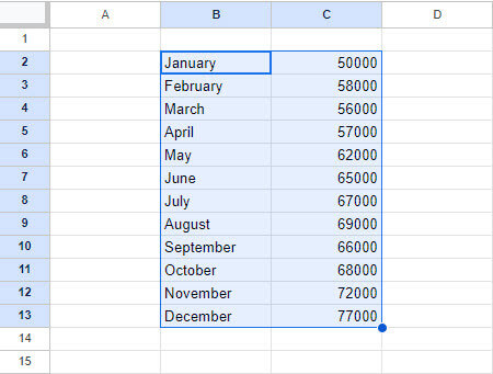
First, enter your data into Google Sheets. For instance, you can enter sales in units for each month.
Step 2 – Choose the Dataset
Then, choose all the cells with your data set. The chart will be created according to the data on the selected cells.
Step 3 – Creating Chart
Then, click on Insert and choose Chart. Chart Editor will appear on the right side of the sheet.
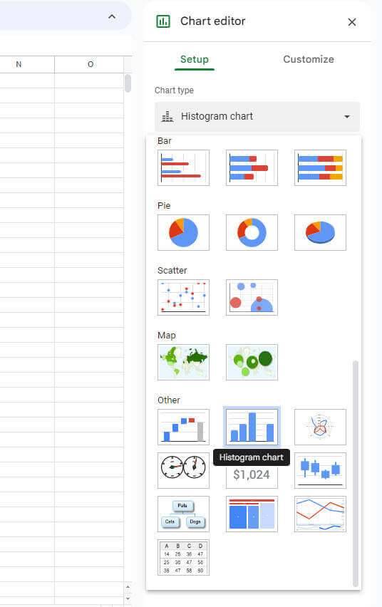
Step 4 – Configuration
Open the Chart Type dropdown box, this will give you multiple chart options. Scroll down to the “Other” category and choose Histogram Chart. Histogram Chart will appear on the Sheets.
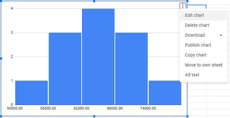
You can edit the chart by clicking the dots button located in the upper right corner of the chart then click on edit.
Step 5 – Customization
The chart editor will pop up, under “Customize” you can edit the chart’s properties such as; chart style, chart & axis titles, series, legend, horizontal axis, vertical axis, and gridline and ticks.
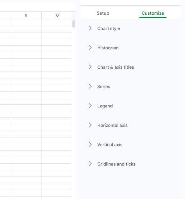
- Chart Style: Click on the Chart style to change the background color, font, and border of the histogram chart.
- Histogram: Under the Histogram chart, you can adjust the group size and outlier percentage of the data.
- Chart & Axis: Optionally you can give your chart a name by opening the Chart & Axis title category.
- Series: If you like to change the color of the chart, you can do that under the series category. You can change the color of the bars, lines and adjust the color opacity to your liking.
- Legend: You can add a legend to your chart to make it more understandable at first glance from the Legend category.
- Horizontal Axis / Vertical Axis: Also, you can customize the written information on the horizontal and vertical axis under the Horizontal axis and vertical axis.
- Gridlines & Ticks: And finally, you can choose to show or hide gridlines under Gridlines and Ticks.
Once you’re done customizing your histogram chart, it will be ready to present.
Making histogram charts in Excel is also a similar process:
4. Ready-to-Use Templates
Now, you know how to make a histogram chart in Google Sheets. But you may want to save your time or create more professional charts. Then, you can use third-party templates to create your histogram diagrams.
Firstly, it’s actually pretty straightforward to create a histogram chart from scratch, however, if one wants a better, more professional-looking Histogram chart with less effort you can always use a Histogram template that generates the chart automatically once you enter the data you want to analyze. Then, going with this route will not only save you time but will also provide a better result.
lastly, we’d recommend Someka’s Histogram Template for Google Sheets.
Creating a Histogram chart with the template is easier than you think! Here is how that works:
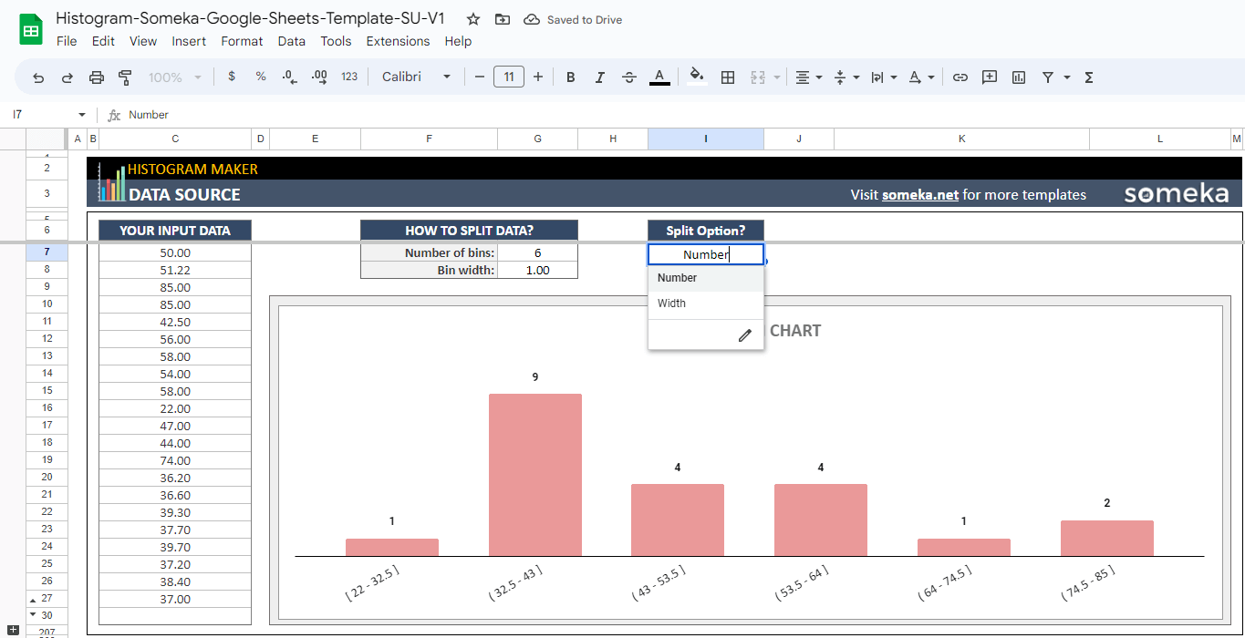
– This diagram is created on Google Sheets Histogram Maker by Someka –
- Firstly, open the template and click on file then choose copy file. This will allow you to use the template with all of its features.
- Secondly, there are 2 sections of the template; the data source where you can enter your data and the chart section
- Then, input your data into the data source and the histogram chart will be ready to present.
- Moreover, menu section also includes customization options. You can change the colors of the histogram chart
- Lastly, your histogram chart will be ready for your presentations and meetings in a short amount of time.
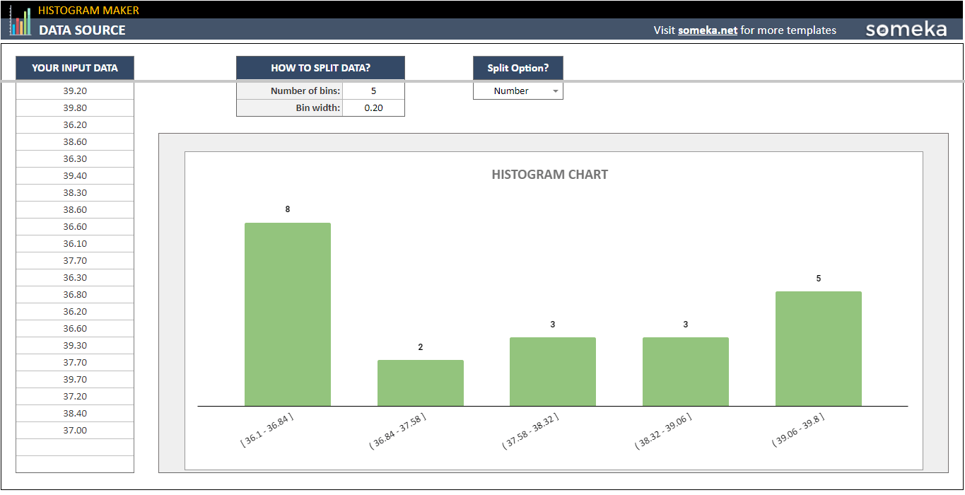
– This is another chart from Google Sheets Histogram Maker by Someka –
5.FAQs
1. How to make a histogram in Google Sheets with two sets of data?
Sor forth, making a histogram in Google Sheets with two data sets is named a double histogram. The double histogram is made of 2 separate column which shows different data sets. As an example, Column A shows the first dataset while Column B shows another dataset.
To demostrate, select the first set of data click the insert menu and choose the chart. In the chart type pop-up choose double histogram. Then add the second dataset by clicking add data button which is on the chart.
2. How to read a histogram?
Firstly, you should understand the dataset that you enter. Then start looking at specific columns and try to understand what they show you. Then, it will make sense after some time. Each column shows a specific data part from the dataset.
3. How to make a relative frequency histogram in google sheets?
Furthermore, when you create a histogram chart, click on the chart and click the more button. Then find the chart options section. Then, you can choose relative frequency here. Click the checkbox and close the panel. A relative frequency histogram will appear on your Google Sheets file.
4. What is the difference between a histogram and a bar graph in google sheets
Moreover, histogram charts’ data should be continuous but bar graphs can be separate. The bar graph compares the different datasets but the histogram shows the distribution of specific data.
Lastly, that all from the “how to make a histogram in Google Sheets?” blog. Thank you for reading.
Recommended Readings:
Related Posts