
Why do we need KPIs? – Best Practices for KPI Dashboards
Today we’ll try to understand why we create KPI Dashboards and will try to explore the best practices of KPI Dashboards.
Table Of Content
1. What’s KPI?
2. Why do we need KPIs?
3. KPI Best Practices
4. Ready KPI Dashboard Templates
Here we go!
1. What’s KPI?
KPI is the synonym for Key Performance Indicator. So those are the key metrics actually. Why do we create such a table? Why do we want to follow this? Let’s explain it.
As the name suggests, key performance indicators (KPIs) are numbers that show how well a business, department, or person is meeting important goals. In business analytics, KPIs are used to measure how well an organization is meeting its goals. They are different for each company and industry, based on their priorities or performance standards.

KPIs work best when they give you insights that you can use right away. For the KPI best practices, your metrics need to be clear, measurable, relevant to the business goals, and well-communicated across the whole organization. For instance, if a company wants to grow its market share, key performance indicators (KPIs) that could help it do that could be the rate at which it gets new customers, the rate at which it keeps old customers, and the percentage change in market share.
In conclusion, KPIs are important for businesses because they give them a way to measure how well they’re meeting their key goals, which helps them make smart decisions and plan strategically. When monitored regularly and acted upon, the right set of KPIs can make a big difference in an organization’s growth and success.
2. Why do we need KPIs?
Do we really need KPIs? Why do companies track KPIs and build KPI Dashboards?
Let’s discuss that!
For instance, you might be a sales manager, run a hospital, or own a chain of stores. Especially if you’re a high-level executive, there are many metrics you want to track. From checking if employees are clocking in and out on time to financial profitability, good sales numbers, and many other different aspects.
Let’s take a simple example for clarity. Suppose you own a grocery store. Even a small store has numerous aspects to manage. People do track these KPIs in their heads, but they are often not aware of it.
It’s one of the interesting points. Because when you tell people about a KPI dashboard and how it’s done, they sometimes react with confusion, wondering where it all came from. Especially when preparing KPI dashboards, these data are often handled by new employees, specialists, or young professionals in their twenties who find these metrics meaningless.
In actuality, everyone keeps track of a wide range of factors—not just for work, but also for family and personal life.
Some Basic Questions:
Assume that you just manage a tiny corner store. Even in this case you have a lot of things to keep an eye on:
- Do the products arrive to you on time?
- Did the sales representatives of the companies that sent you those products stop by?
- Are the products you sell profitable?
- Are you making money?
- How many phone calls did you receive?
- Do customers call you and ask questions?
Do you know the answers of these questions? What are the KPI best practices.
Another example for HR management. Let’s say an apprentice or an employee works for you:
- Does that person come to work on time?
- What should his salary be?
- Should we adjust his salary based on the salaries of apprentices working in other markets?
Notice how, in a way, you have departments like HR, finance, purchasing, customer relations, and CRM, even though they are not formally established in a small shop. All these departments or functions are separately active in your mind. This is exactly the point.
Why are KPIs important?
Larger companies have executives who want to look at these metrics and results collectively because they can’t be as hands-on as a person managing their own shop.
As a senior executive overseeing a team of 500 employees, you can’t be aware of everything going on there, unlike the shop owner who handles everything by themselves. You should thus view some summary metrics.
This is the exact place where the idea of Key Performance Indicators and KPI management first emerged. The process by which you identify and monitor these metrics is unique to your business and compliant with internationally recognized norms.
Call Center Example and KPI Best Practices
Depending on the sector, division, or topic, several metrics are critical to monitor. There are particular metrics to keep an eye on, for instance, if you’re in charge of a call center with 150 employees spread out across the nation.
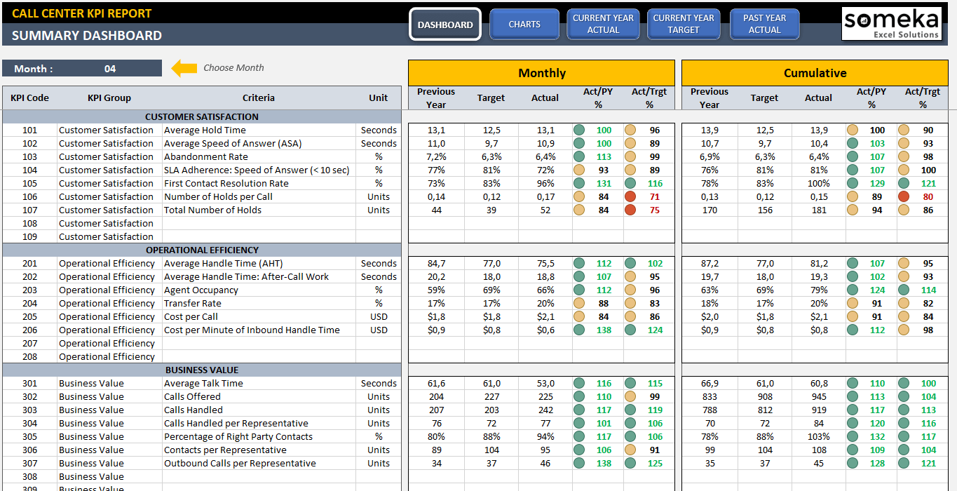
– This is the main analysis section of Call Center KPI Dashboard by Someka –
You’re probably missing out if you’re not looking at the metrics that many top-tier call center management teams take into account. Beyond these guidelines, there are additional metrics that you would personally like to keep an eye on. It goes beyond merely reasoning: “Since everyone is staring at this, I should too.”
The strategy focuses more on what a manager like you would naturally want to see. To get a sense of how things are going, you may want to know how long it usually takes to answer a call. Alternatively, how long has it been since a call was not returned, and how frequently does this occur? I’m not an expert in call centers, but if I were in charge, I would want to see these metrics because I believe they are important. This is the genesis of these metrics.

3. KPI Best Practices
We are surrounded by a vast amount of data in the modern world. The gathering of trillions of terabytes of data and our actions with it, including its interpretation, are among the most important issues. For businesses, gathering data on its own is no longer a noteworthy accomplishment.
Each department head receives a ton of data that has been gathered. The important queries are, however, can they examine it closely?
Are they able to decipher it? Can they act on what they perceive to be true? These are important factors. It is pointless to collect data if you are not doing this. Our KPI metrics must be meaningful and practical when we define them.
Otherwise, it is not informative to know that we sold 100 units or that the average response time was 5 seconds. What does this mean? Is it beneficial or detrimental? What is the norm?
3.1. Metrics to Compare?
First of all, the method applied in the management and tracking of most KPI metrics is to compare these data according to two different things:
- Past Performance
- Targets / Industry Benchmarks
The first is our own company’s past performance. So how is this compared to last year? Is he healed? Has it gotten worse?
Secondly, how did it fare according to the goals we set? As a call center manager, for instance, we were responding in five seconds on average. This year, we set a goal of four seconds, but we actually achieved four and a half. We haven’t reached our goal, but we are still better than we were a year ago.
All of these metrics will be visible to a manager who is reviewing this. A report should ideally include between 25 and 30 metrics. Over that can result in information overload, which lengthens the time needed for analysis and interpretation. It makes sense to monitor about 20 metrics as a result. Don’t include more than this amount in your reports.
Above that number can result in information overload, which lengthens the time needed for analysis and interpretation. It makes sense to monitor about 20 metrics as a result. Don’t include more than this amount in your reports.
3.2. Visualization of Comparisons: Best Practices
When a manager looks at this report, he sees things in red and green. When you type KPI dashboard and click on any Google Images, you can understand what we mean here. Most reports and dashboards are similar to each other anyway. In fact, people want to draw their attention to red-colored areas.
These red areas raise concerns, such as why this has gotten worse or why our goal hasn’t been reached. If not, we won’t be able to examine each metric separately—3, 5, 100.7, etc. Now let’s look at another instance.
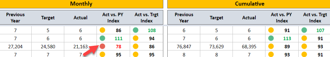
Our goal in this manufacturing facility is to lower production costs. For this product group, the cost per unit was approximately 100 units the previous year. This year, we wanted to bring it down to 90 units, but the real number was 110.
The manager in this case, whether it be the finance manager or the factory manager, will see two red indicators: one will show that we’ve missed our target and the other will show that we’re performing worse than we did a year ago.
This pertains to determining the existing circumstances. Additionally significant are trends. Depending on the industry, it can occasionally be too long to compare one year to the next, so we might want to monitor these trends on a monthly or even weekly basis. Let’s now discuss the trend element.
3.3. Best Practices on Commenting the Trends
As we covered in the previous section, we’ve evaluated our current situation in relation to the previous period and our goals. Now, we have a general picture. It’s time to examine trends.
Even though a given month may be poor, the general trend may be favorable, or vice versa. We must investigate these patterns in order to prevent being duped by anomalies.
As you can see in our KPI Dashboards, there is both a snapshot section and we see the trends.
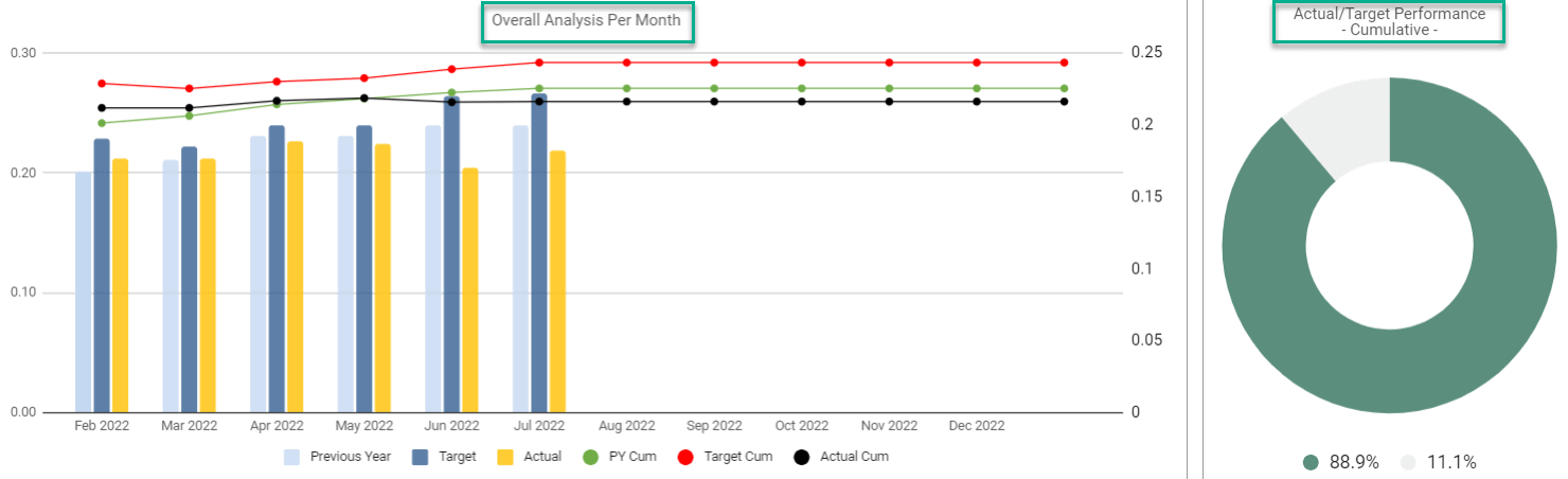
In other words, it may be week by week, sometimes even day by day, depending on how the month went or the subject you are examining, but KPI metrics are generally not examined on a day-to-day basis. Even the week is actually very ambitious.
3.4. Frequency in KPI Dashboards: Best Practices
Once you’ve determined which metrics to track and which ones to identify, reports are generated at the manager’s preferred frequency—monthly, weekly, or quarterly. This is the fundamental idea underlying what is known as a KPI dashboard.
Depending on the topic, we can view the progress week by week or month by month. KPI metrics are typically not examined on a daily basis, though. Weekly is a stretch; they are typically reviewed every month. It is unlikely that a manager will go over these reports on a daily or weekly basis.
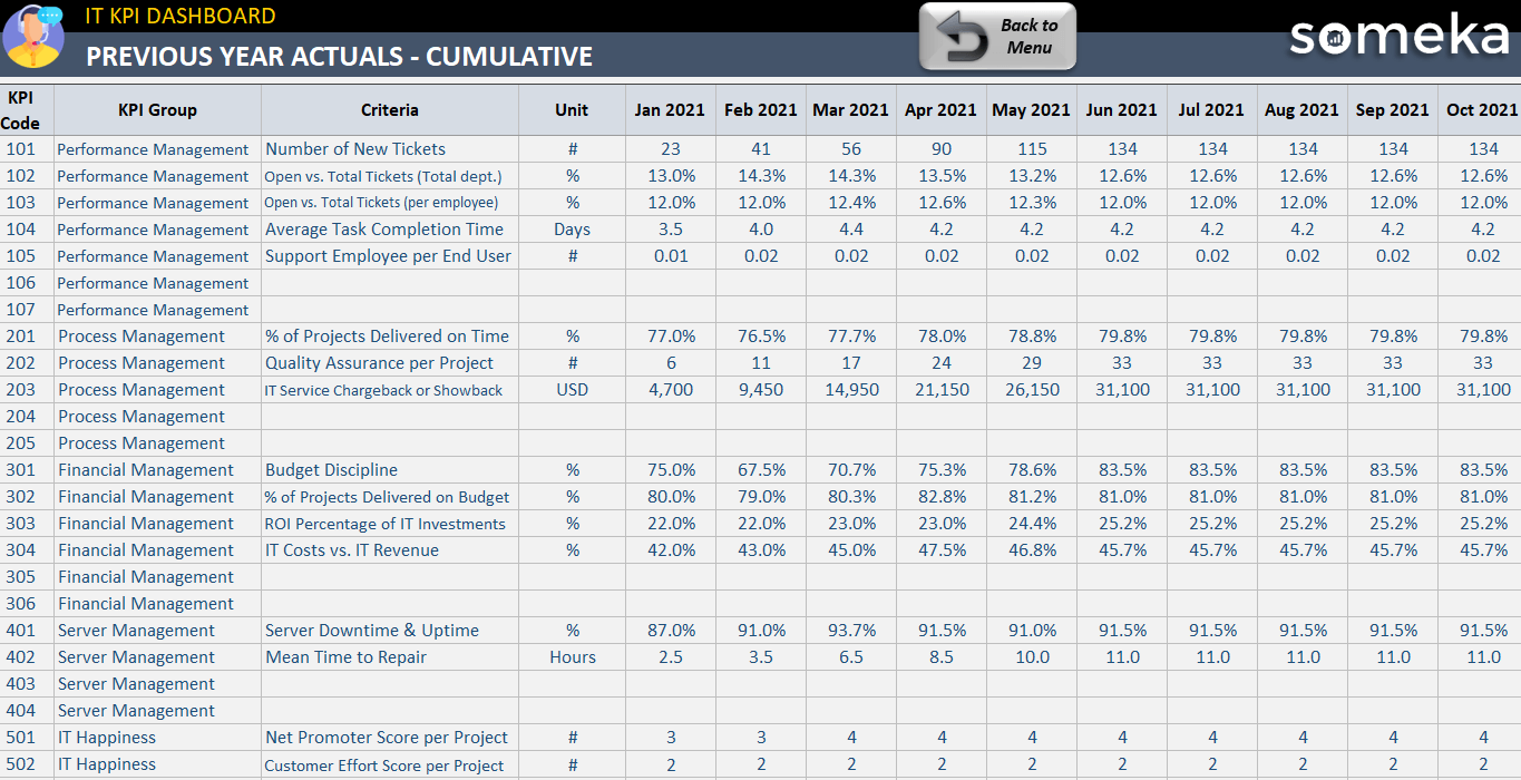
– This is the monthly cumulative sheet of IT KPI Dashboard Excel Template –
Monthly reviews are standard practice worldwide because there are daily operations to oversee. The total sales figures show monthly trends, showing which months experienced drops or increases.
3.5. Which metrics to track?
So which metrics should we follow? What is being monitored worldwide? For this, we have a different set of posts ready.
To choose the best metrics to follow, you should research your industry, keep in mind your corporate goals.
We’ve outlined logical metrics to monitor whether you manage a hospital, own a construction company, or work in the food industry. For 15-20 sectors, we have compiled the most popular and useful metrics, with about 25 metrics per sector. From there, you can look them up.
4. Ready KPI Dashboard Templates
If you do not want to think about all of these aspects, there are ready-made KPI Dashboard templates. You can easily use them with small modifications if you need them. We have prepared all these files with the KPI best practices approach.
In our portfolio, we have 20 different KPI dashboards, with the most common metrics used in that industry, sector, or department.
EXCEL KPI DASHBOARDS COLLECTION
So hope you enjoy our article!
Recommended Readings:
30 Most Important Operational KPIs & Metrics
Overview of Risk Assessment Process: Importance, Steps, and Framework
Related Posts