
How to Make a Pie Chart in Google Sheets
Pie charts (aka circle charts) are graphics that are especially useful to show part-to-whole relationships of your data. And you can easily create a pie chart in many spreadsheet programs. Would you like to learn how to make a pie chart in Google Sheets? Let’s start!
When to Use a Pie Chart
If you have a single dataset that has less than 6 categories and each of the categories is a part of a percentage then probably displaying your data with a pie chart would be best practice.
Pie Charts are generally used to show percentages of a total sum. The data should not be time-dependent as pie charts only show a single status.
This post will guide you through how to make a pie chart in Google Sheets step-by-step.
Preparing the Dataset
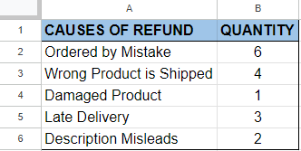
Let’s assume that we have an e-commerce website and we would like to compare the causes of the refunds of the previous month.
Below you can see the dataset we will be using when creating the pie chart.
Creating a Pie Chart
There are two ways to create a pie chart for your data set.
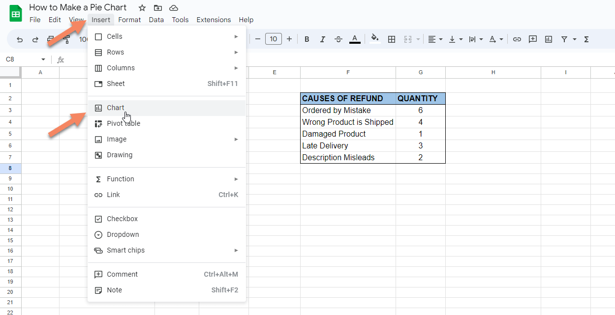
1. Click insert on the top bar and select the chart from the menu by clicking it.
2. Click the explore button on the bottom right corner of the page ( or press alt+shift+x). Google will show you the results related to your data. Drag and drop the pie chart from the explore section to your sheet.
Editing the Pie Chart
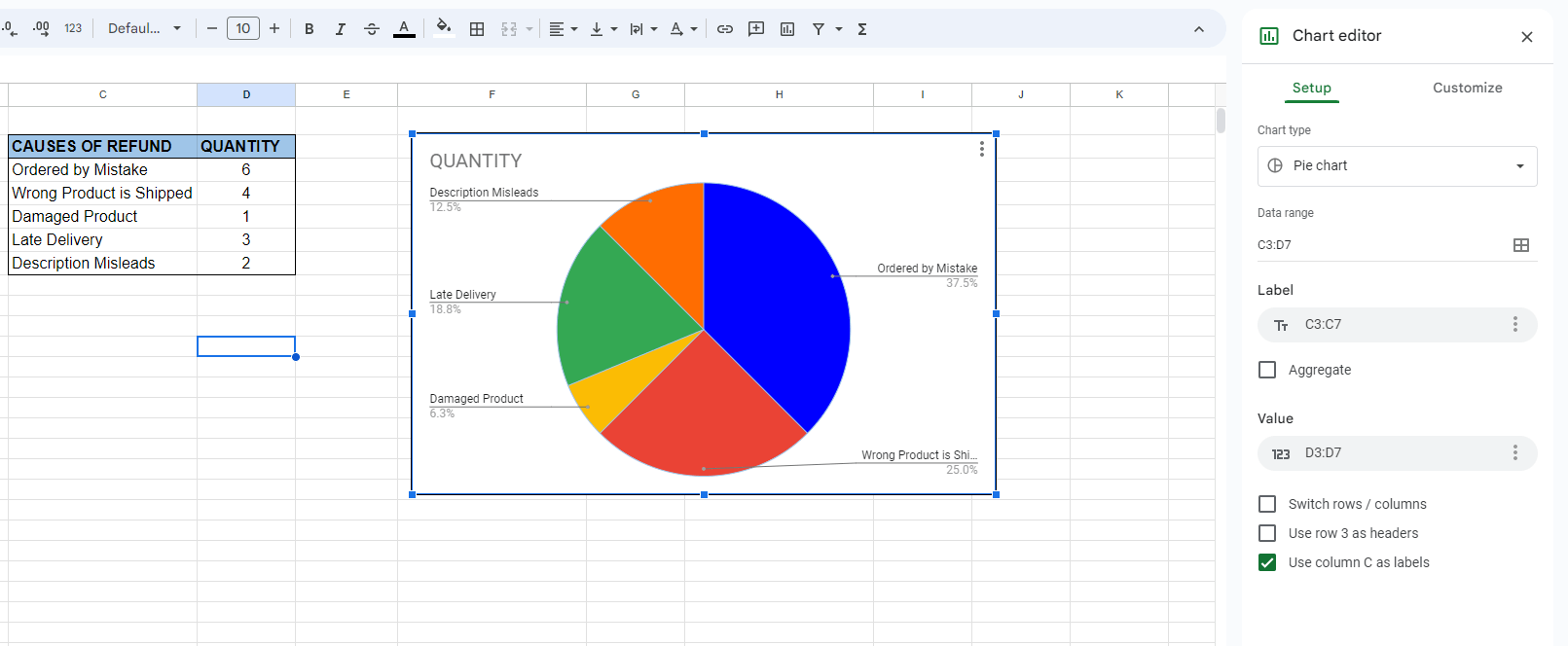
By double clicking the chart created you can open the chart editor window where you can edit your chart. If somehow your chart is not created as a pie chart, you can select the pie chart from the chart editor->Setup->Chart Type menu.
You can also change your data range, label and value to be used from the setup menu.
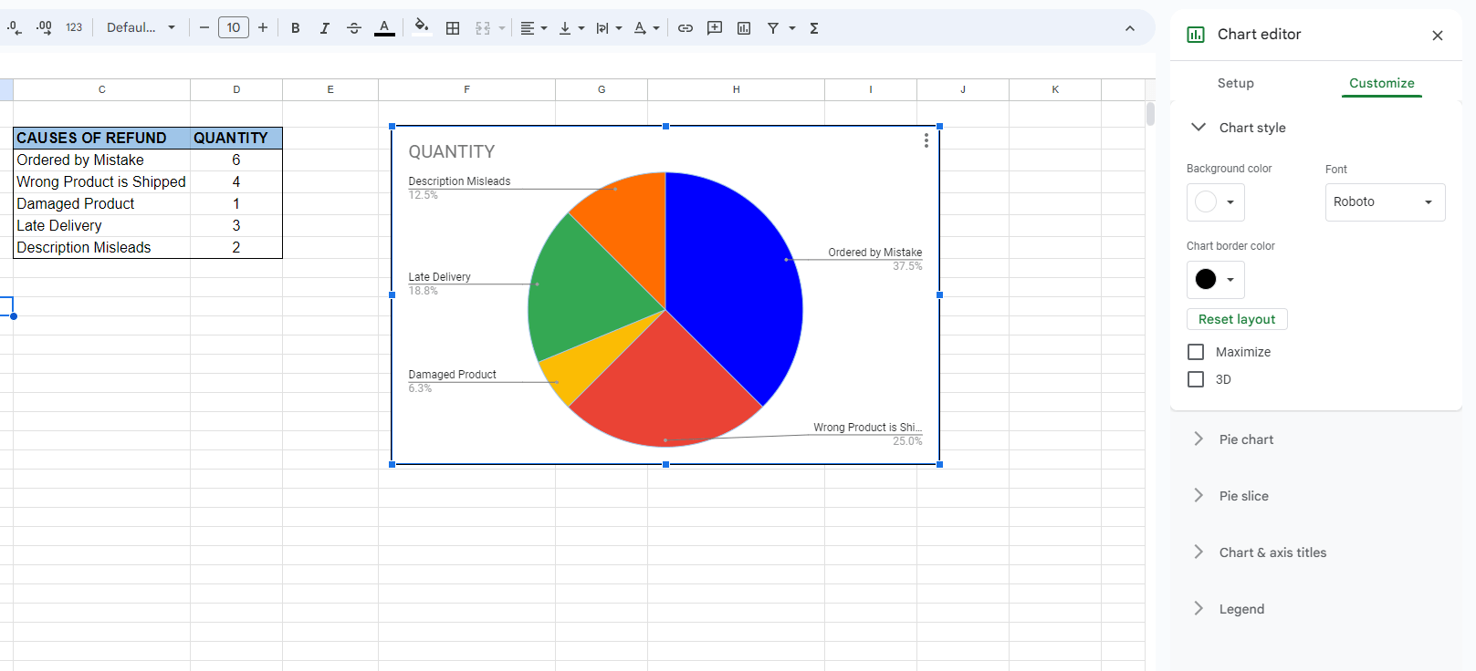
You can change the chart’s background color, font color and size , you can also make slices distance from the center, you can make a donut hole to your pie chart from the customize section of the chart editor.
Changing the Title of a Pie Chart
You can also make changes by directly clicking on the related section of the pie chart. For example if you want to change the title of the pie chart, simply click on the title and change the name. Then, you can see the three dots on the right top corner of the chart. By clicking this symbol you can edit, delete, move etc. to your chart also.
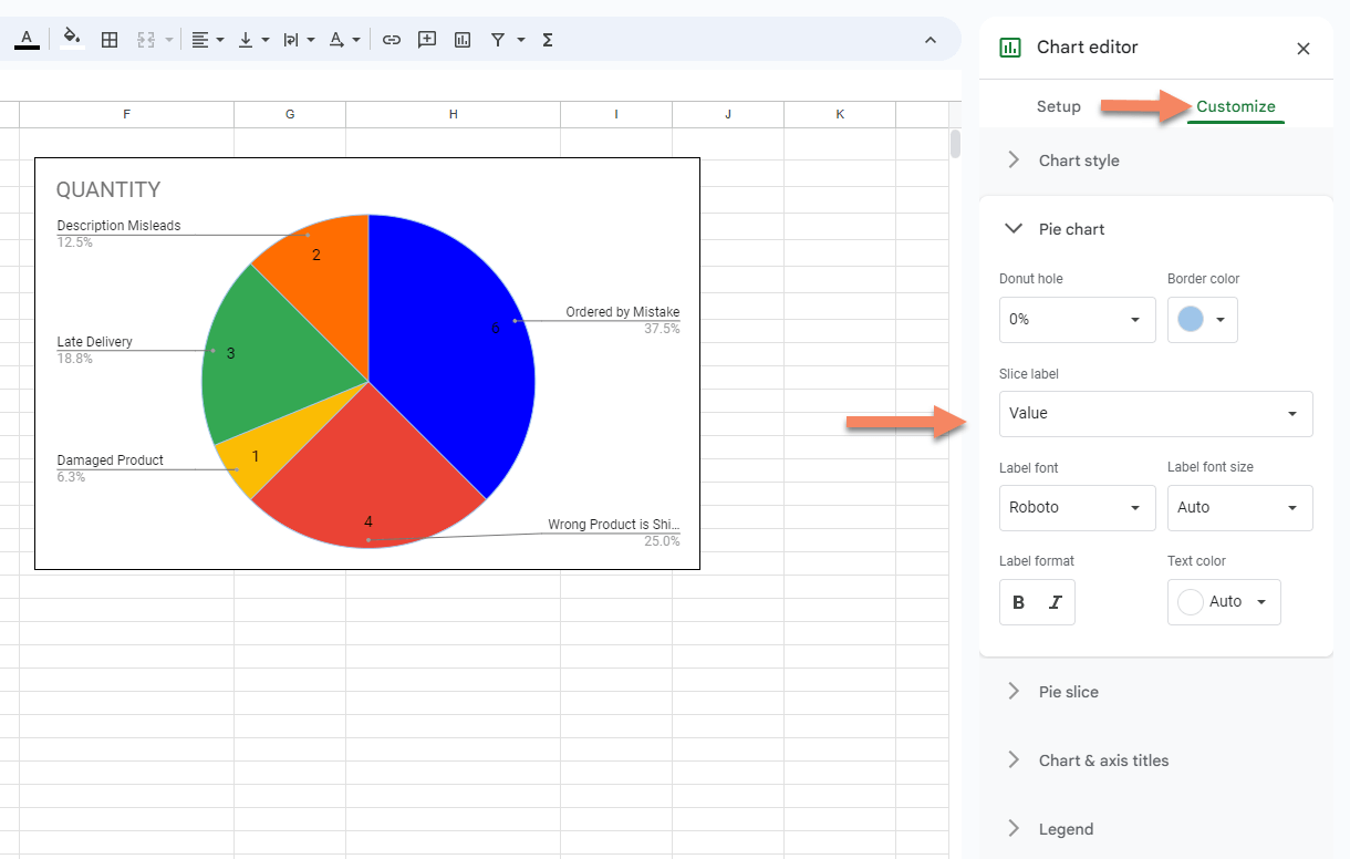
Showing the Value and/or Percentage
If you want your pie chart to show values on Google Sheets, double click on the chart, from the chart editor, select customize and pie chart respectively. In the pie chart section click the slice label and from the drop down menu select “Value”. With this way, you can show values on your Google Sheets pie chart.
You can also select “Percentage” from the slice label drop down menu to change pie chart slice view as percentage or you can both show percentage and value together by selecting “Value and Percentage” from the slice label drop down menu. You will not see any trouble with your pie chart not showing all labels, this way.
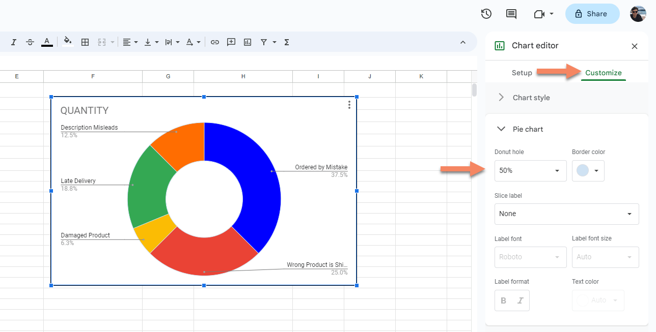
How to Make a Donut Pie Chart in Google Sheets
By double clicking the chart, you can open the chart editor. Then, from the chart editor section click “Customize” and “Pie Chart” respectively. After that, change the percentages on your pie chart according to your need by clicking the Donut hole dropdown button.
Related Posts