How to make your Excel files look MUCH better? – 11 Tips to Create Professional Excel Spreadsheets
In this article, we will give you a few tips on how you can make your Excel files look much more beautiful in a simple way. Here’s a full list of expert tips to create professional Excel spreadsheet files.
As Someka, we have been creating globally admired Excel files and dashboards for years. We’ve accumulated experience and developed specific methods and techniques over the years. Now we’ll share some standard, well-established information with you about them.

Therefore, it would be beneficial for you to follow these tips. Actually, you all have some idea about how ugly Excel files used in companies look. They usually look very complicated and ugly and crude.
This is particularly evident when we offer these custom services. Sometimes productivity can be greatly increased by simply making minor changes to a file’s appearance and usability without affecting its functionality. Consequently, don’t undervalue the significance of appearance. In actuality, UI and UX—which describe the way a user interacts with a file—are crucial. Don’t disregard this subject by thinking, “What difference does it make if only the visuals are good?”
Here’s still another reason we should take care of the appearance of our files. An Excel file isn’t always used by one person. It might be acceptable in certain situations if the file’s creator is the only user, but most of the time, other people also use these files.

Occasionally, the file gets handed over to new people who carry on working on it after the original employee leaves the company. As a result, it’s critical that the file make sense. Although we have other posts that cover this subject in greater detail, we’ll provide some advice below.
Enough for our reasons for writing this post abour professional excel files.
Let’s dive into real tips:
1. Remove gridlines or set your own borders
As you are aware, gridlines are enabled by default in Excel, and the background appears to be graph paper. These gridlines can get confusing as your files get more complicated and include tables and different calculation sections. They offer helpful advice at first, but as time goes on, they make your file appear extremely complex.
This is particularly ugly for more complicated files. There are two things to create professional Excel spreadsheet tabs:
- Turn off the gridlines entirely first
- Then, draw your own borders
Draw your own borders if you are setting up a table, a section, or making boxes on the left and right. It can work well to use thicker lines on the outside and thinner, subtly colored lines on the inside. The gridlines won’t be confusing in this manner. The second technique involves maintaining the gridlines while altering the Excel sheet’s background to a subdued shade of grey, for example. Examples of this are available in our files.
– This image is from Sales Dashboard Excel Template by Someka –
This approach has an advantage over the other one in that the grey background doesn’t strain the eyes; however, the gridlines will remain visible if you decide to remove the grey color from your tables. This implies that you won’t have to redraw your internal borders. Additionally, the formatting won’t smear during operations like copy-paste, and the file’s visual stability will hold steady throughout. This is an additional useful technique.
2. Use a different formatting for data input areas
For us, this is one of the most crucial approaches to create professional excel spreadsheets. You are aware that there are cells in an Excel file designated for calculations as well as data entry. The user will have trouble knowing where to enter data and where not to if all of these cells have the same format. Usually, we leave the data entry sections blank, with a white background and no formatting.
On the other hand, some people use a light yellow color in global standards. To be honest, we don’t think any formatting makes more sense.
![]()
– This is a clear example of different formatting for Input Area and Calculated Area taken from Recruitment Tracker Template –
This is a result of users occasionally pasting information from files or other sources into these data entry fields. We decided on this course of action because we didn’t want to mess with the formatting, and our users have been really happy with it thus far. To sum up, give distinct colors or backgrounds to various sections, but keep the areas where data is entered white. In this manner, the user can quickly determine where data should be entered.
Data Input vs Calculated Areas:
We would also like to add something to the second tip. It is advantageous to separate the data entry and calculation areas.
The calculation sections can be moved to a different sheet or hidden. To be honest, we occasionally witness people using techniques like matching the background and text colors to make elements invisible. This approach is neither optimal nor good. People might then unintentionally erase those sections. Therefore, it’s best to either conceal them or transfer them to a different sheet.
3. Make Freeze Panes to create professional excel spreadsheets
It’s actually very easy to do this.
Use Freeze Panes when working with your tables so that the headers at the top remain visible as you scroll down. Excel has a built-in feature that keeps your headers visible when you scroll down, even if you use its Default Table Formatting. We still, however, much rather install Freeze Panes ourselves.

We recommend leaving some space above and to the left of the sections where we input our tables or data, as we’ll touch on in one of the points below. In other words, just remember to use Freeze Panes.
4. Pay attention to headers
Tables are a common way to enter data into Excel. However, it is important to separate the data input part of these tables from the header part.
Here are some basic actions to make beautiful headers:
- Make the headers Bold
- Change Vertical to Centered
- Give a different background color. It may be slightly light blue
- The height should be one notch higher than the other lines. The standard here is twice the size of normal data rows
- Also make Wrap Lines. In other words, the headers should move to the second line in the cell.
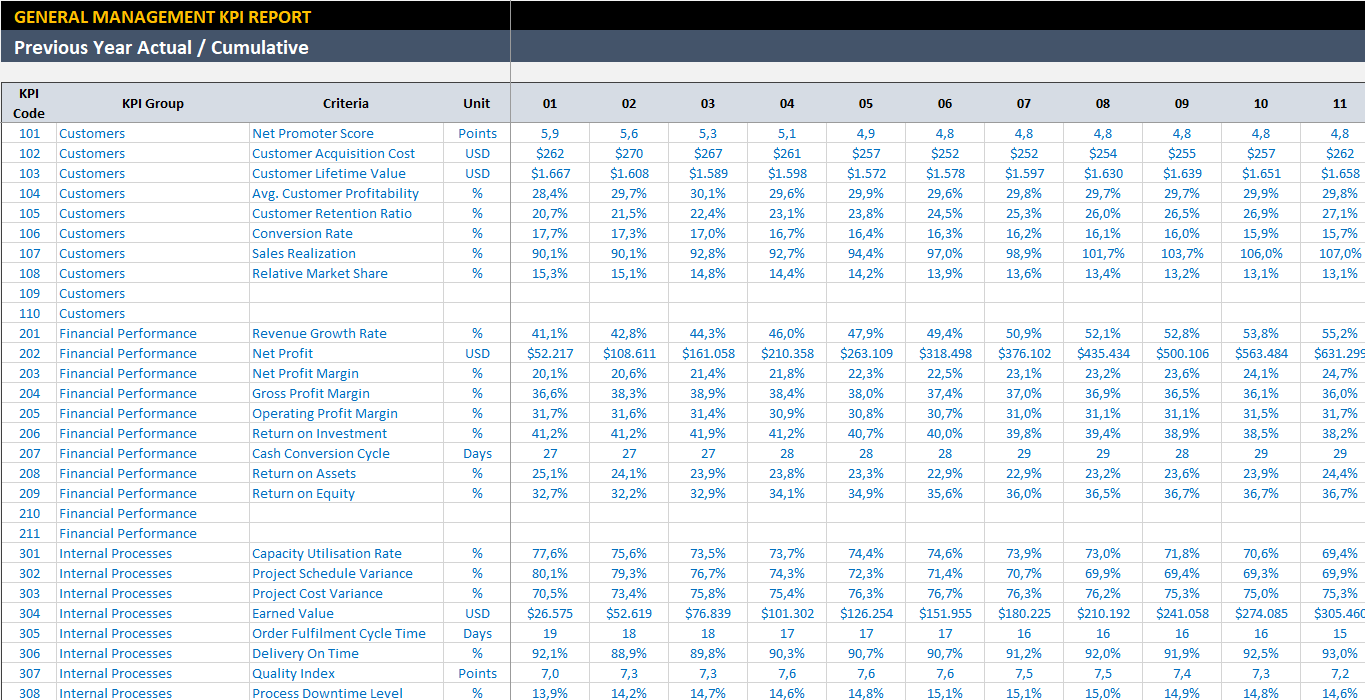
– This image is from Management KPI Dashboard Excel Template –
Thus, the header and data section are cleanly separated from each other.
5. Give up the habit of centering your data
We are referring to alignment that is horizontally centered here. Tables with lengthy text, numbers, and other data can occasionally be seen. One example would be a table with 100 rows and 10 columns that is all centered. Not every kind of data has to be centered. We’ll go into more detail in a future post, especially with regard to setting up tables.
For the time being though, I can state that while long data—especially text data—should not be centered, short data can. When centered, they appear incredibly disorganized and intricate.
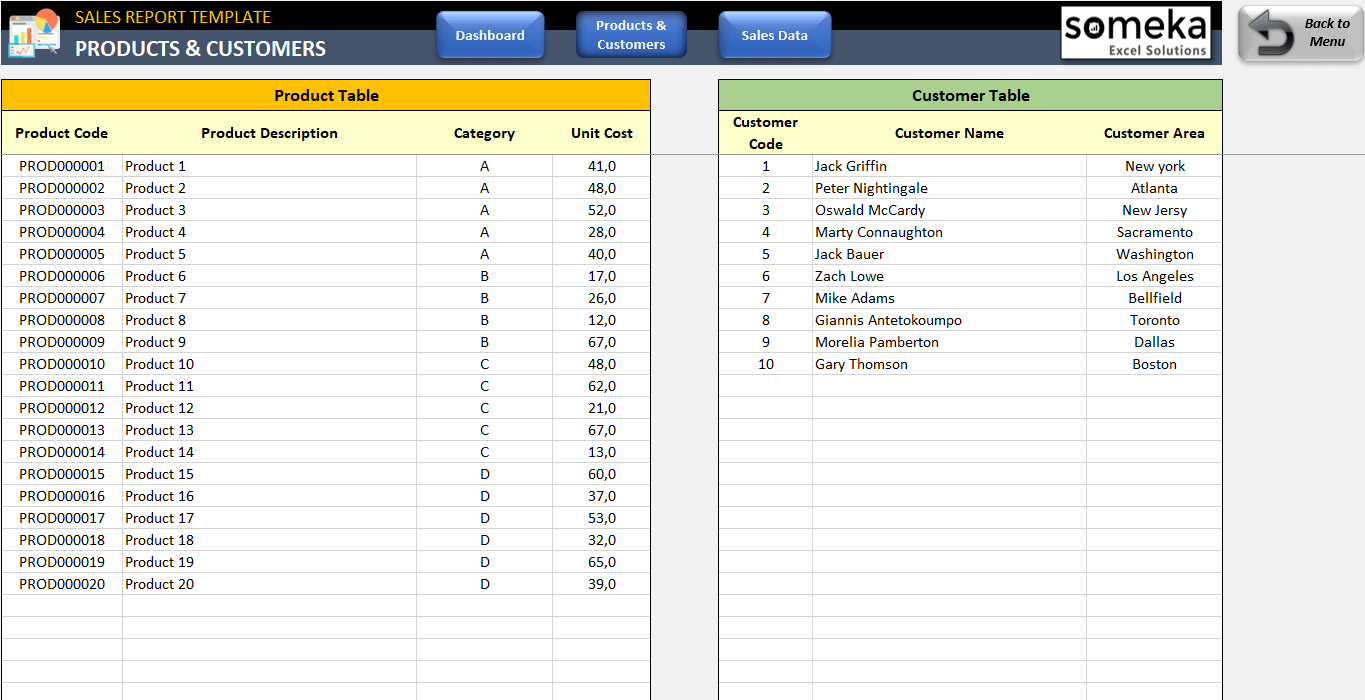
– This is main input area of Someka Customer Follow up Sheet in Excel –
Consider a CRM file containing customer data, for example. Information such as the person’s name, address, business, and city ought to be arranged to the left. These can be centered for very brief data, such as the state in which they reside or a quick numerical detail about the individual. However, avoid centering everything in the table horizontally.
6. Do not put too many decimals
This error is frequently observed in tables containing data with excessive decimals, such as prices displayed as 120.683 or 150.790 dollars with precise decimals. When discussing large revenue figures, adding decimals doesn’t make much sense. This is the standard for decimal usage.
For instance, there isn’t much of a difference between making 120 million dollars and 120.13 million dollars. A mere 13 cents out of 120 million dollars is a tiny detail. As a result, in these situations, you do not add decimals.

Nonetheless, employing two decimals can make sense in situations such as stock pricing or a trading journal where prices are like 0.95, 1.13, etc. Prices typically use two decimals. Decimals are not used for revenues or other quantity information, especially since quantities are usually whole numbers, so there’s no need to add needless clutter to your table.
7. Leave space at the top and left sides
Do not align your data to the top left!
A common concept in websites and web design, whitespace is essential to design. This term may not be familiar to those who are not technical in nature. Nonetheless, the utilization of adequate space, also referred to as “Whitespace,” is what gives a website, interface, program, or app an attractive, uncluttered appearance.
It facilitates clearer perception and helps concentrate attention where the designer desires. We are frequently asked why our tables, data, and calculations have white space on the left and top. In fact, we even have standard measurements, expressed in pixels, for how much room to leave. In conclusion, avoid beginning your tables in cell A1, which is located at the very top left. Make a little room there. We’ve written an article explaining why we take this action
8. Do not make dark borders inside your boxes and tables
Although we discussed it briefly in the first tip, we’ll recap it here. You cannot highlight the areas you want people to notice if you make all borders extremely dark.
Moreover, your tables will have an ugly appearance. Typically, the standard design entails thinner, fainter lines inside data entry areas and thicker borders outside. This is the standard for general design. You can use this best practice to build your own professional Excel spreadsheets.
9. Limit the number of colors you use on your tables
People frequently color-code cells in their tables to help with categorization. They color things they want to filter or focus on in yellow or green, and important items in red. This eventually results in an ugly and perplexing color combination. It’s an easy fix.
![]()
– This image is from Invoice Tracker Excel Template in Someka collection –
Use data to filter your tables rather than colors. Compared to colors, which are merely formatting, this method is much healthier and allows the data to show through when making things like pivot tables. Thus, try not to create a vibrant mess on your tables. In fact, we advise against coloring any of the table’s data entry sections.

As you can see, we never color the tables in our products. You could use symbols in its place. A new column containing symbols such as X, Y, or status indicators could be added. This facilitates understanding for other people.
10. Color Palette is Important to create Professional Excel Spreadsheets
Guys, colors really matter. You can make big difference only by using the right colors on the way to create professional Excel spreadsheets.
We will underline two major things to about colors:
1. Colors have meaning:
In your file, using red, blue, black, and grey at random leads to inconsistency. Red is used for negative aspects or warnings because it attracts attention. When we want to minimize attention or significance, we use grey. Positive aspects are indicated by green. Thus, avoid using an excessive amount of vivid colors in your data. It attracts unwarranted attention. The first thing about colors is that.
2. Too many different colors make your file unreadable:
Ten different colors shouldn’t be used in one file. The most number of colors that is advised is four or five, and these colors are generally harmonious when you search for “color palette” on Google. A disorganized use of colors such as yellow, green, blue, and red will make your file appear unprofessional.
Think about using different shades of the same color if you must use different colors. Excel’s color palette, which includes shades of blue and green, makes this simple. Use shades of one color, such as green, for example, if you have three tables and want to use different colors for their headers rather than using entirely unrelated colors. This strategy is far more logical, straightforward, and tidy.
![]()
– This is the Dashboard of Employee Training Tracker which is built with a few colors picked from the same color palette –
Excel’s color palette, which includes shades of blue and green, makes this simple. Use shades of one color, such as green, for example, if you have three tables and want to use different colors for their headers rather than using entirely unrelated colors. This strategy is far more logical, straightforward, and tidy.
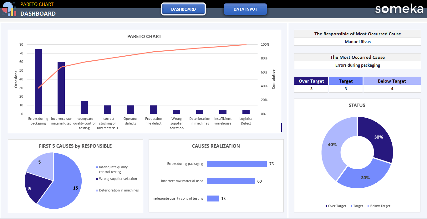
– This is the Dashboard of Pareto Chart Excel Template with impressive colors –
11. Using Bold is Important
This is a very basic rule:
If you want to draw attention to everything, you can draw attention to nothing.
Therefore, you cannot bold many different things in an Excel file.
As a result, you cannot bold numerous items in an professional Excel spreadsheet. To attract attention, you could, for example, bold the table headers or specific sections of your data. Alternatively, you could just bold the first data column. Everybody else should weigh normal. Your file will appear much more organized and consistent if you do this. Otherwise, a file with a lot of bolded text appears incredibly disorganized and ugly.
Final Words
Generally speaking, these are the pointers for making stunning Excel files and enhancing your existing ones. We recommend that you take a look at an Excel file you already have and see how much it improves after using these tips.
Our ready-made templates and dashboards can serve as sources of inspiration as well.
We’ll continue to explain the secrets of Beautiful Someka Templates, stay tuned!
Recommended Readings:
Complete List of Things You Can Do With Excel
Why do we create KPI Dashboards? – KPI Dashboard Best Practices
Related Posts