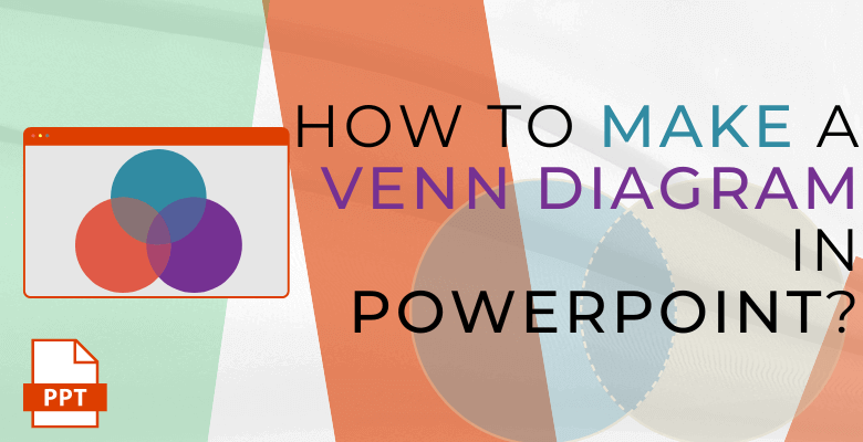
How to Make a Venn Diagram in PowerPoint? Easy Steps with Examples
Creating a Venn diagram in PowerPoint can be a valuable tool for visually representing relationships and comparing sets of data. With the help of PowerPoint’s SmartArt graphics, you can design a professional looking Venn diagram that effectively communicates your information but in some limitations on your imagination.

Thus, to create a Venn Diagram, you should follow these two methods. Firstly, create a Venn Diagram in PowerPoint. Second one is the dynamic, magical and faster way. In other words, to use the Venn Diagram Maker with an Excel Template a.k.a. Venn Diagram Maker or Venn Diagram Generator.
Table of Contents
1. How to Make a Venn Diagram in PowerPoint?
2. Automatic Venn Diagram Maker Excel Template
3. FAQs
1. How to Make a Venn Diagram in PowerPoint?
In this blog post, we will guide you through the process of creating a Venn diagram using different methods, allowing you to present complex concepts and overlapping relationships in a clear and concise manner. From selecting the appropriate Venn diagram layout to customizing its appearance and presenting or printing the final result. These steps will empower you to create visually appealing and informative Venn diagrams. Let’s get started and unlock the potential of visualizing data with Venn diagrams in PowerPoint!
This set-by-step guide will let you build your custom venn diagram with SmartART feature in ppt.
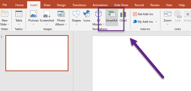
Step 1 – Insert SmartArt
To create a Venn diagram in PowerPoint, begin by opening a new or existing presentation. Navigate to the “Insert” tab in the PowerPoint ribbon and click on “SmartArt” in the Illustrations group. A gallery of SmartArt graphics will appear.
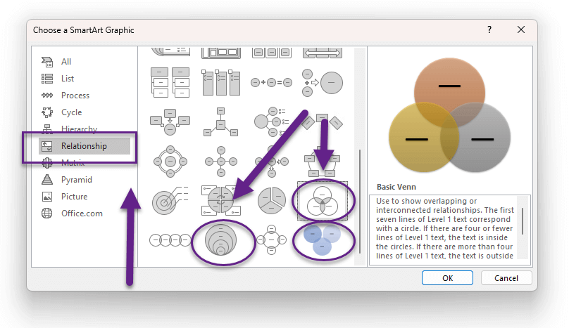
Step 2 – Choose the Venn Diagram PowerPoint SmartArt
To begin, select the “Relationship” category in the SmartArt window. Scroll through the options and choose the Venn diagram layout that best suits your needs. There are various styles available, including two-set and three-set Venn diagrams. When you decide the shape or type, you can simply click a Venn diagram layout (such as Basic Venn) and then click OK. The Venn Diagram will automatically be created in PowerPoint.
Step 3 – Fill in the Content or Place the Data to Venn Diagram PowerPoint
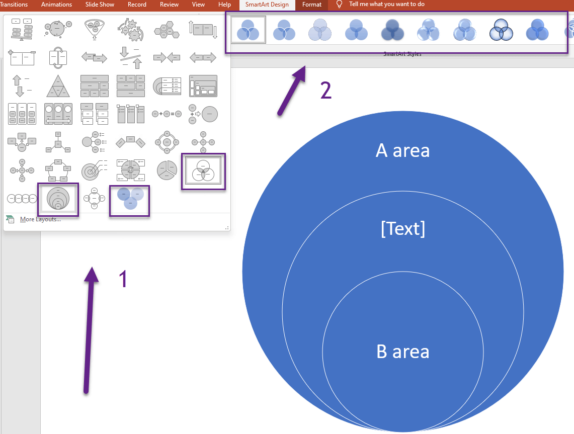
Once you have chosen the Venn diagram layout, a placeholder graphic will appear on your slide. So, double-click on each circle or intersection area to add text and enter the appropriate content. Consider using meaningful labels to represent your sets and intersections, providing clarity to your audience.

Step 4 – Format the Venn Diagram
Enhancing the visual appeal and comprehensibility of your Venn diagram is crucial. To achieve this, you can customize its appearance in a few simple steps. Begin by clicking on the diagram itself, which will activate the SmartArt Tools tab in the ribbon. Utilize this tab to make adjustments such as modifying the color, font type, and font size of your Venn diagram. It’s recommended to experiment with different color combinations and font styles to ensure optimal readability and visual impact.
If you wish to change the layout of your Venn diagram, the process is equally straightforward. Moreover, simply right-click on the Venn diagram you want to modify, and a context menu will appear. From the menu, select the “Layouts” group located on the Design tab under SmartArt Tools. As you hover over each layout option, your SmartArt graphic will transform to provide a preview of how it would appear with that particular layout. Choose the layout that best suits your needs.
For different types of overlapping relationships, you have various layout options. Therefore, to depict overlapping relationships in a sequential manner, you can select the “Linear Venn” layout. If you want to emphasize growth or gradation in the overlapping relationships, the “Stacked Venn” layout is a suitable choice.
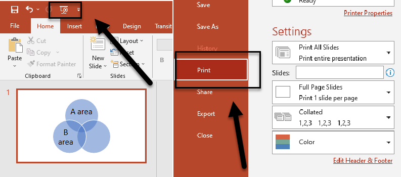
Step 5- Print or Present the Venn Diagram in PowerPoint
Once you have finalized your Venn diagram, you can choose to print it or present it directly from PowerPoint. If printing, make sure to select the appropriate print settings, such as paper size and orientation, to ensure the diagram fits the page as desired. If presenting, simply navigate to the Slide Show mode to showcase your Venn diagram to your audience.
By following these improved steps, you can easily create a professional-looking Venn diagram in PowerPoint using SmartArt graphics. Customize it to suit your needs, and confidently present your data in a visually appealing and informative manner.
In conclusion, incorporating Venn diagrams into your PowerPoint presentations is a powerful way to visually represent relationships and compare data sets. By utilizing the SmartArt graphics feature in PowerPoint, you can create impressive Venn diagrams that effectively communicate complex concepts in the boundaries of limited abilities. From selecting the appropriate Venn diagram layout to filling in content, formatting the diagram, and even changing the layout style, you have the flexibility to customize your diagram to meet your specific needs.
Whether you choose to print your Venn diagram or present it directly from PowerPoint. These steps ensure that your audience receives clear and visually appealing information. With these methods, you can leverage the power of Venn diagrams in PowerPoint to boost your presentations and engage your audience in a meaningful way.

2. Automatic Venn Diagram Maker Excel Template
A Venn diagram is a highly popular and versatile visualization method employed to depict relationships among different sets of data. Whether you require a straightforward representation or a more intricate one, Venn diagrams cater to diverse needs. The credit for its discovery goes to John Venn, and since then, mathematicians and statisticians have devised numerous models for sampling and comparing data.
For further insights into the Venn diagram‘s significance in general culture, you can explore the other information sources. Learning about the history and development of Venn diagrams, as well as how they are used in fields such as computer science, logic, and mathematics, can be useful for gaining a better understanding of these visualization tools.
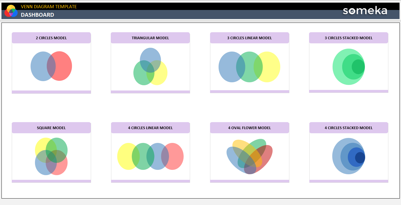
– These are different Venn Models offered by Someka Venn Diagram Excel Template –
The template includes 8 different Venn diagram models, each with its own function. As a result, we will go over the details and significance of each Venn Diagram Model with you.
In our Venn Diagram Excel Template, we offer dynamic models of the most commonly used Venn diagram variations, encompassing two to four sets of data. These models are designed to provide a more manageable representation of the data within Excel. Surely, we will explain the working principles of the template, like the steps for making Venn diagrams in PowerPoint.

3. FAQs about Venn Diagram PowerPoint
1. How do you overlap circles in PowerPoint?
Firstly, to overlap Venn circles in PowerPoint, start by inserting a SmartArt graphic. Go to the “Insert” tab in the PowerPoint ribbon and click on “SmartArt” in the Illustrations group. In the SmartArt window, select the “Relationship” category. Then, choose a Venn diagram layout that suits your needs, such as the “Basic Venn” layout. Once the Venn diagram is inserted on your slide, you can adjust the overlapping circles by clicking on them and dragging them closer together.
Additionally, you can resize the circles by clicking on them and dragging the corner handles. These steps will allow you to create overlapping circles and customize their positions in your PowerPoint presentation.
2. How do you make a Stacked Venn Diagram in PowerPoint?
Begin by putting a SmartArt graphic into PowerPoint to make a layered Venn diagram. In the PowerPoint ribbon, go to the “Insert” tab and select “SmartArt” from the Illustrations group. Select the “Relationship” category in the SmartArt window. As a result, select a Venn diagram layout with a stacked design, such as the “Stacked Venn” layout. After inserting the Venn diagram onto your slide, you can add content by double-clicking on each circle or junction area and typing the relevant text. So, to change the look of the stacked Venn diagram, click on it, and the SmartArt Tools tab will appear in the ribbon.
As a result, utilize this tab to change your diagram’s color, font type, and font size. Additionally, these steps will enable you to create a stacked Venn diagram and customize its content and appearance in PowerPoint for effective data visualization.
3. How do you make a 3-Circle Venn Diagram in PowerPoint?
Insert a SmartArt graphic into PowerPoint and choose the “3-Circle Venn” layout to make a 3-circle Venn diagram. Thus, fill in the required text and use the SmartArt Tools option to alter the appearance. You can simply construct a 3-circle Venn diagram in PowerPoint and personalize it to properly display relationships and comparisons between three sets of data by following these steps.
Recommended Readings:
What is a Pareto Distribution? Here is an Eye-Opening Guide to Pareto Charts!
How to Make a Venn Diagram on Google Docs? Step-by-Step Guide
Related Posts