How to Make a Bar Graph in Google Sheets
The bar graph is one of the most used and multi-purpose charts. So, it is useful to know how to create a bar chart in Excel and of course, the new star of the spreadsheet world, Google Sheets. This post will guide you through how to make a bar graph in Google Sheets step-by-step.
Preparing the Dataset
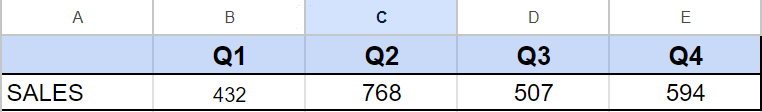
Let’s assume that we have a café that sells beverages.
Below you can see the dataset we will be using when making a bar graph.
Making a Bar Graph in Google Sheets
There are two ways to make a bar graph for your data set.
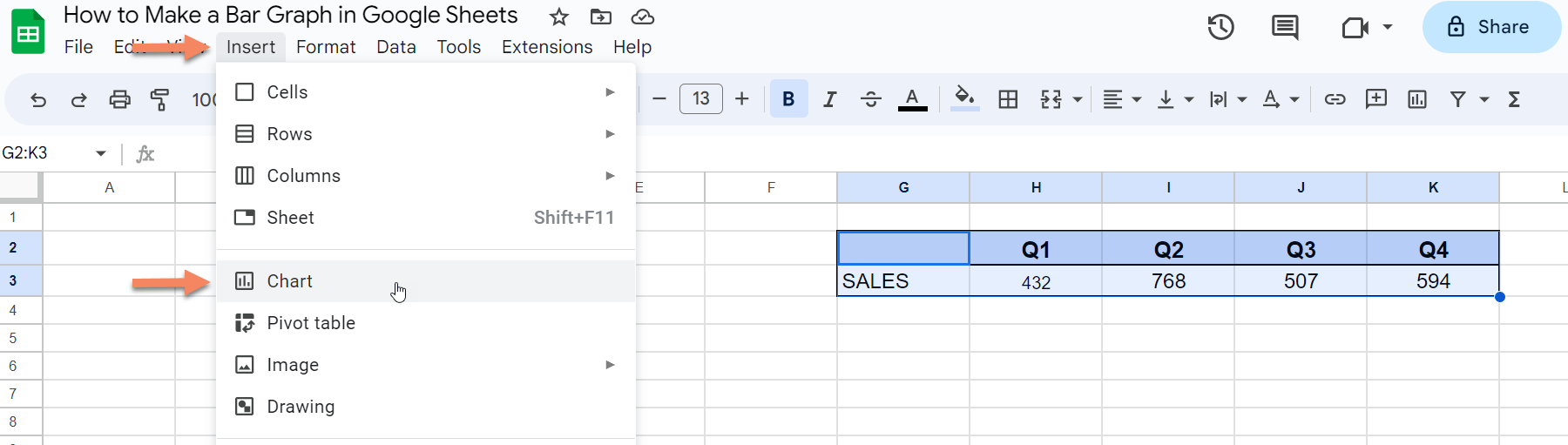
1. Firstly, highlight your data set then, Click insert on the top bar and select the chart from the menu by clicking it.
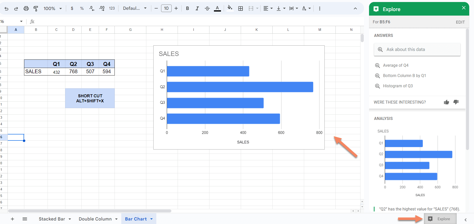
2. Likewise, highlight your data set. Then, click the explore button on the bottom right corner of the page ( or press alt+shift+x). After that, Google will show you the results related to your data. Drag and drop the chart best fits for your need from the explore section to your sheet. After that you may also edit your chart for further improvements.
Editing the Bar Chart in Google Sheets
By double clicking the chart created you can open the chart editor window, where you can edit your chart. If somehow your chart is not created as what you want, you can select the chart type you want from the chart editor->Setup->Chart Type menu.
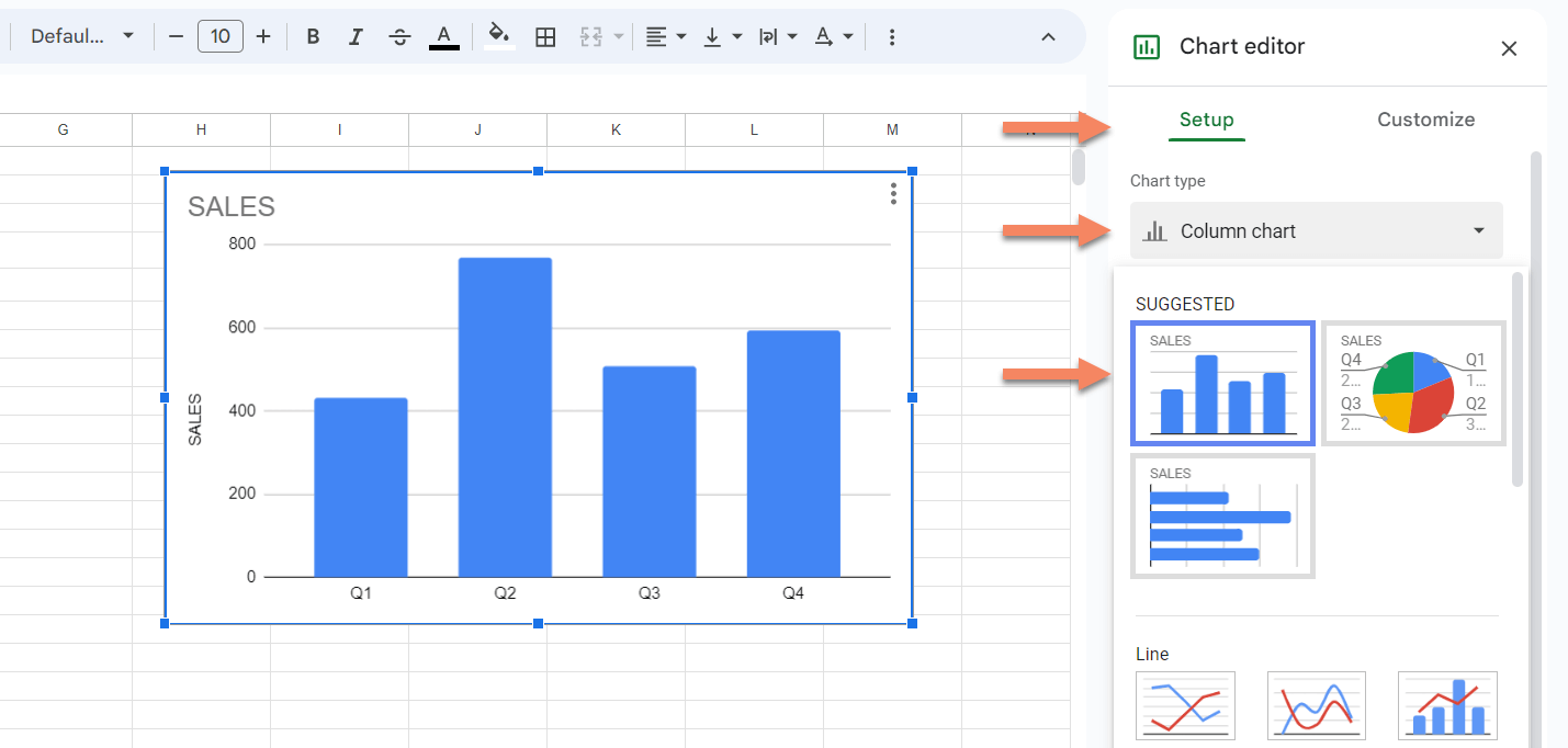
In addition to that, you can change your data range from the setup menu.
Editing Chart Style in Google Sheets
You can also change the chart’s background color, font and border color from the Chart Editor->Customize->Chart Style section.
Editing Color of a Bar in Google Sheets
You can change the color of bars from the Chart Editor->Customize->Series section.
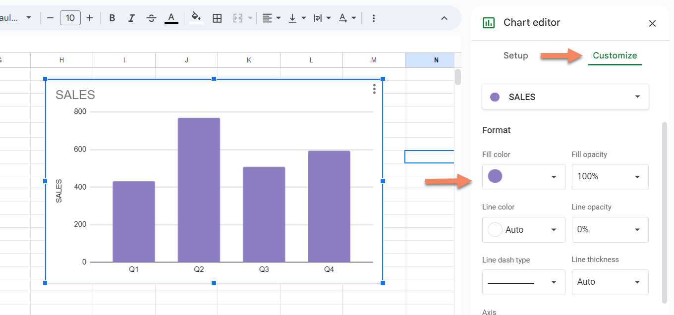
Changing the Title of a Bar Chart
You can also make changes by directly clicking on the related section of the bar chart. For example if you want to change the title of the bar chart, simply click on the title and change the name. There are three dots on the right top corner of the chart. By clicking this symbol you can edit, delete, move etc. to your chart also.
More Bar Charts in Google Sheets
Depending on your dataset you can change the bar chart style of your data to best fit your needs. If you have two sets of data you can use a double bar chart, if you have different categories in your dataset, you can try using stacked bar charts, if you want to compare elements in each category or across categories then you can try using grouped bar charts.
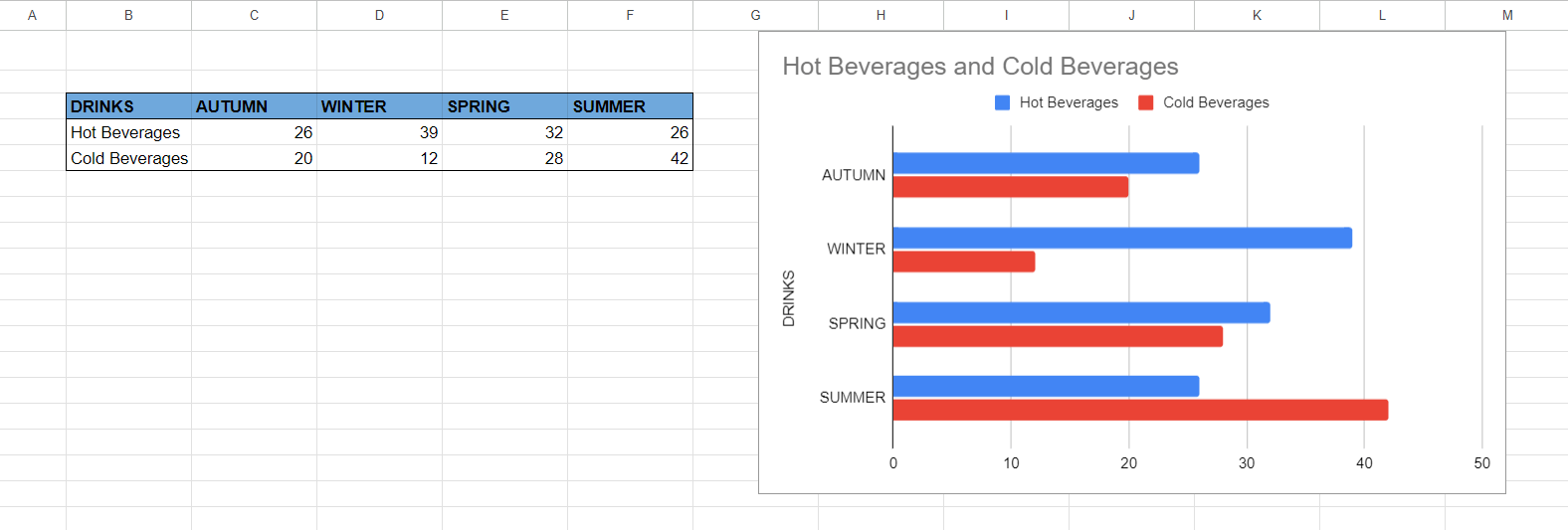
Double Bar Chart
In the example below we have the sales data of hot beverages and cold beverages by season. Using a double bar graph makes it easy to make comparisons. You can make a double bar chart out of your data by simply following the Making a Bar Graph in Google Sheets section of this blog.
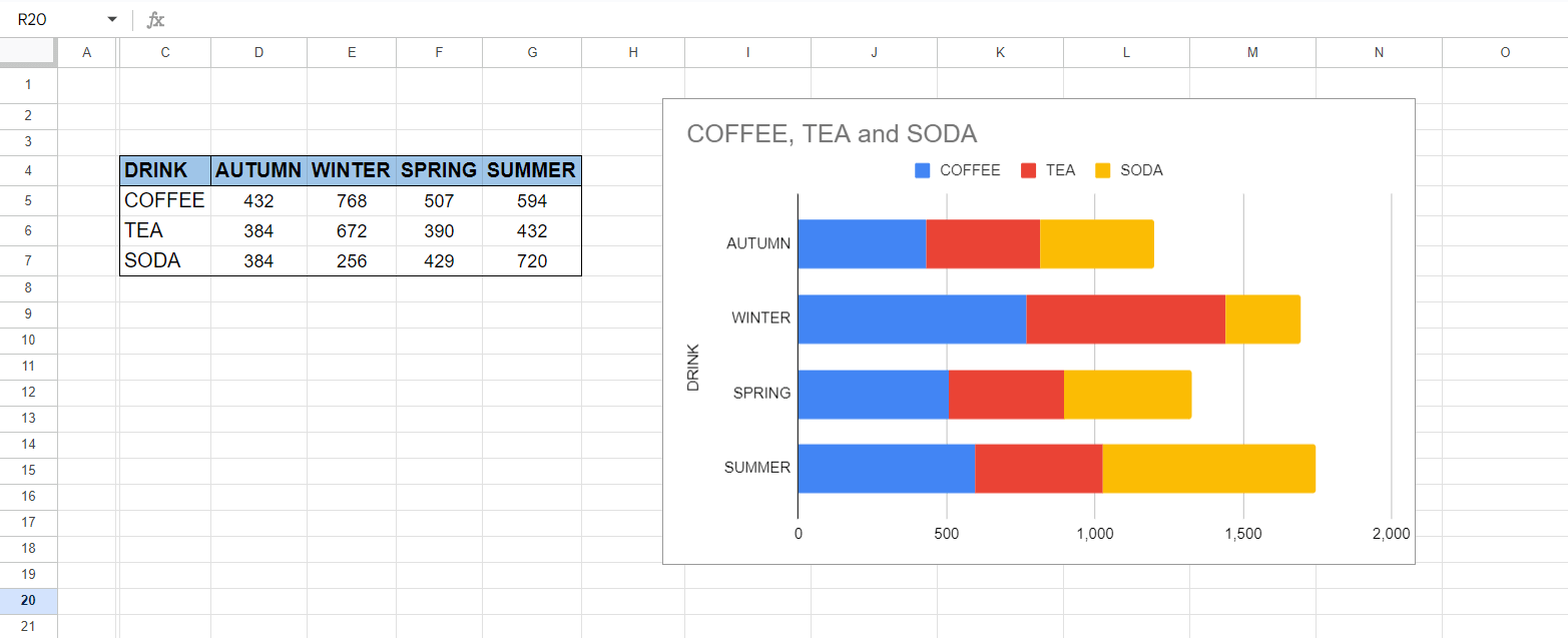
Stacked Bar Charts
In the example below we have the sales data of coffee, tea and soda by season. By using a stacked bar graph you can make comparisons of drinks as elements within the categories of season. You can make a stacked bar chart out of your data by simply following the Making a Bar Graph in Google Sheets section of this blog.
Grouped Bar Charts
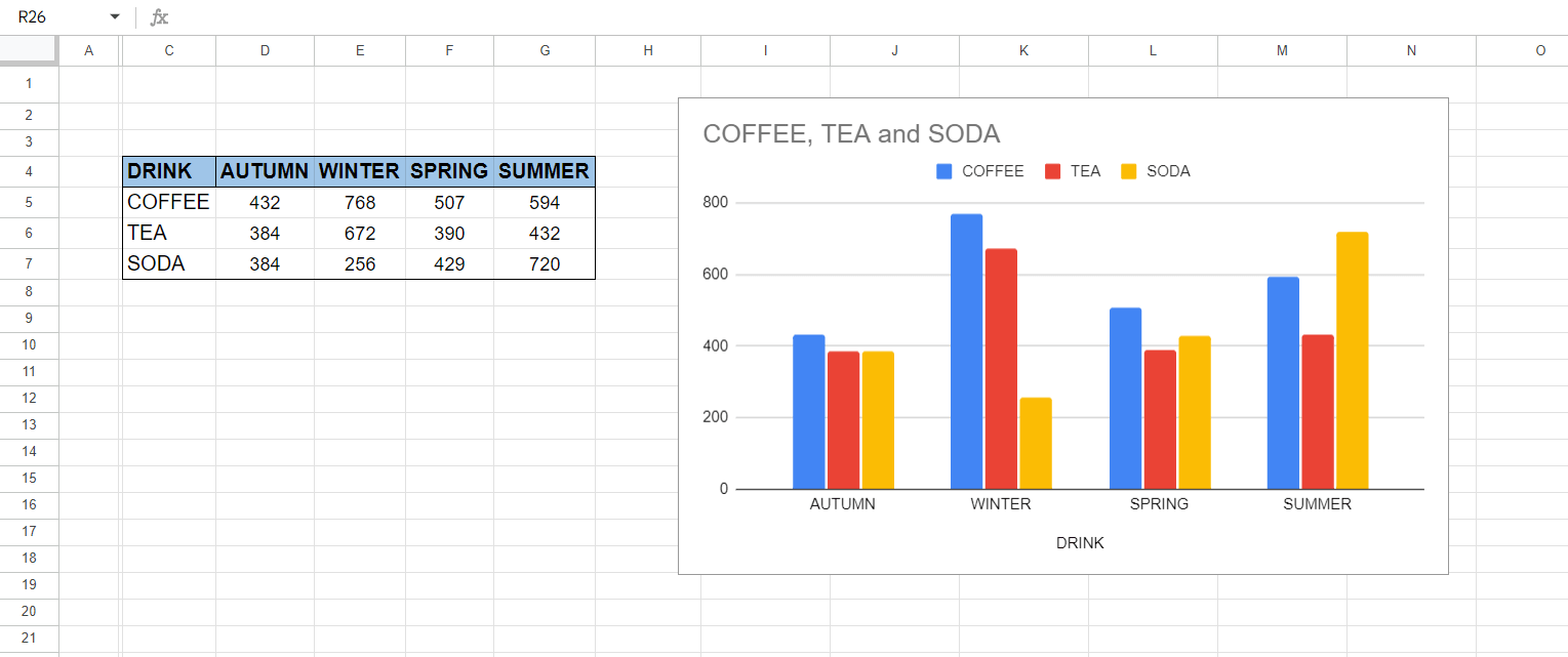
In the example below we have the sales data of coffee, tea and soda by season. By using a group bar graph you can make comparisons of drinks as elements in each season as category or you can make comparisons of drinks across seasons. You can make a grouped bar chart out of your data by simply following the Making a Bar Graph in Google Sheets section of this blog.
Related Posts