
How to Make a Line Graph in Google Sheets
Line graphs are one of the most common and efficient graphs out there in the data analysis world. The knowledge of creating a line graph should be in the toolkit of every Google Sheets user. Afterall, you might not know when you will need a line graph. Therefore, we decided to explain the basics of making a line graph in Google Sheets. Let’s start!
Preparing the Dataset
Below you can see the demo dataset used for making a line graph. It contains the total visitors number during a month for a website.

Creating a Line Graph in Google Sheets
There are two ways to create a line graph for your data set.
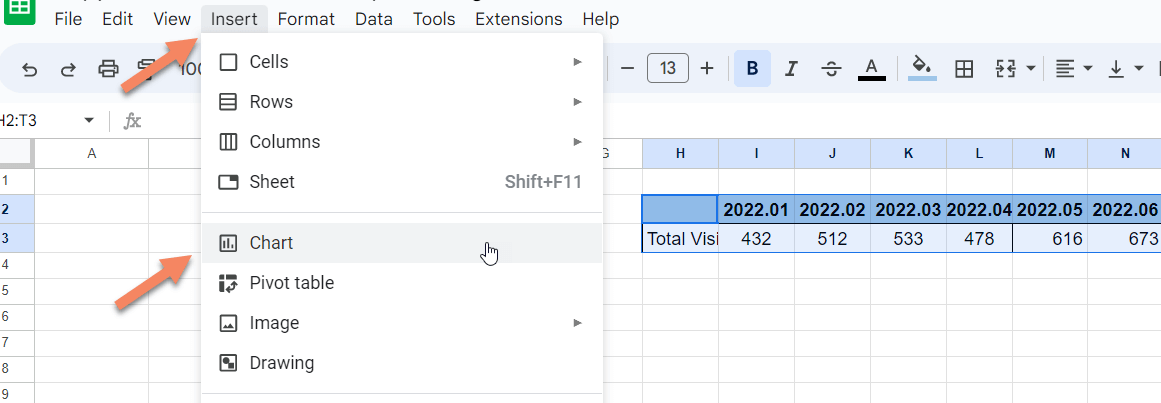
1. Highlight your data set then, Click insert on the top bar and select the chart from the menu by clicking it.
2. Highlight your data set then, Click the explore button on the bottom right corner of the page ( or press alt+shift+x). Google will show you the results related to your data. Drag and drop the chart best fits for your need from the explore section to your sheet. After that, you may also edit your chart for further improvements.

Editing the Line Chart in Google Sheets
By double-clicking the chart created you can open the chart editor window where you can edit your chart. If somehow your chart is not created as what you want, you can select the chart type you want from the chart editor->Setup->Chart Type menu.
You can also change your data range from the setup menu by selecting the chart editor->Setup->Data Range section.
Editing Line Chart Style in Google Sheets
You can change the chart’s background color, font, and border color from the Chart Editor->Customize->Chart Style section.
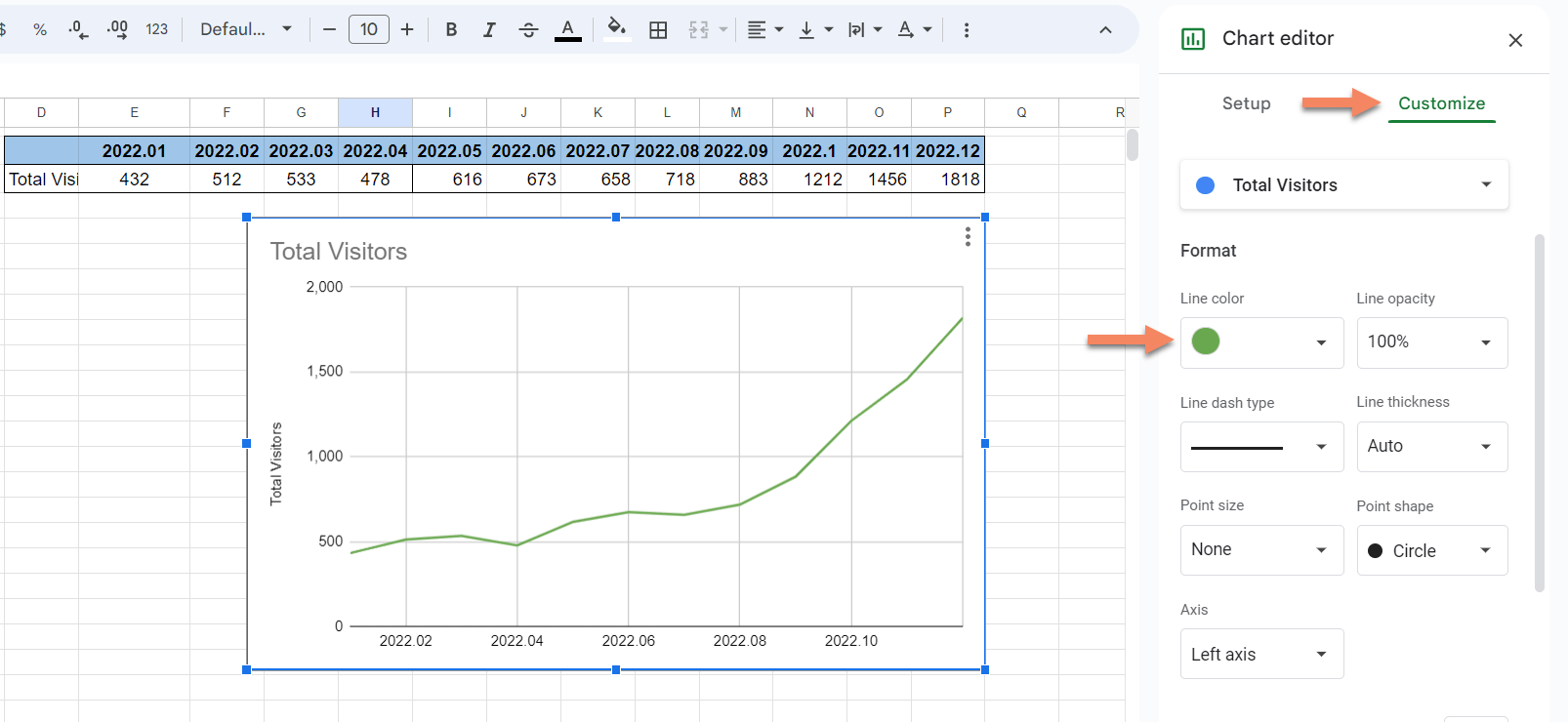
Editing the Color of a Line in Google Sheets
You can change the color of the line from the Chart Editor->Customize->Series section.
Changing the Title of a Line Chart
You can also make changes by directly clicking on the related section of the line chart. For example if you want to change the title of the line chart, simply click on the title and change the name. There are three dots on the right top corner of the chart. By clicking this symbol you can edit, delete, move etc. to your chart also.
Make Multi Line Graphs in Google Sheets
Depending on your dataset you can choose which chart fits best for your needs. If you have two sets of data you can use a double line graph to show two lines in a chart. If you have more than two sets of data in your dataset, you can use a multi line graph. When deciding to use line graphs for your data just bear in mind that line graphs best fits to data which gradually change over a period of time. When using multi lines in a single graph, if the values of different lines are close to each other it may not be a best practice to use line charts.
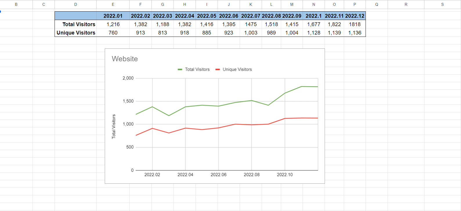
Double Line Chart
In the example below we have the total visitors and unique visitors of a website in a month during a year. Using a double line graph makes it easy to analyze the data. You can make a double line chart out of your data by simply following the Creating a Line Graph in Google Sheets section of this blog.
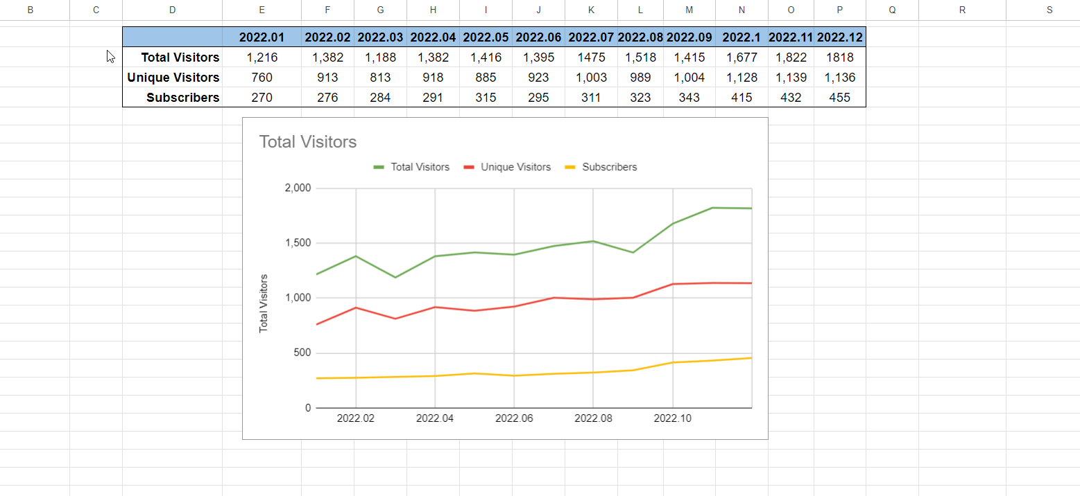
Multi Line Charts
In the example below we have the total visitors, the unique visitors and subscribers of a website in a month during a year. Using a multi line graph makes it easy to analyze the data. You can make a multi line chart out of your data by simply following the Creating a Line Graph in Google Sheets section of this blog.
Final Words
In conclusion, you can make and edit a line chart quite easily in Google Sheets. If you are interested in other types of graphs, such as bar graph, you can continue reading our articles on Google Sheets tips.
Related Posts