Pareto Chart Google Sheets Template
Frequency analysis tool in Google Sheets. Input your data and visualize it on Pareto Chart. Easy to use template with access from any device.

TEMPLATE DESCRIPTION
If you’re looking for an easy way to visualize data and make smart decisions, so, the new Pareto Chart Google Sheets Template is just the tool you need! Prepare your Pareto diagram just in seconds.
Above all, the template lets you create interactive bar graphs that show frequency or cost and give insight into which situations are more significant.
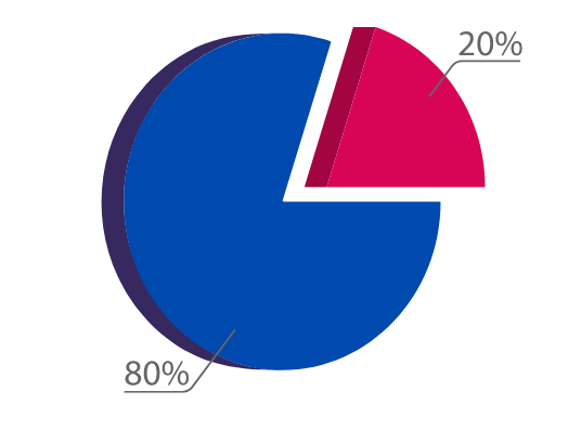
Also, with this template, 80% of a project’s benefit can be achieved by doing only 20% of the work – and it couldn’t be easier to use!
What is Pareto Chart Analysis?
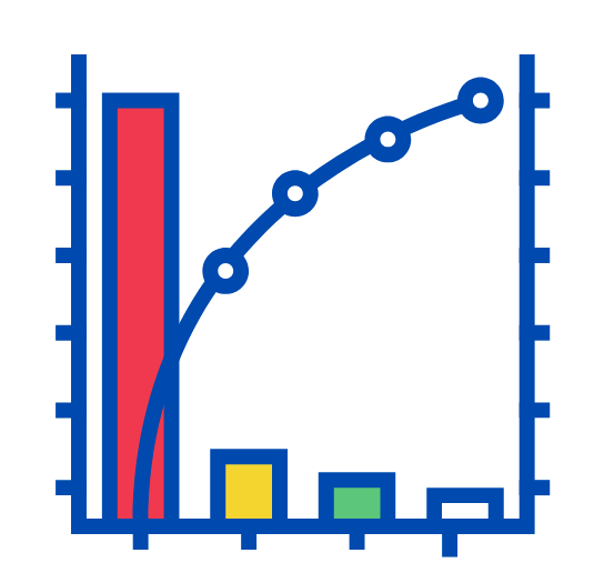
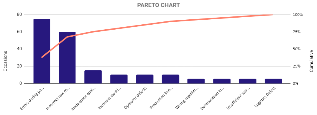
A Pareto chart is a simple bar graph used for visualizing data and showing frequency or cost. So, the bars on the left represent the longest values. While the ones on the right have shorter lengths to represent shorter values.
This makes it easy to compare various pieces of information and see what’s most important in one look.
What are the Advantages of using a Pareto Chart?
- Identify areas where there’s room for improvement and find solutions quickly
- It makes comparison and decision-making much simpler than other types of analysis methods
- Save time and money in the long run
Pareto Chart Google Sheets Template Sections
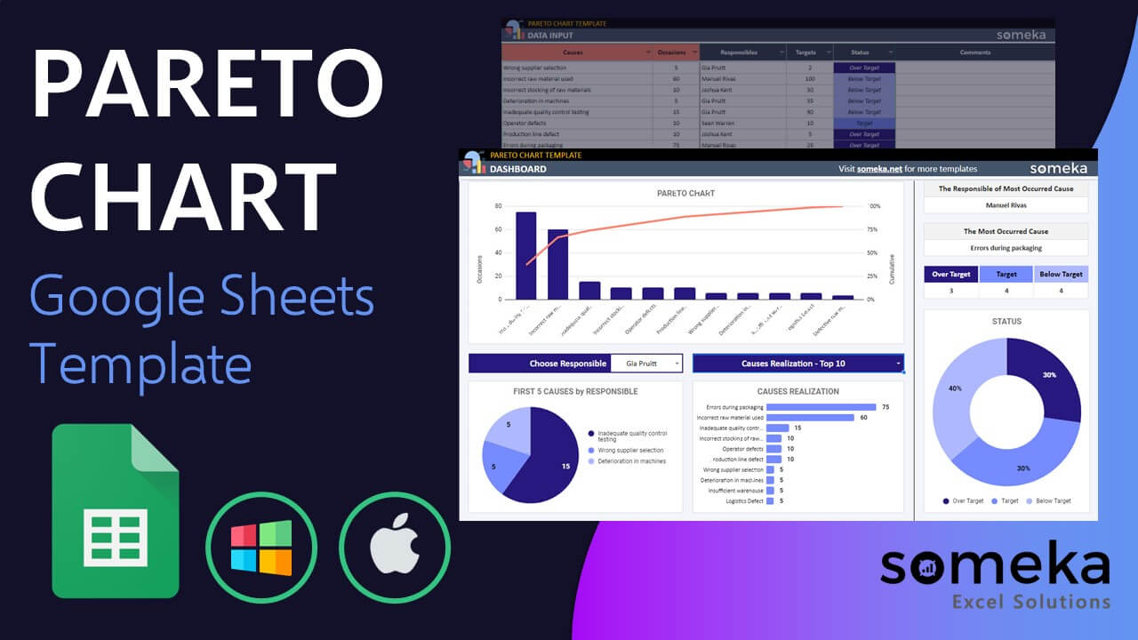
Basically, this template has 2 parts: Dashboard and Data Input Sheet. Let’s check them in detail:
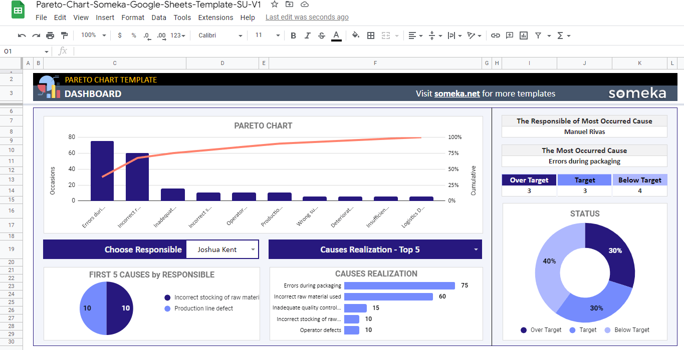
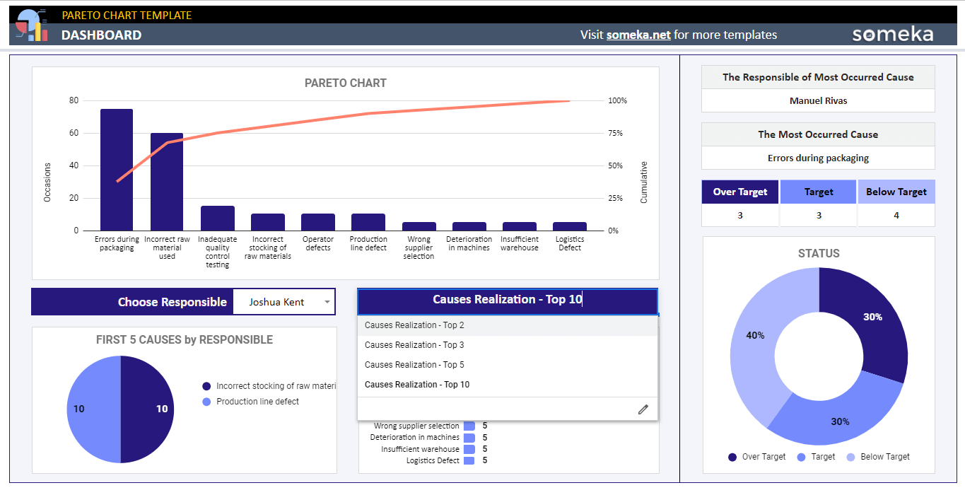
1. Dashboard of Pareto Chart Google Sheets Template
Firstly, in this part, you can see the “Pareto Chart”, “First 5 Causes by Responsible” and “Causes Realization”.
To clarify, you can see the efficiency analysis of your data on the “Pareto Chart”.
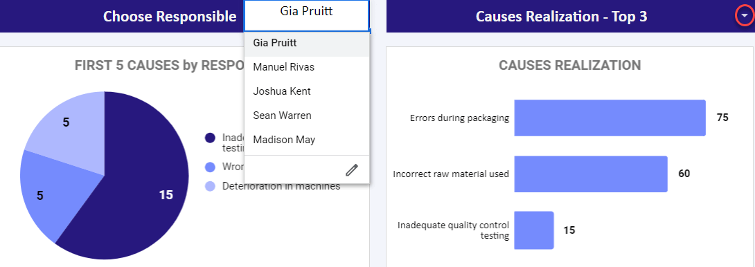
Then you can see the top cause by selecting the top range from the dropdown menu on the “Causes Realization” Chart.
After that, you can see which causes are responsible by selecting the Responsible Person from the dropdown menu on the “Causes by Responsible” Chart.
Additionally, it is possible to track down the Status of tasks in the “Status Chart” which is divided into 3 sections: Over Target, Target, and Below Target. So, with this Pareto Chart Google Sheets Template easily monitor the team and tasks.
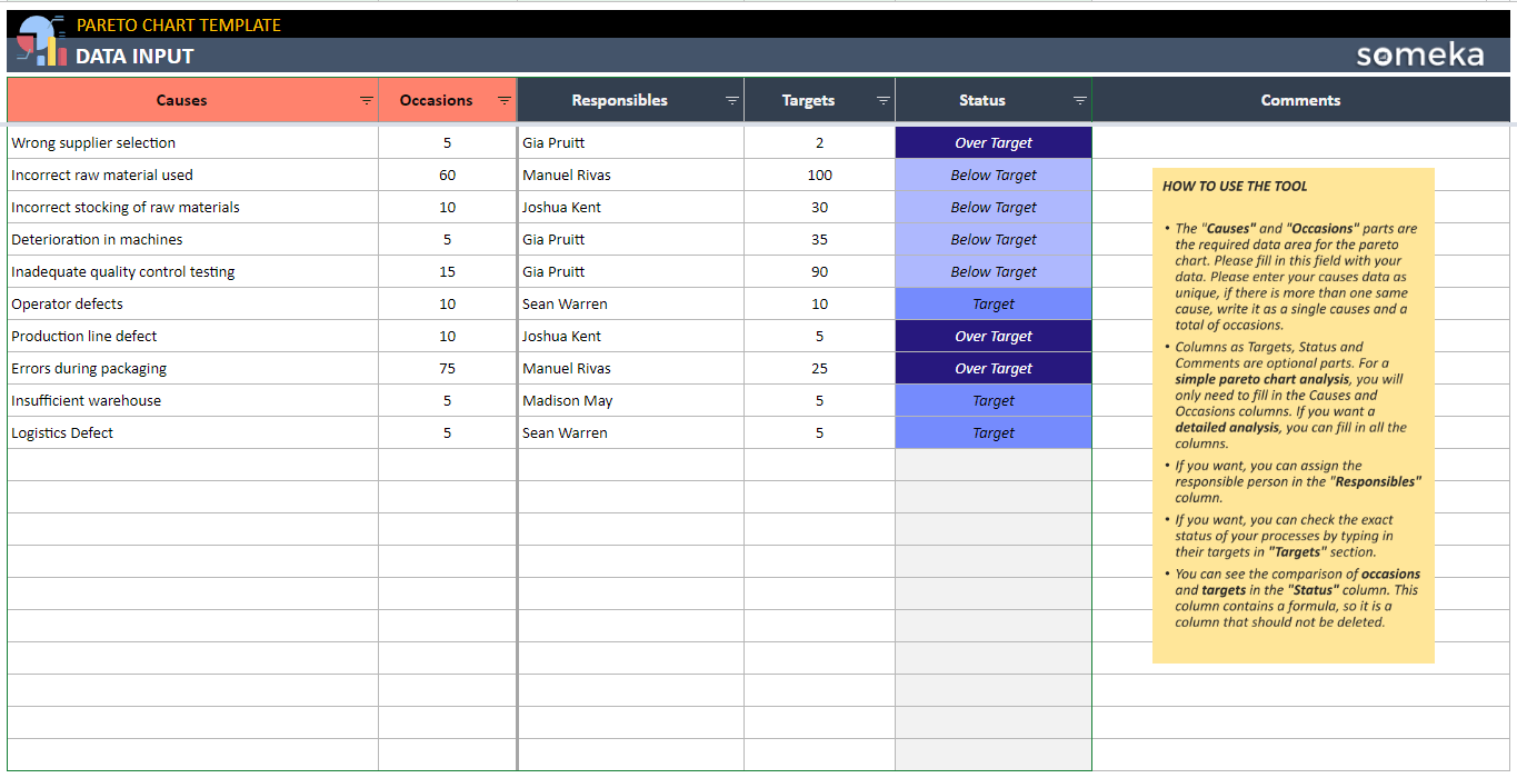
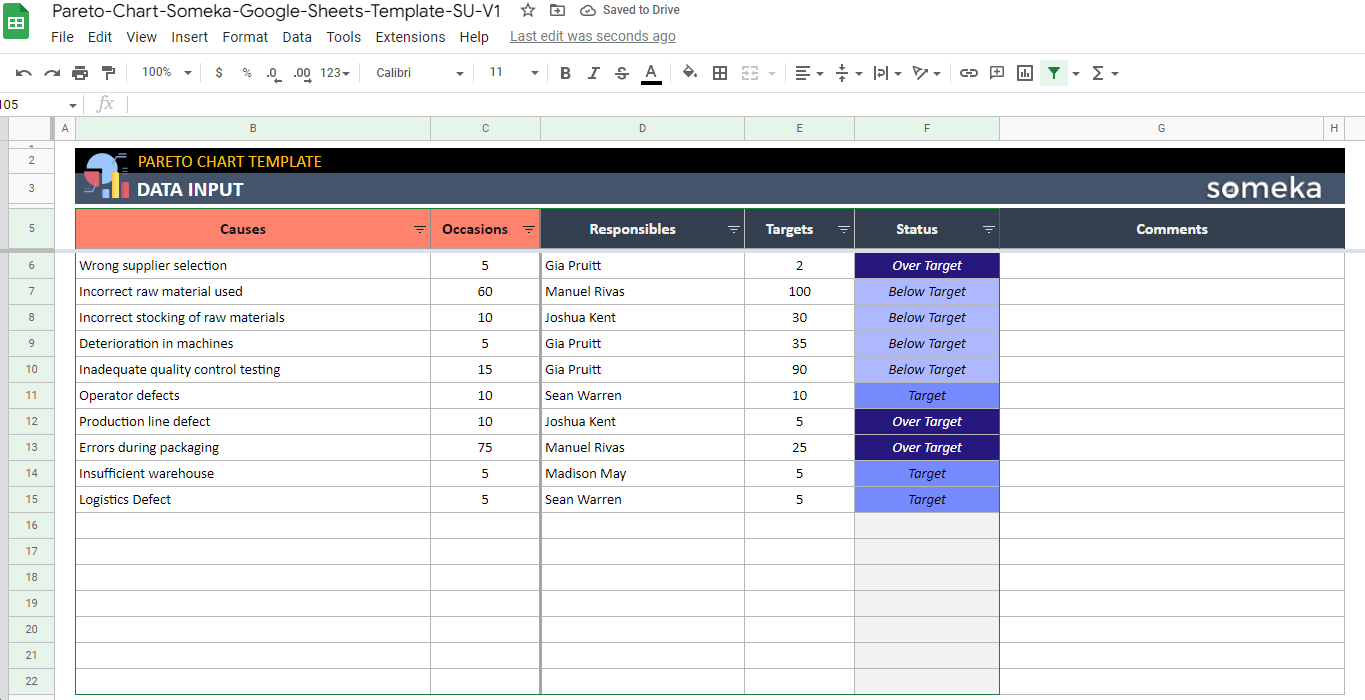
2. Data Input of Pareto Analysis
Secondly, in this Data Input sheet of the Pareto Chart Google Sheets Template, you have access to add and change these tables. Causes, Occasions, Responsible, Targets, Status, and Comments.
The “Causes” and “Occasions” columns are the required data area from the Pareto Chart. So, please fill these columns with your data.
Moreover, please add unique data to your “Causes Column”.
Then, columns such as “Targets”, “Status” and “Comments” are optional parts. In addition, to have a simple Pareto Chart Analysis, you need to fill in the Causes and Occasions columns. But, if you want a detailed analysis, you can fill in all the columns.
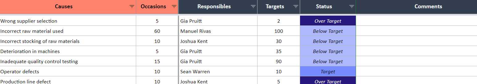
Therefore, you can assign the responsible person in the “Responsible” columns,
Furthermore, it is also possible to check the exact Status of your processes by typing in their targets in the “Target” section.
Pareto Chart Google Sheets Template Features Summary:
- Visualize your data with Pareto Chart in Google Sheets
- Find out the top responsible person for one occasion in a chart
- Dynamic dashboard with bars and charts
- Fully customizable and ready to print
- Informational notes included
- Ready-to-use chart
- Works on any operating system
- Suitable for any device including mobile, tablet, desktop
PRODUCT VIDEO
Watch the video below to see the template in action! Presentation also includes usage notes, explanations and tips & tricks about the template.
USER REVIEWS & COMMENTS
4 reviews for Pareto Chart Google Sheets Template
You must be logged in to post a review.
RELATED TEMPLATES
-
 This product has multiple variants. The options may be chosen on the product page
Employee Database Google Sheets Template
$0.00 – $69.95HR database template in Google Sheets. All-in-one tool with dynamic forms and dashboard. Ready for presentations and access from all devices.
-
This product has multiple variants. The options may be chosen on the product page
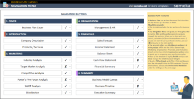
Business Plan Google Sheets Template
$0.00 – $69.95Business Plan in Google Sheets. Analyze and present your business feasibility with step by step guide. Fully printable and accessible from all devices.
-
This product has multiple variants. The options may be chosen on the product page
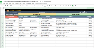
Customer Follow Up Google Sheets Template
$0.00 – $59.95Ready-to-use lead tracking list in Google Sheets. Organize client data, follow leads, and monitor progress status in one place. Access in all devices.
-
This product has multiple variants. The options may be chosen on the product page
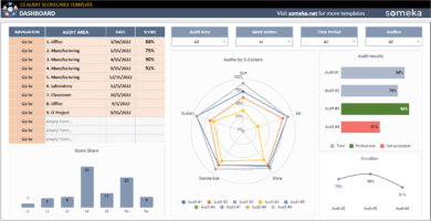
5S Audit Scorecard Google Sheets Template
$0.00 – $69.955S Scorecard audit tool in Google Sheets. Evaluate your workplaces with 5S checklist. Auto radar chart generator included. Access from all devices.
-
This product has multiple variants. The options may be chosen on the product page
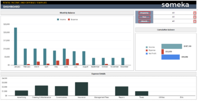
Rental Property Income and Expenses Google Sheets Template
$0.00 – $69.95A Google Sheets template for landlords. No more stress on the tax time. Simple yet powerful property management tool with access from all devices.
-
This product has multiple variants. The options may be chosen on the product page
Management KPI Dashboard Google Sheets Template
$0.00 – $79.95Online dashboard for Management KPIs. Summarize your key business metrics with trend charts. All in Google Sheets with access from all devices.


Mitul Jain –
we have machine breakdown cause, it repeats 3 times a week. Should we put it separately or in total?
Someka –
Hi Mitul, thanks for your comment! If the cause is the same, you need to enter the data in total in the Causes column. Otherwise, the data will appear in different columns in Pareto chart, too. Hope this helps!
Patel S –
With the paid version could I change the name of the headings (causes)
Someka –
Hi Patel, thanks for your question! After purchasing our templates, you may edit them as you like. For Google Sheets, all you need to do is to click on the heading you want to change and type the name you prefer.
Wang –
Do I have to fill out every data section? no targets..
Someka –
Hi Wang, thanks for your question! No, you don’t have to fill out every column in the Data Input sheet to create a Pareto Chart. For a simple Pareto Chart, you only have to enter the Causes and Occasions columns. The other information is optional. Hope this helps!
Joseph K –
Thank you very easy