Quality KPI Dashboard Excel Template
Excel spreadsheet to track quality metrics. Most used quality KPIs. Printable dashboard with monthly and cumulative trend analysis. Ready to present.
TEMPLATE DESCRIPTION
High levels of quality are crucial for a company’s lifetime. Surely, quality is a must to avoid defects and mistakes before the supply process. But, how to manage and measure quality management? This Quality KPI Dashboard Excel Template will help you to choose quality metrics to track, and manage the quality process in your business. Also, it’s ready for representation!
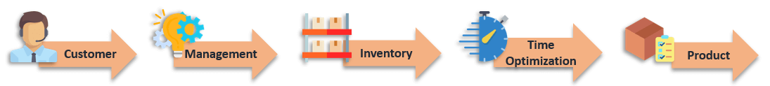
In general, we have compiled the most common 25 Quality KPIs in different categories under five main groups:
Then, let’s dive into the features of the template and detailed descriptions of Quality metrics.
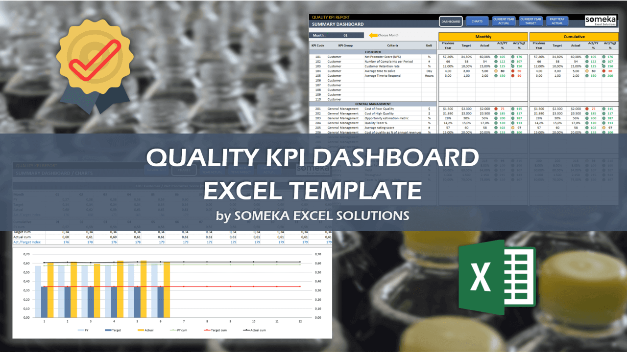
Quality KPI Dashboard Excel Template Features:
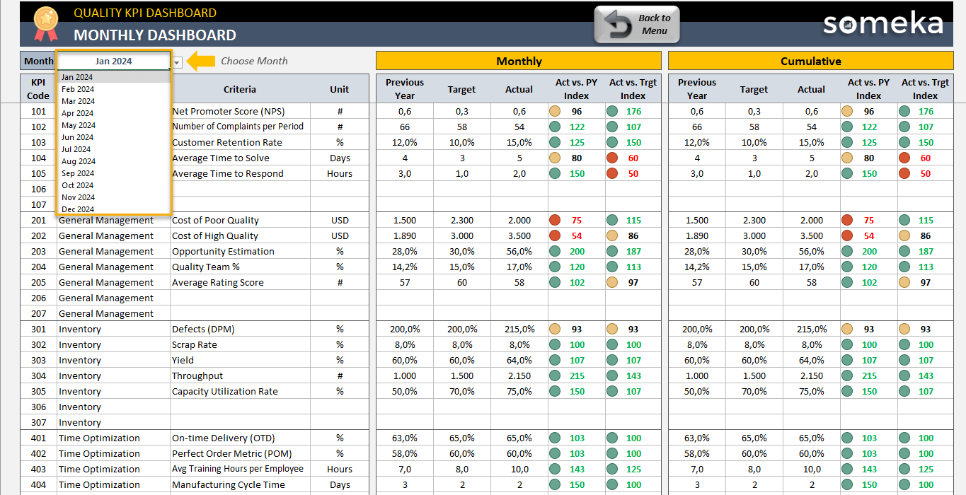
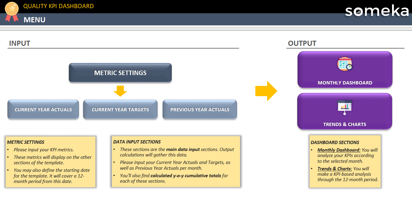
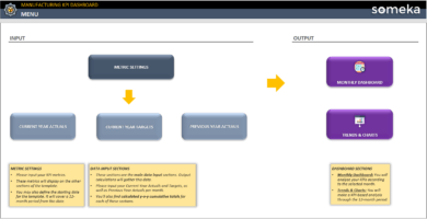
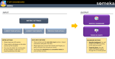
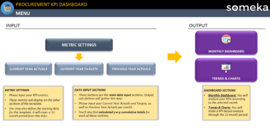
Firstly, the navigation buttons at the top of the page serve as a control panel to make switching between sections easier.
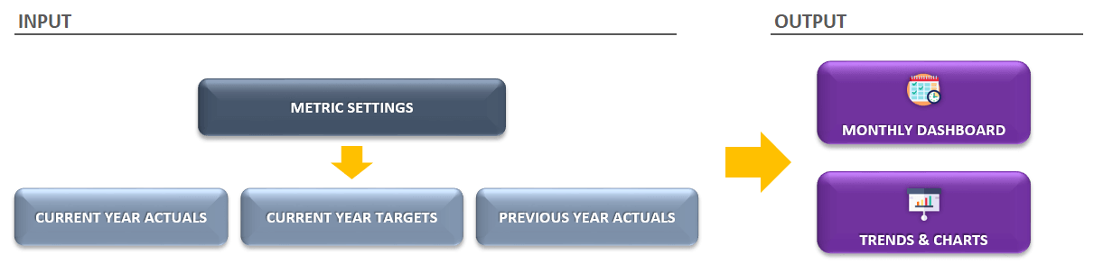
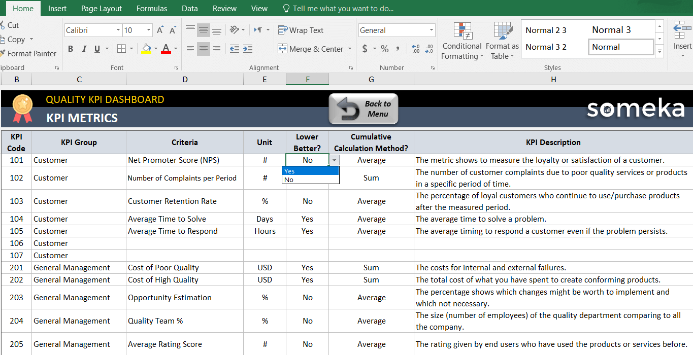
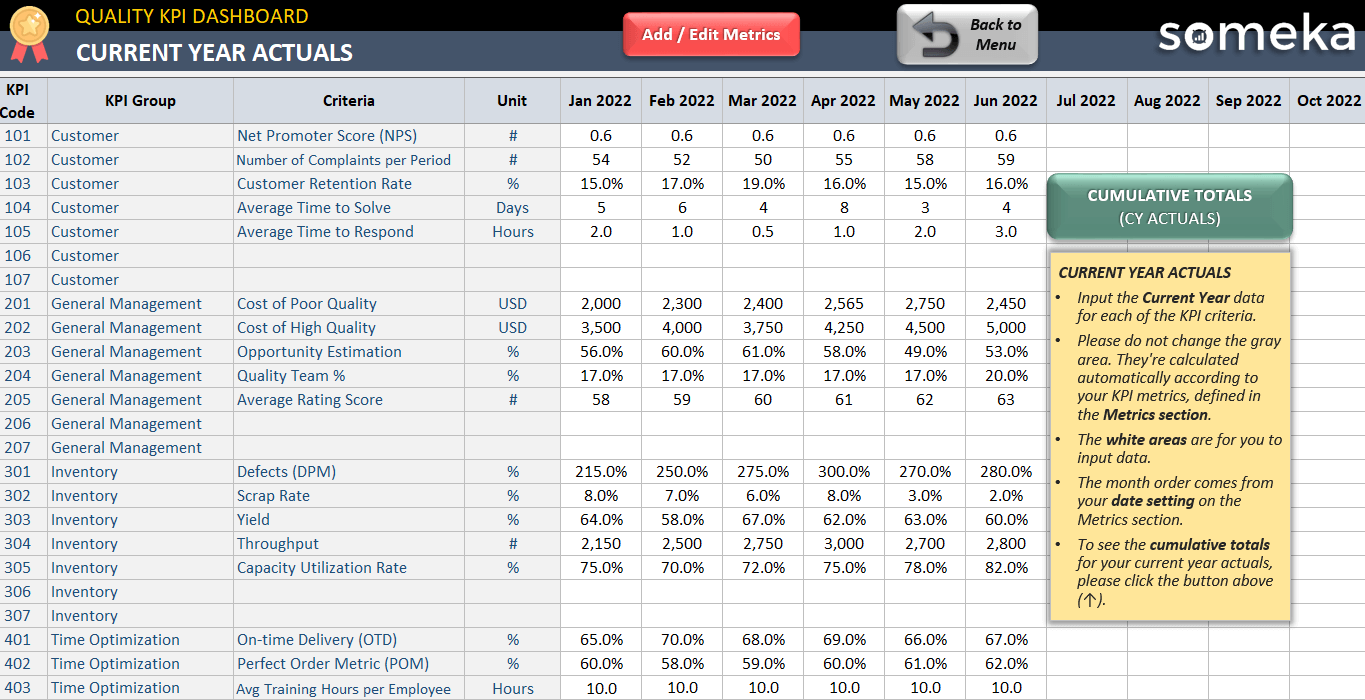
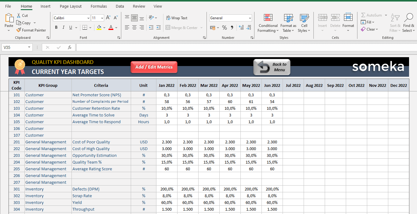
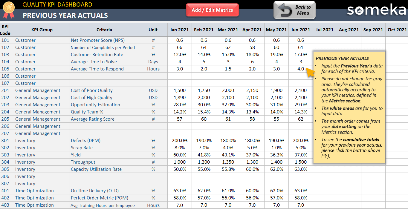
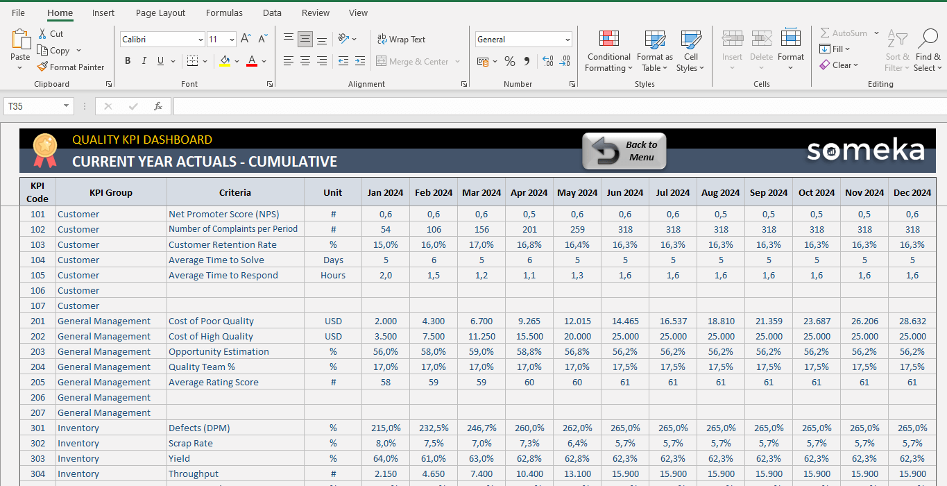
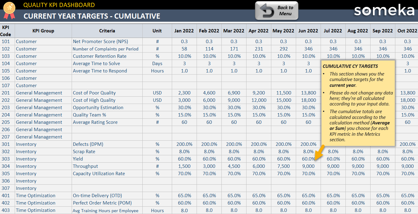
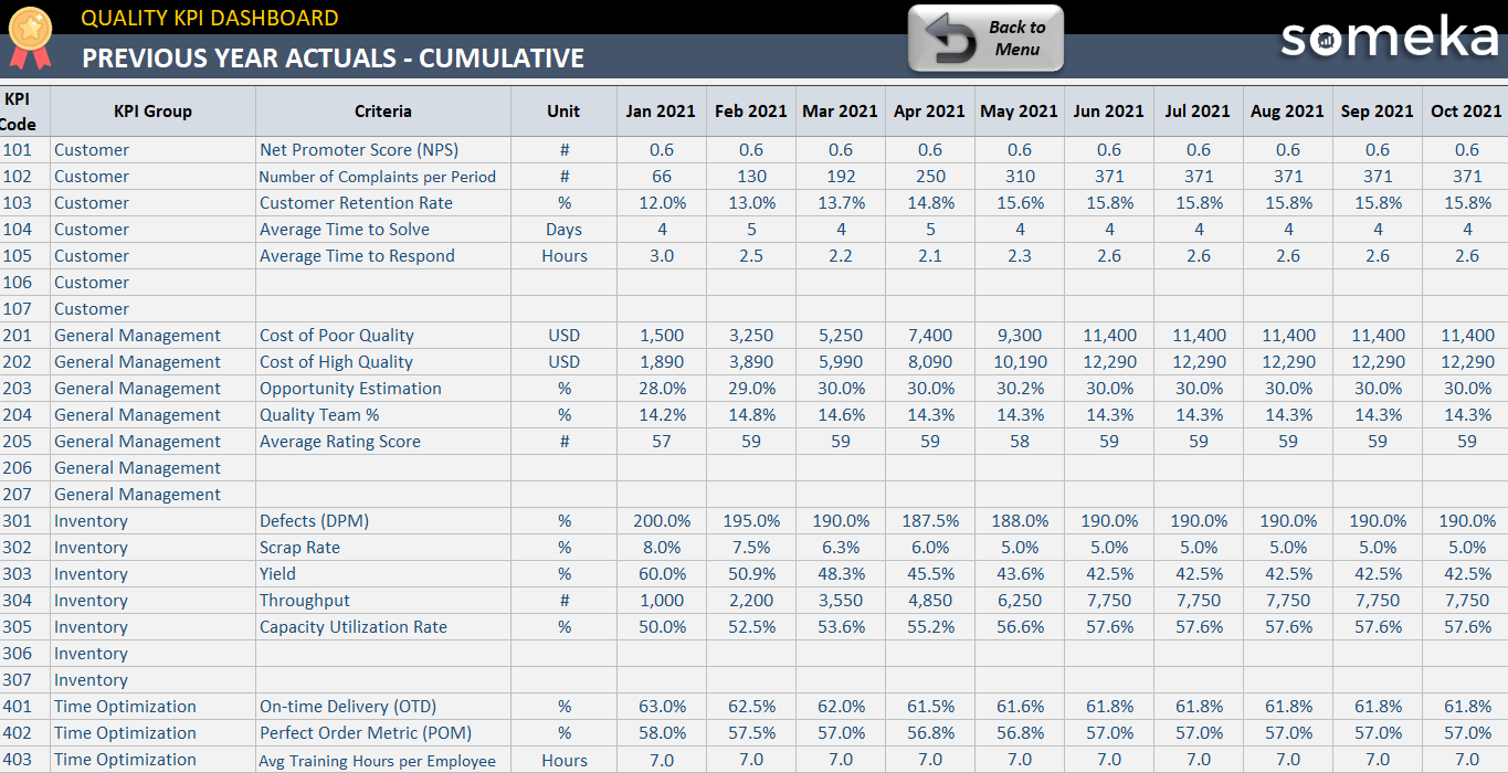
Basically, the Current Year Actual, Current Year Target, and Past Year Actual are the sections in which you can input your own metrics inside it. Moreover, you can remove the default metrics if those are not suitable for your company.
Warning!: Please do not forget to add new KPI to other sections as well. Because Cumulative results will take data from the sections that you input manually.
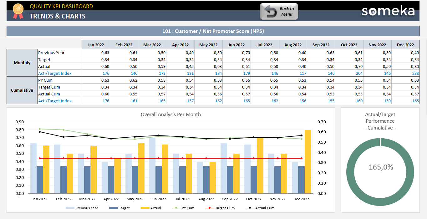
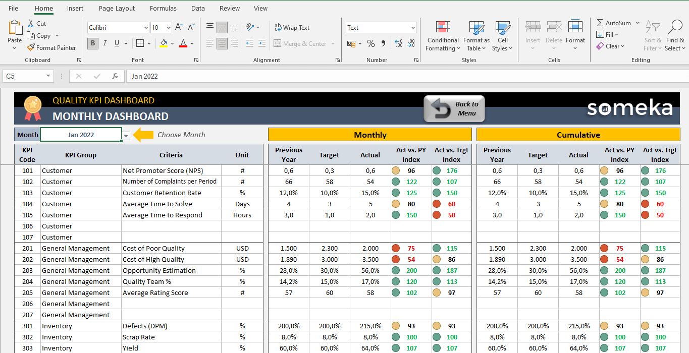
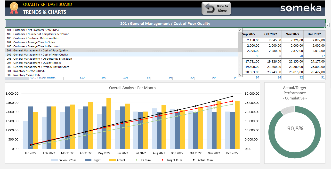
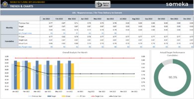
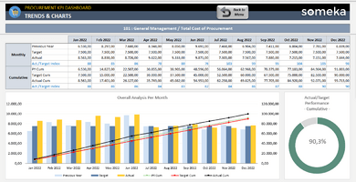
On the other hand, the Charts section presents visualized data to see trends of your performance according to the selected KPI.
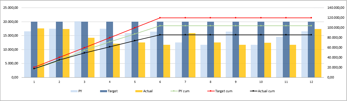
Finally, you can compare your monthly and cumulative results and try to understand the past year and company target comparison.
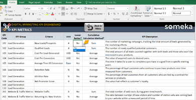
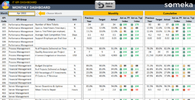
Detailed Description of Quality KPI Metrics in Excel Template:
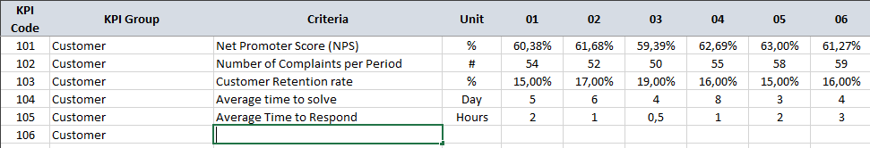
 Customer
 Customer
Net Promoter Score (NPS): This metric measures customer loyalty by asking “How likely is it that you would recommend our company to a friend or colleague?”
NPS : You can calculate it with this formula: NPS = % of promoters – % of Detractors
Number of Complaints per Period: Measures the number of customer complaints registered by the organization, as a result of poor quality services or products in a specific time of period.
Customer Retention Rate: Customer retention rate indicates the percentage of customers, the company has attained given a period of time. Calculated as:
(#of customers at the end of the period – #of new customers during that period)/#of customers at the start of the period)*100
Average Time to Solve: It is the metric that indicates the average timing to solve a problem.
Average Time to Respond: It is the metric that indicates the average timing to respond to a customer even if the problem persists.
Furthermore, you may add new KPIs for your quality dashboard in this Excel template.
General Management
 General Management
Cost of Poor Quality: Cost of Poor Quality is a metric where all the costs for internal (scrap, rework and re-inspection) and external failures (defects reach the customer, including adverse event reporting, warranty, corrections and removals, product liability and loss of brand reputation) are gathered up.
Cost of High Quality: COGQ is the cost of what you have spent to create conforming products. Thus, these costs are mainly Appraisal (inspection and testing, quality audits and calibration) and Prevention costs (statistical process control (SPC), quality planning and training).
Opportunity Estimation Metric: Opportunity Estimation Metric is the multiplication of the estimated impact of the quality issue and the estimated probability of this impact. So, a higher value shows the effectiveness of decision-making. The formula stands as Impact (%) x Probability (%)
Quality Team %: It shows the percentage of Quality Department employees among all the employees.
Average rating score: The detailed unbiased reviews from the users who already used the product or service will show you the proof of how good or how bad it is by the marks they give.
Inventory
 Inventory
Defects Per Million (DPM): Defects per million (DPM) show the weight of Defective parts among all total parts in every million.
The formula stands for (Defective Parts/TotalParts) x 1.000.000
Scrap Rate: Scrap rate is the percentage of materials sent to production that never become part of finished products. The formula stands for :
Scrap rate = Total Scrap / Total product run
Yield: Yield is the percentage of the correctly manufactured goods to the total manufactured goods. This formula may apply to more than one material or category.
Yield(A) = #correctly manufactured(A) / Total Manufactured (A) and the total yield is = Yield(A) x Yield(B) x Yield(C)…
Throughput: Throughput is the number of goods that the company produce over a given time period. The formula stands for :
(Total Units/Processing Time) x (Processing Time/Total Time) x (Good Units/Total Units) or in a shorter way (Good Units/Total Time)
Capacity Utilization Rate: Capacity Utilization Rate is the percentage of total output capacity used at any given point. The formula stands for (Actual Output/Potential Output) x 100
Also, please remember you can change these metrics with your own ones in this quality KPI dashboard spreadsheet.
Time Optimization
 Time Optimization
On-time delivery (OTD): This metric is calculated as the percentage of units delivered within the OTD window. The formula stands for (Delivered goods within OTD)/ (All delivered goods)
Perfect order metric (POM): The percentage of orders that arrive complete, on time, damage-free and with a correct invoice. The formula stands for POM = (&Complete) x (%On time) x (%Damage free) x (%Correctly invoiced).
Average training hours per employee: This metric shows you the average training hour of an employee. You can calculate it as;
(Total number of training hours) / Total number of employees
Manufacturing Cycle Time: Manufacturing Cycle Time stands for the time between the order of that product and the production to finished goods.
Moreover, this template in Excel for quality KPIs lets you add new metrics according to your particular needs.
Product
 Product
Active defects: Active defects metric shows the amount of new, open, or fixed(and waiting for re-test) defects.
Rejected defects: Rejected defects are the defects where the consumer states a problem but the producer or developer doesn’t think it is a defect. The formula for the weight of Rejected defects is (#Rejected Defects)/ #Total Defects.
Defects Fixed Per Day: This metric indicates the average amount of defects that your company solves during a working day.
Severe Defects: This metric indicates the percentage of critically defected goods to the total defects. Then, the formula stands for:
(Critically defected goods) / Total defects
Supplier Defect Rate: This metric indicates the percentage of materials from suppliers not meeting quality specifications.
Please note that KPIs and OKRs (Objectives and Key Results) are both important to sustain your quality activities.
Quality KPI Dashboard Excel Template Features Summary:
- Both periodic and Accumulative analysis
- Both Past Year and Target Values Comparisons
- Overview dashboard with interactional charts
- A simple design that is easy to use for presentations
- KPI Examples for Quality Management
- Straightforward on-sheet directives
- Excel 2010 and later versions compatibility
- Windows and Mac Compatible
- No download/installation is required. Ready-to-use.
- Print-ready
- White Label
- No Visual Basic for Applications (VBA) Macros
EXCEL KPI DASHBOARDS COLLECTION
PRODUCT VIDEO
Watch the video below to see the template in action! Presentation also includes usage notes, explanations and tips & tricks about the template.
USER REVIEWS & COMMENTS
13 reviews for Quality KPI Dashboard Excel Template
You must be logged in to post a review.
RELATED TEMPLATES
-
 This product has multiple variants. The options may be chosen on the product page
Retail KPI Dashboard Excel Template
$0.00 – $79.95Excel KPI tracker for retail stores. Most used metrics for retail managers. Printable dashboard with cumulative analysis. Ready to use.
-
This product has multiple variants. The options may be chosen on the product page
Digital Marketing KPI Dashboard Excel Template
$0.00 – $79.95Excel KPI spreadsheet for digital marketers. Track your key metrics on social media, SEO, PPC and leads. Printable dashboard with trend charts.
-
This product has multiple variants. The options may be chosen on the product page
Manufacturing KPI Dashboard Excel Template
$0.00 – $79.95Manufacturing KPI Dashboard Template in Excel. Includes most used key metrics for production with trending charts, contrast analysis and much more.
-
This product has multiple variants. The options may be chosen on the product page
IT KPI Dashboard Excel Template
$0.00 – $79.95Excel spreadsheet for IT departments. Track your key metrics in information technology with target-based and yearly comparisons. Printable trend charts.
-
This product has multiple variants. The options may be chosen on the product page
Procurement KPI Dashboard Excel Template
$0.00 – $79.95Excel spreadsheet for procurement metrics. Track your purchasing KPIs with monthly and cumulative analysis. Printable dashboard with on sheet guide.
-
This product has multiple variants. The options may be chosen on the product page
Excel ERP Template
$0.00 – $199.95ERP spreadsheet template as a mini ERP application in Excel. Simple yet powerful. Manage your processes, see projections and calculate financials.
Katie H –
Big fan of monthly dashboard, shows everything in the simplest way with colors. Thank you somkea for creating
Jelena E. –
What’s the difference between SU and MU
Someka –
Greetings! If you’re a solo user, the single user version is the most ideal option for you. However, the Multi User (MU) edition enables you to work with your colleagues or friends on the same template. To learn more about the different licences that Someka offers, click here.
David Hardie –
It would be fantastic if there were some ready-made templates for various industries and business types.
It be far morre convenient to use the template from the start.
Ian W –
I’m absolutely delighted with ! It’s changed my business for the better and significantly upgraded our quality management practices.
Oscar Per –
This Quality KPI Dashboard is really superb! It’s simple to operate and it supplies an expansive selection of quality metrics. Strongly suggest!
Yoselin –
useful excell application thanks guys
Dallas Ld –
very creative
but want adding new sheet, can you support about this?
Someka –
Hi Dallas,
First, you need to unlock both worksheets and workbook. How do I unlock the sheets? What is the password?
After that, please open the sheet tabs and add a new sheet
Hope this helps!
chachanon –
good
Daniel E. –
I am already using one of your KPI Templates. But is it possible to make changes to what the metrics are called? my organization uses different terminology in many cases for their quality metrics…
Someka –
Hi Daniel,
Of course, you can use different terminologies for your key performance indicators. We made a research to gather the most common metrics before we create this template. But it is totally modifiable so, you can add new metrics by using the blank rows or you can even modify the existing ones. For further questions please do not hesitate to contact us!
Sparsh A. –
The easy of use…I literally created a fully capable dashboard showing all of our quality data in less than one hour.
dante –
It is a great roadmap and makes it really easy to report your metrics and make them visible to the entire team
Amanda2 –
We have been able to create different reports that took close to our key metrics in a month. While the product has some limitations, the user-experience and ease of use make it a good overall experience.
Mathew Baldwin –
It is very flexible, with the range of metrics that I exactly need.
I had a question: I see there is an option for charts to be built based on the data we input. Right now the chart displayed is a bar chart for trending. This is a great one but I am also curious if you have other options for the chart or only the bar chart?
Someka –
Hello Matthew,
Thanks for reaching out and your interest in our KPI Dashboard Templates!
Regarding the question you asked, as default, we do not add a feature to change chart type but you can do that using the Excel function easily. Just select the chart -> Go to Design Tab-> Click Change Chart Type. You will see all available chart for the data we’ve visualized and change the chart design as you see fit!
Hope this helps! Otherwise please do not hesitate to contact us for any of your questions.