Pareto Chart Excel Template
Pareto Analysis tool in Excel. Input your data and visualize it with 80/20 rule. Automatic chart maker with printable dashboard. Ready-to-use.
TEMPLATE DESCRIPTION
Do you have a large project to tackle and need help understanding which tasks need more attention? Then you can visualize your data with Pareto diagram, and here is our Pareto Chart Excel Template to help you build your dashboard.
What’s Pareto Chart?
Above all, Pareto Chart is a statistical tool used to make decisions on what tasks have the highest overall impact. Also, it gives you an overview of how to manage your project in the best way.

History of Pareto Chart
Originally, 80/20 rule-Pareto’s law, it was first developed by Italian economist Vilfredo Pareto in 1896 and has since become an important tool for businesses around the world.
Moreover, with our Pareto Chart Excel Template, you can quickly analyze data in your production processes without worrying about formatting or other details.
Besides, the template takes care of everything for you, so all you have to do is input the data and watch as it creates an effective visualization.

What is the logic of the 80/20 Rule?
Additionally, the 80/20 Rule is at the core of this template’s use: typically, 20% of the effort will produce 80% of the results. The rule means focusing on these aspects can provide a great benefit for the success of your business.
The Pareto Chart Excel Template does this job effortlessly; simply enter information about your existing production process and then get an instant analytic showing you, exactly what needs more attention.
As a result, it shows you what areas require more attention. Then, decision-makers can improve efficiency by adding more resources where they need them more.
Pareto Chart Excel Template Main Features
Basically, this template has 2 parts: Dashboard and Data Input Sheet. Let’s check each of them separately:

1. Dashboard of Pareto Chart Excel Template
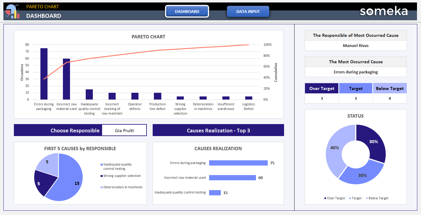
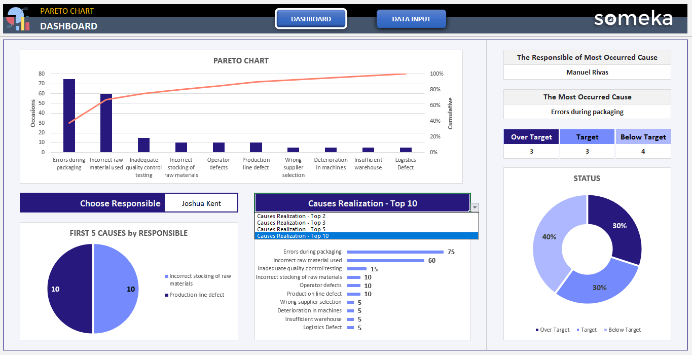
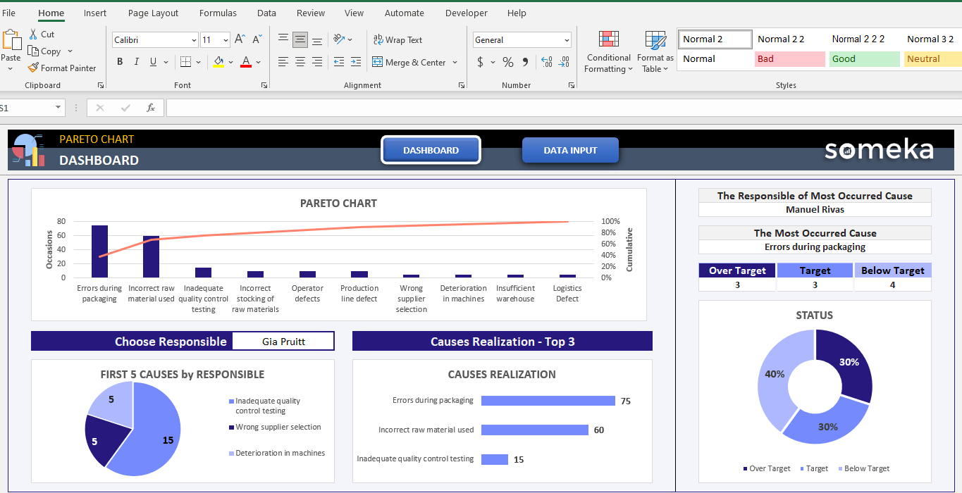
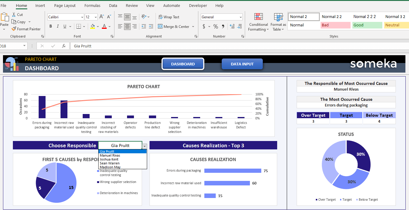
Firstly, here is a sheet where you can see data analysis in detail. In the upper left corner, you immediately see the “Pareto Chart”.
Also, the part below 80% on the red line shows us the 20% causes that we should pay attention to. These are “Errors During Packaging”, “Incorrect Raw Material Used” and “Inadequate Quality Control Testing” in this example.
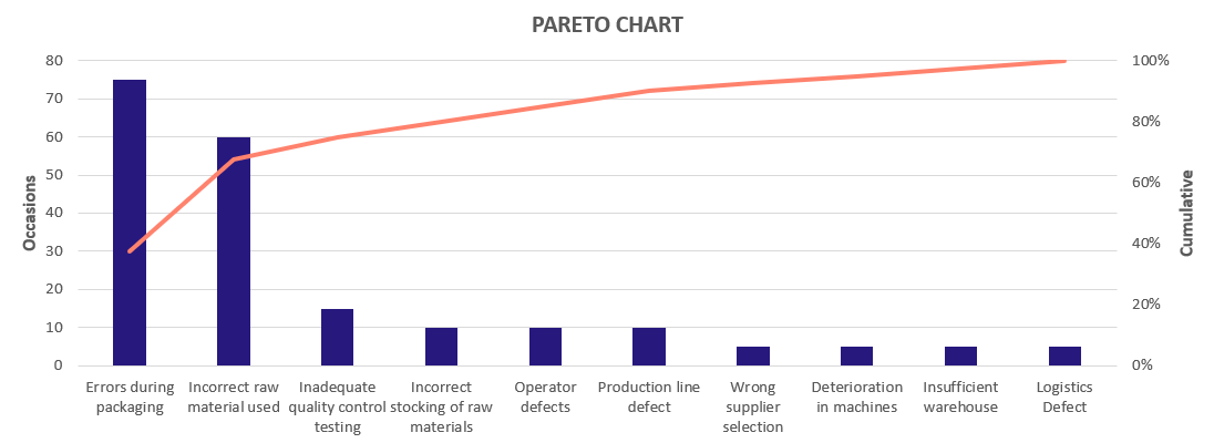
On the occasion’s axis on the left, you can see the frequency of causes, that is, how much they repeat. Also, the axis on the right has cumulative values of the Pareto Chart Excel Template.
Then, you can see the graphic “First 5 Causes” by “Responsible” in the lower left corner. First, you must choose the person responsible for the dropdown above it.
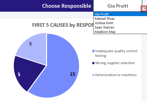
After that, you will see the top 5 most important causes under the responsibility of the responsible person. The numerical values on it show the frequency of the causes.
Causes Realization Chart
The chart on the right is the “Causes Realization Chart”. There is also a dropdown at the top. Here you can see the most important causes. If you choose Top 2, you will see the first 2 most important causes and it progresses according to your choice.
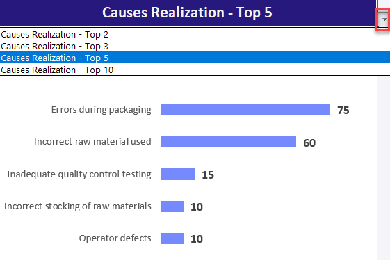
To clarify, with the “Responsible of Most Occurred Cause” you can see who is responsible for the most important causes in the process. Also, the purpose of this calculation is; If we observe the frequency of errors in the production process, it is to determine which worker has a problem.
The part below one is “The Most Occurred Cause”, it is here to identify the most problematic or most profitable process.
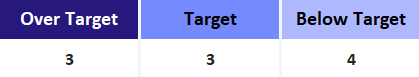
The 3 colored areas “Over Target”, “Target”, and “Below Target” provide a general analysis for the determined targets.
Then, In the graph just below is Status Chart, you can see the distribution of targets on the pie chart. Finally, the purpose here is to analyze exactly how the user is in the frequency targets and show it to the user.
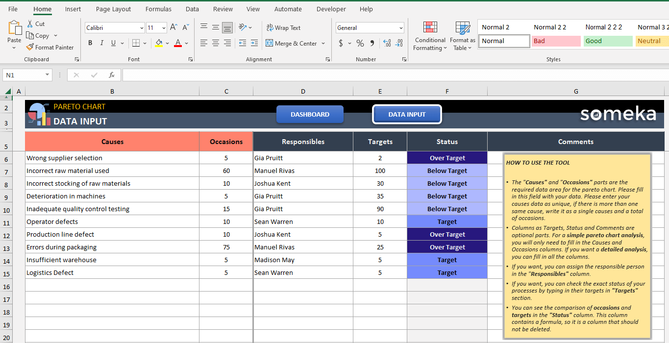
2. Data Input
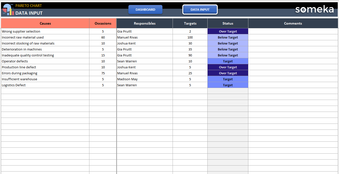
Secondly, here in the Data Input of the Pareto Chart Excel Template, you can see 6 columns. The columns highlighted in red are mandatory fields for a Pareto Analysis.
Then, you can see the first “Causes” column. There is a data field of 100 rows here. The user should write which processes he wants to follow here. Here the user must enter the causes as unique.
If the same causes exist, they should collect their frequencies in the data and write the total value to the occasions under a single cause.
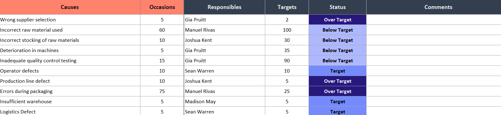
- Also, the “Occasions” column is the column that shows the frequency of the processes. So, you have to write the number of times the process is followed.
- The “Responsible” column shows the employee following that process.
- The “Targets”, so the target occasions are written here.
- In the “Status” column, occasions and targets are compared. This field contains the formula.
- If you want to add a special note in the “Comments” column, you can add it.
Lastly, if you’re looking for a simple yet effective way to make smart decisions, consider investing in the Someka Pareto Chart Excel Template today!
Pareto Chart Excel Template Features Summary:
- An effective frequency analysis tool in Excel
- Input your data and build Pareto Chart
- Includes a dynamic dashboard and pie chart in Excel
- Fully customizable and ready to print
- Informational notes included
- A ready-to-use chart in Excel
- Works both on Mac and Windows
- Compatible with Excel 2010 and later versions
- Does not include VBA code and macros
PRODUCT VIDEO
Watch the video below to see the template in action! Presentation also includes usage notes, explanations and tips & tricks about the template.
USER REVIEWS & COMMENTS
6 reviews for Pareto Chart Excel Template
You must be logged in to post a review.
RELATED TEMPLATES
-
 This product has multiple variants. The options may be chosen on the product page
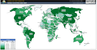
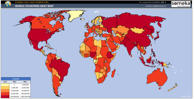
World Countries Heat Map Generator Excel Template
$0.00 – $69.95World Heat Map Excel Template will visualize your data on the global map. Put your data and heat map will be created and painted automatically.
-
This product has multiple variants. The options may be chosen on the product page
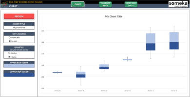
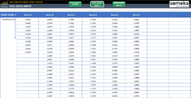
Excel Box and Whisker Plot Maker
$0.00 – $49.95Automatic box and whisker template. Create box plot diagrams with one-click. Dynamic chart and quartiles with different color options. All in Excel.
-
This product has multiple variants. The options may be chosen on the product page
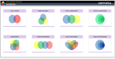
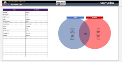
Excel Venn Diagram Maker
$0.00 – $59.95Venn Diagram Template automatically creates venn charts from your data in Excel! Most used models like 2 & 3 & 4-circle sets. Works in Mac & Windows.
-
This product has multiple variants. The options may be chosen on the product page
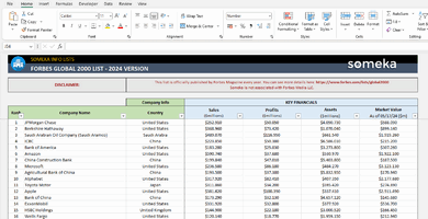
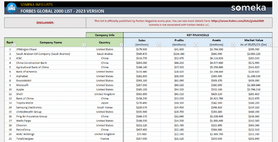
Forbes Global 2000 Excel List
$0.00 – $39.95Forbes Global 2000 official rankings. Top global companies list. Sales, profits, assets & market value info. Fully printable & sortable. Available in Excel.
-
This product has multiple variants. The options may be chosen on the product page
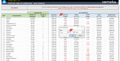
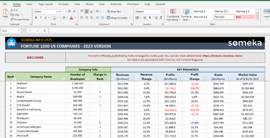
Fortune 1000 Excel List
$0.00 – $39.95Fortune 1000 official rankings. Top US companies list. Key financials and other company info. Fully printable & sortable list. Available in Excel format.
-
This product has multiple variants. The options may be chosen on the product page
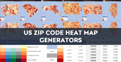
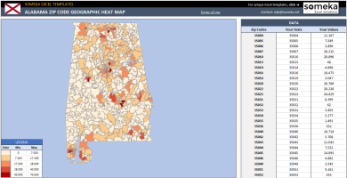
US Zip Code Heat Map Generator Excel Templates
$0.00 – $79.95US Zip Code Heat Map Generators convert your data into visual geographical heat map by zip code. Editable shapes in Excel & Powerpoint.
Daniel P. –
thanks for making it works on Mac too. I am a mac user and it works really smoothlyl.
Filipe Dusa –
i really like the dashboard section with statuses. well done team.
Lemi –
I like it really, you added so many details and charts. I also printed it and had a small presentation to my boss. It was a life saving template 🙂
Farnk Sett –
hey there, can you please explain more about 20/80 rule? I need more info
Someka –
Hi, thank you for asking.
You can use the 80/20 rule to prioritize the tasks that you need to get done during the day. The idea is that out of your entire task list, completing 20% of those tasks will result in 80% of the impact you can create for that day.
So it is more about prioritizing the tasks that have the most results and you have to spend more time and money on it.
Parsad –
How I can unlock my template? I purchased the template and I received and email with the download file and password, but I am not experienced with using excel and I need help to unlock sheets. Also thanks for it, the template visualization is good and I can understand it easily.
Respect
Someka –
Hello, happy to hear that you are satisfied with the template.

First click on Review, then you can see the Unprotect element, after clicking on it you see a small box to paste the template password.
You can also follow the steps like this image.
If you need more help please be in touch with us: contact@someka.net
Sugandhi –
That’s a useful template, thank you Someka.